This is the house that blog built and this latest update is all about preparation, precision and first impressions. The first evolution of our design house is moving along fast now as we work towards an exciting launch for LDF in September. It’s amazing seeing some colour finally going on after months of bare boards and walls. But any good finish is all in the preparation!
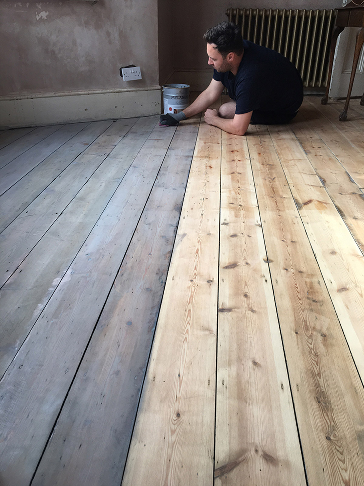
With the hideously dusty stage of the plastering and floor sanding out of the way we moved on to staining the floors with a deliciously pale warm grey called Clay in the Mylands Earth stains range. It was a long job but easy to apply with a cloth to keep control of exactly how far you want to take the colour. We applied lightly as we wanted to keep the natural beauty of the wood and then sealed the floor with 3 coats of Matt varnish. It’s come up a right treat and we love it.
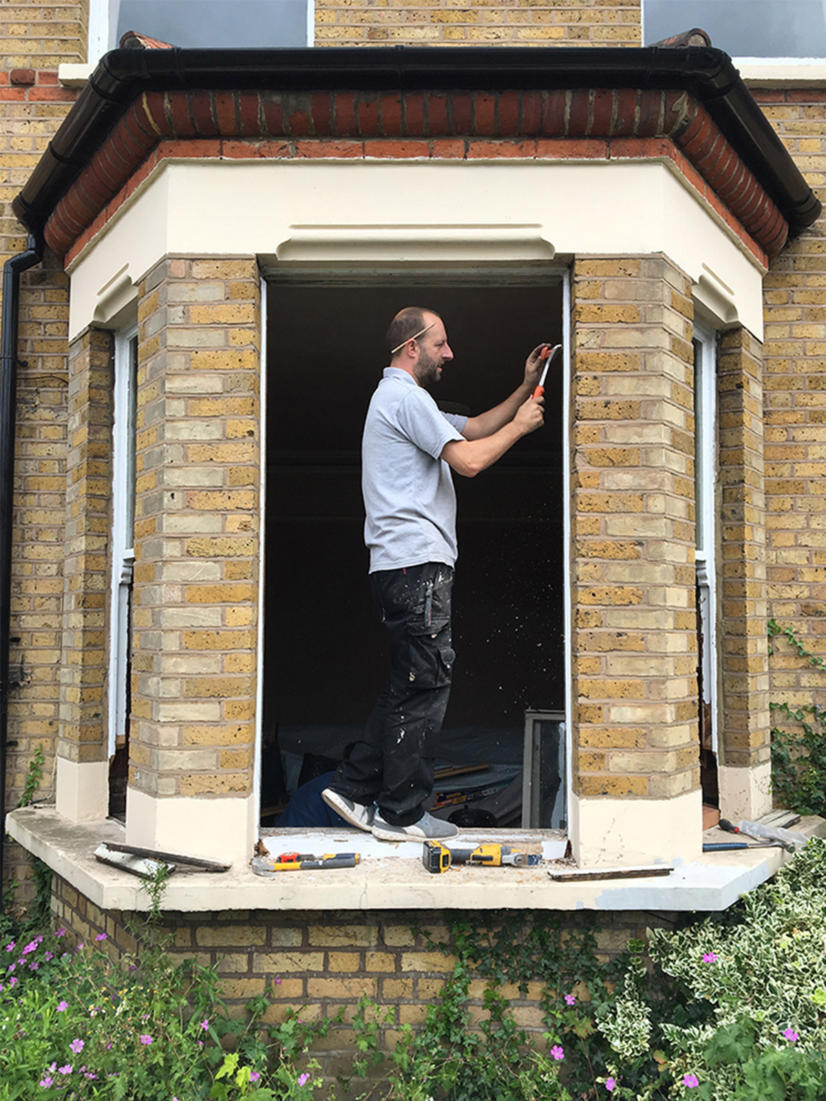
Then we had our windows refurbished. It’s an expensive and tough choice when it comes to original wooden sash Windows when you are in a conservation area but luckily the box frames of our windows had been well looked after over the years and we only had to replace the hardwood cills and the sashes. It’s made such a huge difference in this hot weather just to be able to open our windows! Before they were painted shut and now we can get air in and we know that this winter not be as crazy cold as last year in this old house.
Then we had the newly plastered walls mist coated with watered down white emulsion to prep them for their specially designed wallpaper (more on this soon). And then came light switches.
When we first moved into the house it had dangerously out of date electrics, so we had the whole house rewired. Now it was time to give the wiring its first round of finishing touches with some beautiful flush fitting, screwless, brushed brass, toggle switches. What a mouthful. We went online to My Switch Shop for these and they are beautiful. It’s so important to get these details right as you touch your switches every day, they should never be ignored.
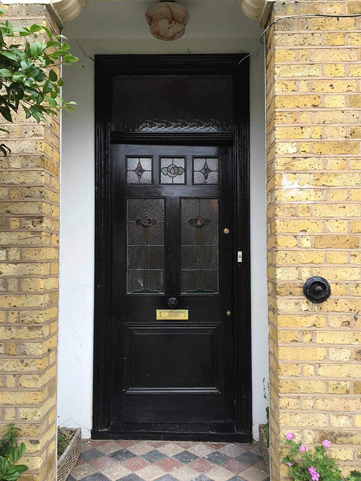
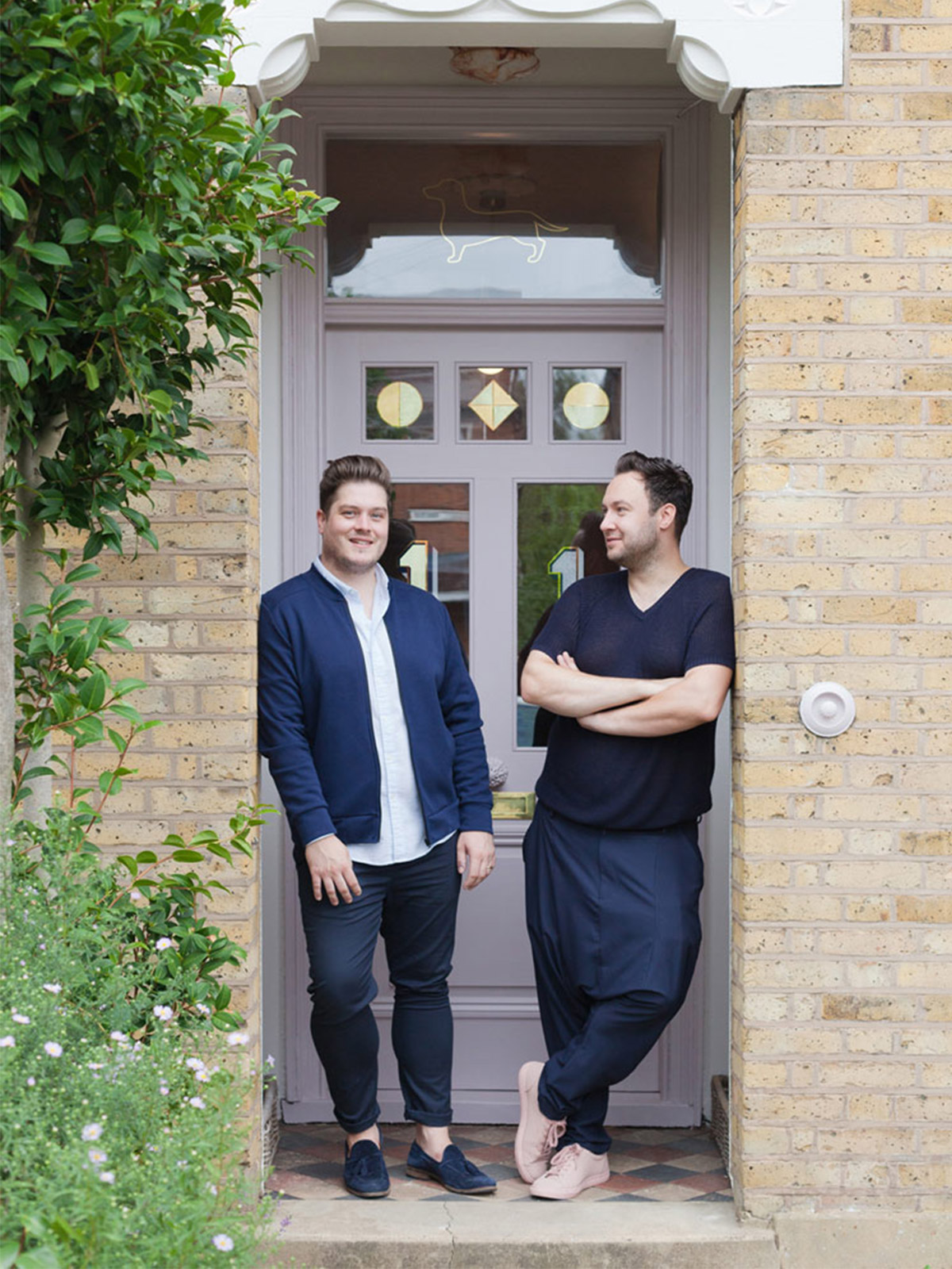
Next came our front door. And we knew one thing for sure – we wanted our front door to make an impact and put a smile on our friends faces. So pink it is. Our pink door moment was inspired by our trip to Copenhagen earlier in the year where we saw an entirely pale pink house and just couldn’t get it out of our heads. So when we Mylands, their factory is just round the corner from us, to find some paint colours we knew it had to be a pink shade. We chose Soho house for the front door, Fitzrovia for the ceilings and roses and coves and for the woodwork we chose Rose Theatre. The names are all amazing and Rose theatre has particular sentimental attachment for us as well as being a stunning, pink/lilac grey shade that is so sophisticated and livable. We opted for their water based Matt wood and metal paint and we cannot recommend this enough. It’s got a silky feel to the touch that is sometimes absent from other water based wood paints and it is truly Matt to the eye giving such a soft look.
For us the glass in the door also had to change. The stained glass panels were not original and not particularly pretty so we took the decision to go for some clear double glazed units in the existing door. Admittedly, this move was largely down to our passion for the sign writing skills of artist and craftsmen, Archie Proudfoot. We met when we did Design Junction last year at London Design Festival. Our stands were close to each other and we had admired his wares from afar for the whole week before we got chatting.
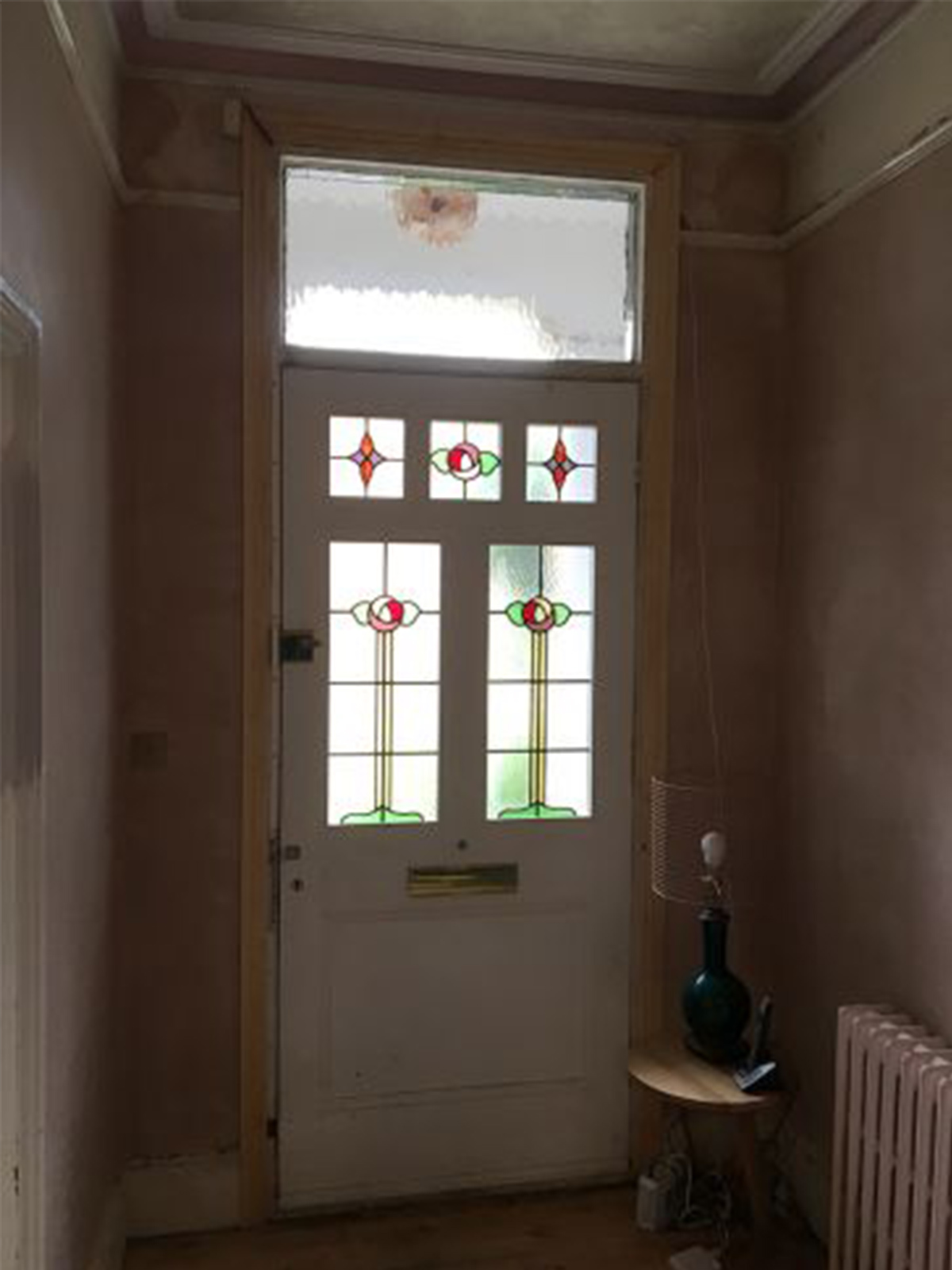
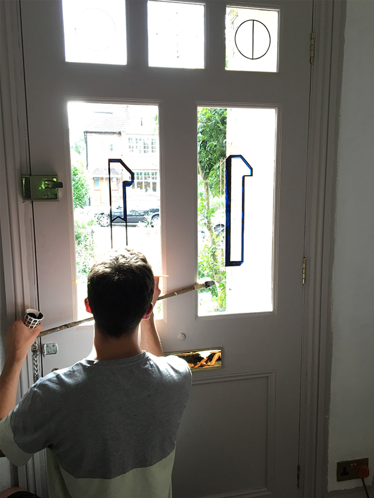
When we first approached Archie about being part of our Design House and showcasing his extreme talent on our front door, he was excited about the prospect of the design breaking out from the glass panel above the front door and onto the rest of the glass lower down on the door itself. This only fired us up more to really go for it.
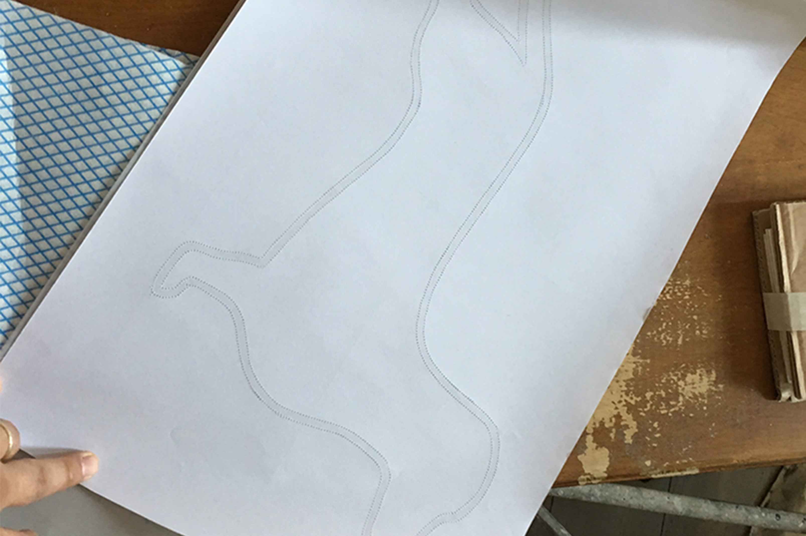
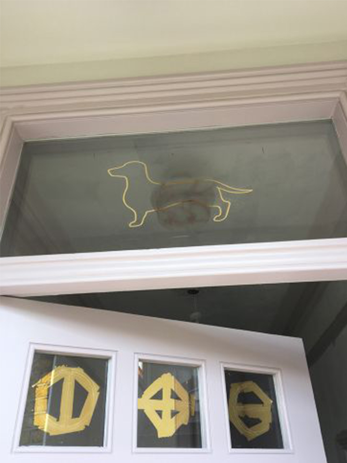
As we went through Archie’s amazing Instagram page we became obsessed with the splatter effects and the Matt and gloss gold. We then shared some of our top secret wallpaper designs, launching soon, with him and some of the textures/motifs have been worked into the design of the door glass with the artists signature touches to make it truly unique. So with the numbers boldly moved into the main door, what to put in the fixed glass pane above the door? We came up with the idea to put a silhouette of our very own design dachshund, Buckley. Archie ran with it and then his proudfoot approach led to our cold feet. To Buckley or not to Buckley. That is the question….would it be too much? In the end you can see the decision we made…as if it could ever have been any other way! It was such fun to watch the precision and beauty of your work in action. Thank you Archie, we LOVE it!
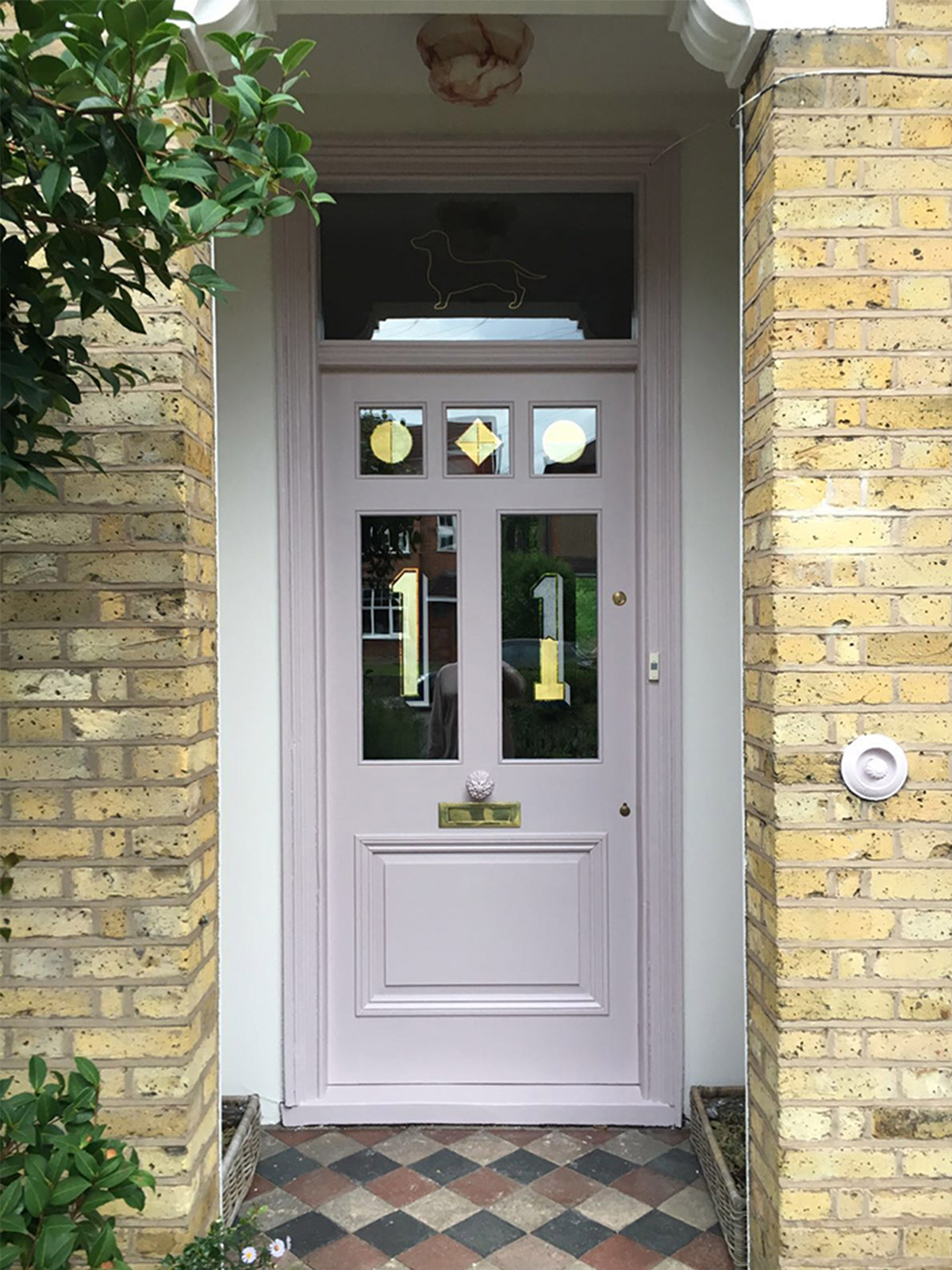
And big thanks to Mylands and MySwitchShop for the beautiful finish of the paint and slick switches. We can recommend them highly.
Let us know how your own renovations or home redesigns are going, we’d love to hear your stories and help if we can. Look out for more progress coming up and some seriously exciting new products we are launching soon. More on that in the coming weeks.
Big love,
Jordan, Russell and Buckley x






 Sunderland Road
 Back to the Futurism – Changing Rooms (Barnstaple)
 Project Garden
 Wonderwall – Creating a tiled feature fireplace
 Getting the shell right – Walls, Windows, Floors and Doors