Before we leap into giving you our low down on the top moments from Milan Design Week (you thirsty design lover you), a moment to tell you why we see it as an integral part of our work.
Before we leap into giving you our low down on the top moments from Milan Design Week (you thirsty design lover you), a moment to tell you why we see it as an integral part of our work.
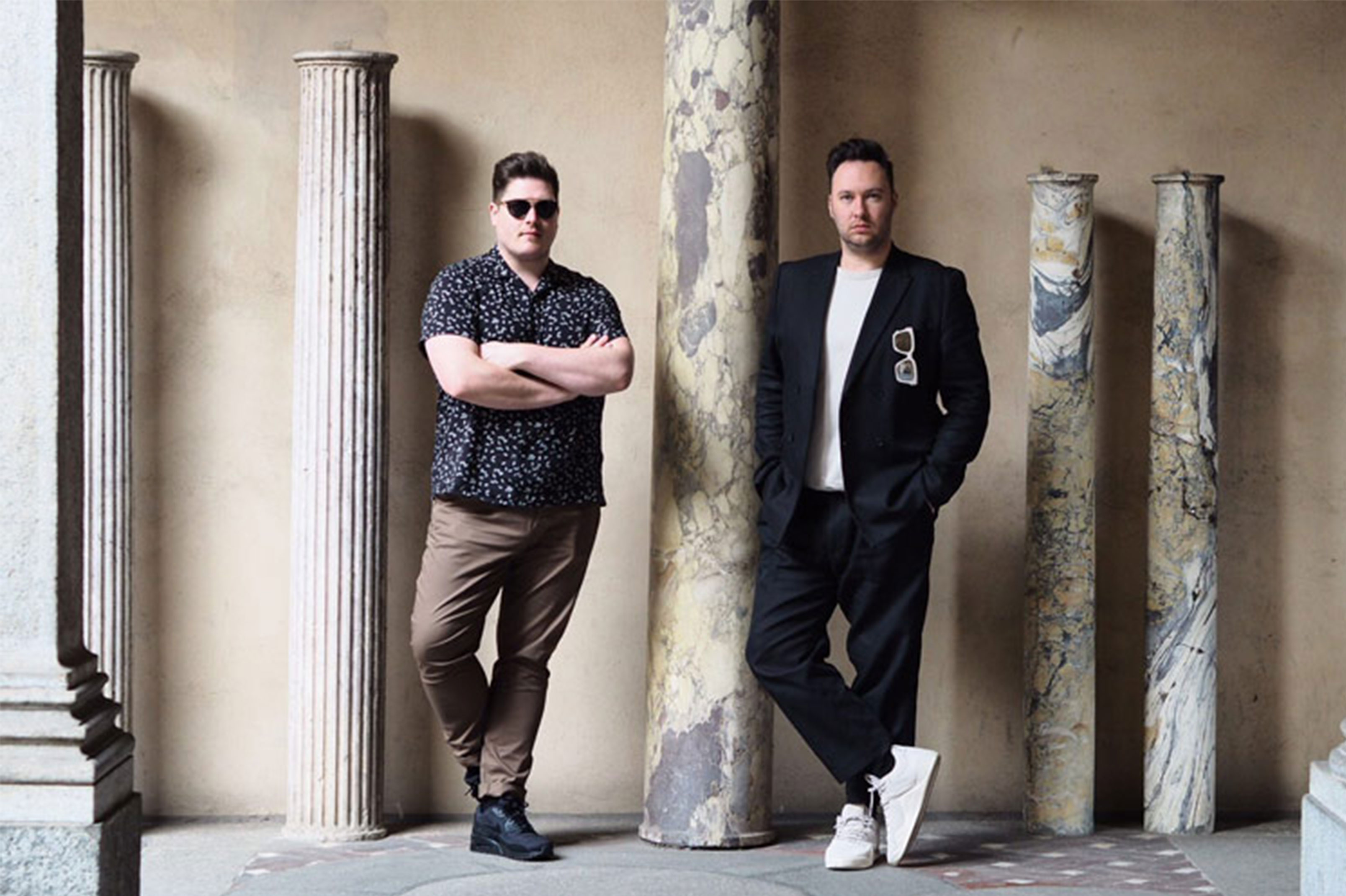
In the past we’ve been asked by other interior designers, why do we go to Milan every year, where’s the value to our business, what’s the return on our investment of time and money?
Do they see it as a frivolous display? Not sure, but until now we have never even questioned why we get so excited about the biggest design show on earth. We just live for it and cannot imagine our year without the annual trip. It feeds the soul, refills our creative pools and gives us life. What more of a return on our investment could we possibly need?
For us it is more than just a week of design installations and shows, it is a pilgrimage, a place to learn, to socialise, to explore our own design boundaries and to share in a collective experience in a vibrant, wonderful city.
So, what did we learn this year? What’s the look that we just won’t be able to put down, the fabric that we just can’t get out of our heads, who is the designer that taught us something about ourselves? It takes weeks for it all to settle in our minds and find place in our design projects. But first thoughts and top moments are below for you to enjoy.
To begin, it was a deeper year than last year, in colour and in thoughts. There were more layered looks, bold concepts that challenge how we live now and a colour palette to reflect this.
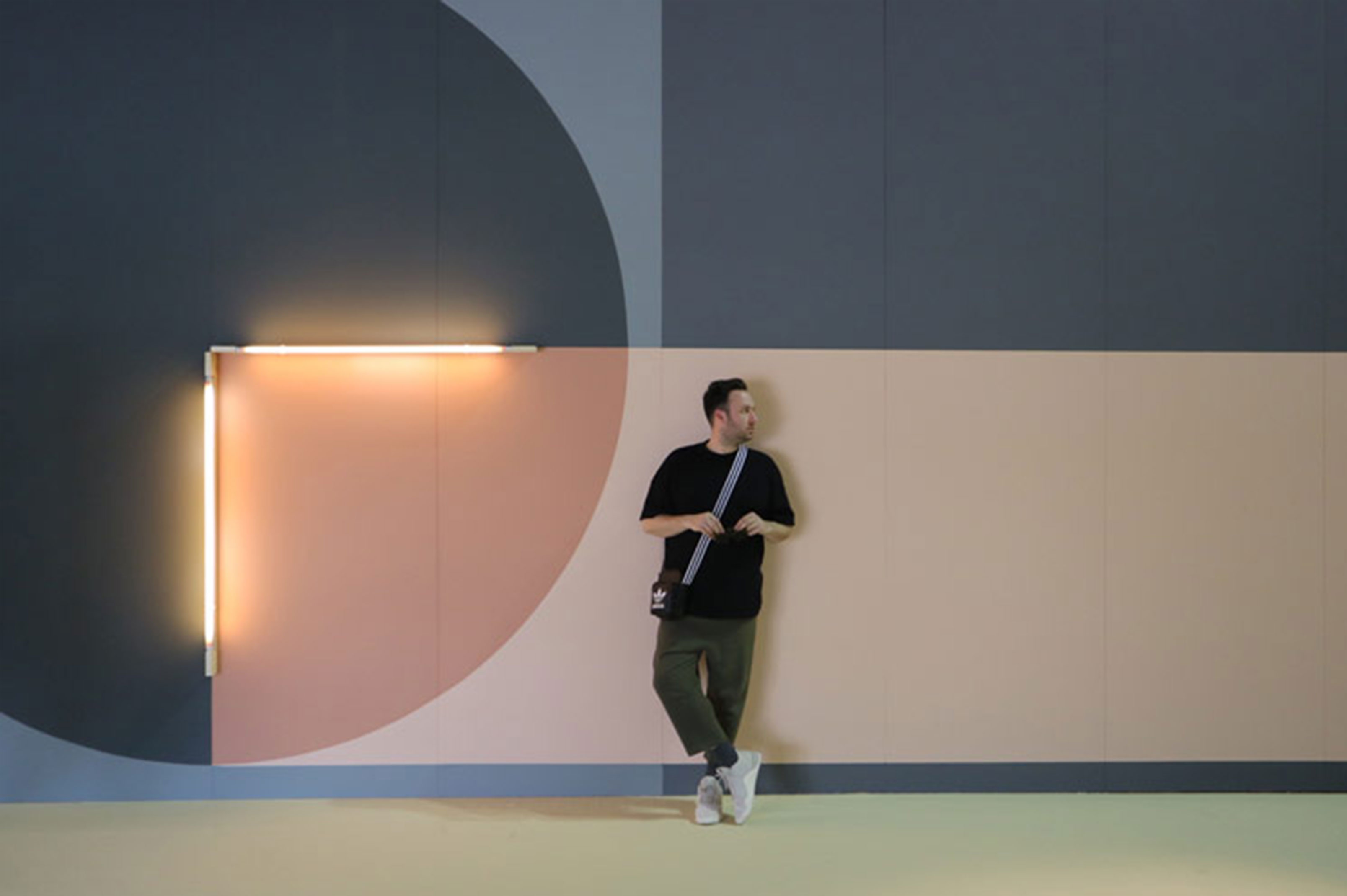
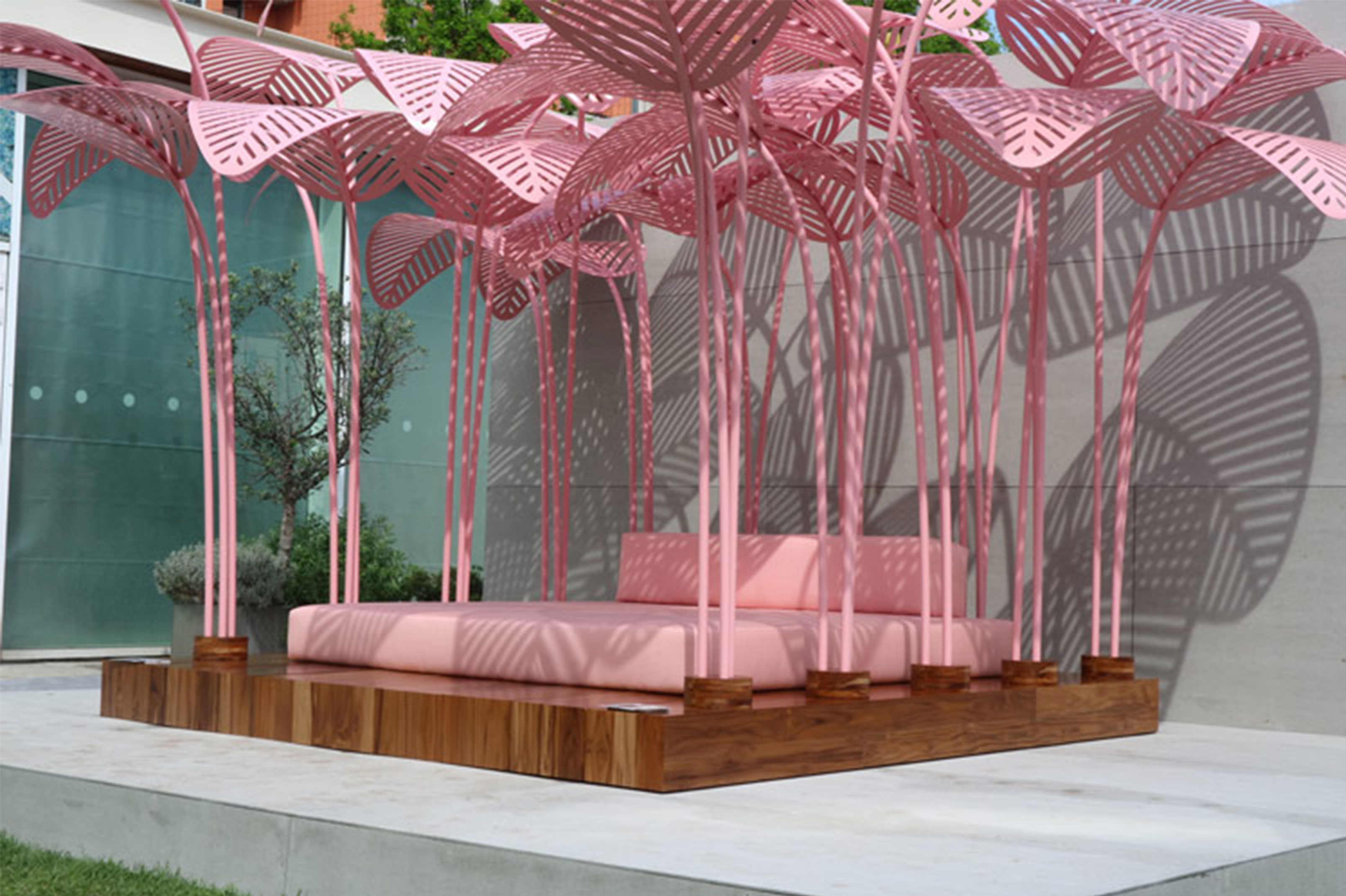
Brown was all around town. A deepening of the terracottas and tans from last year that were still present. And ‘Millennial’ pink was in abundance.
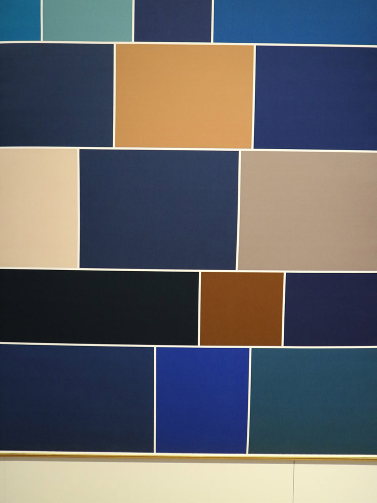
We also saw mustard yellow and forest green making a strong impact with a clean monochrome base. And our beloved Blues were having a moment, this time in royal and navy.
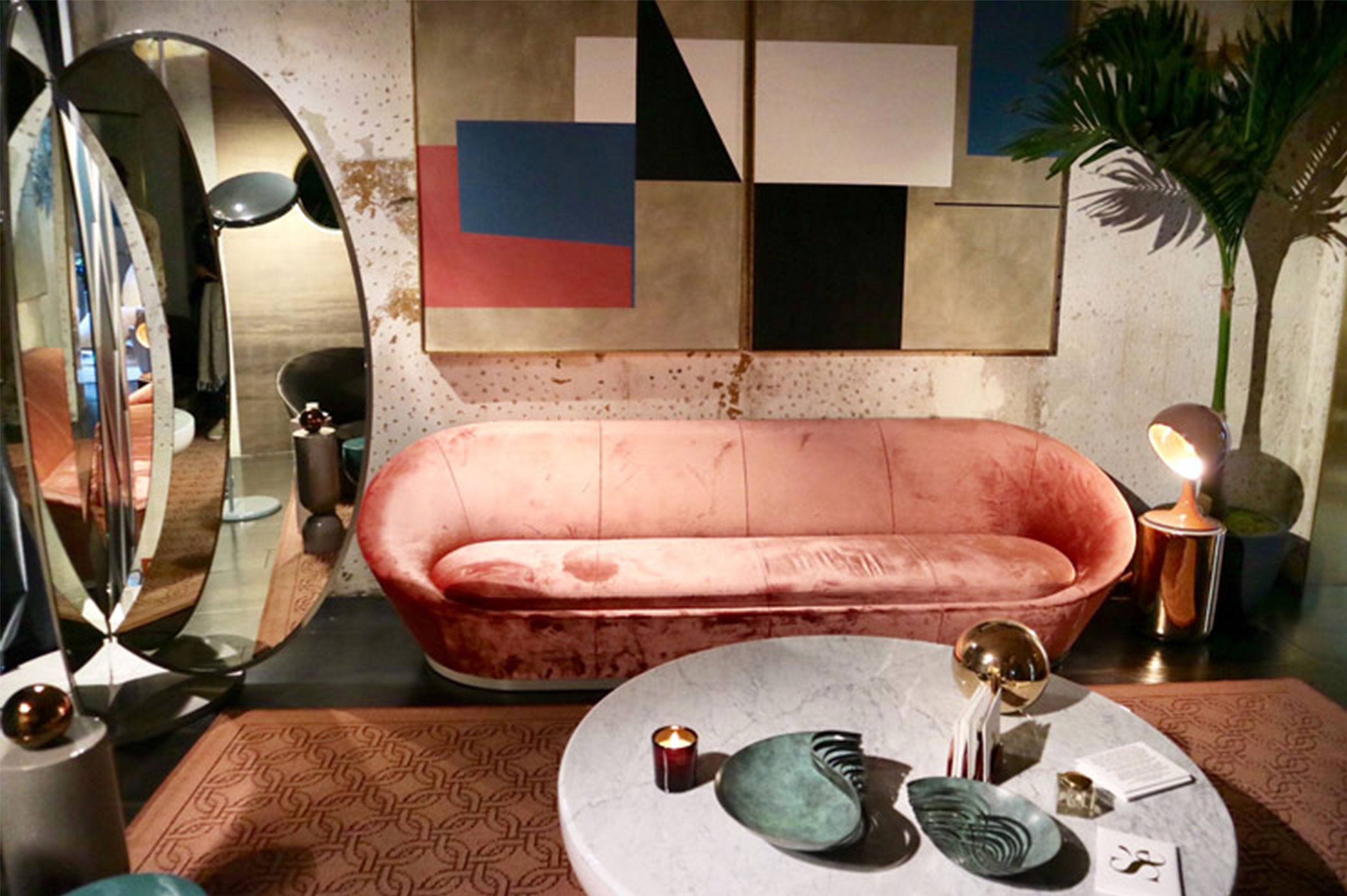
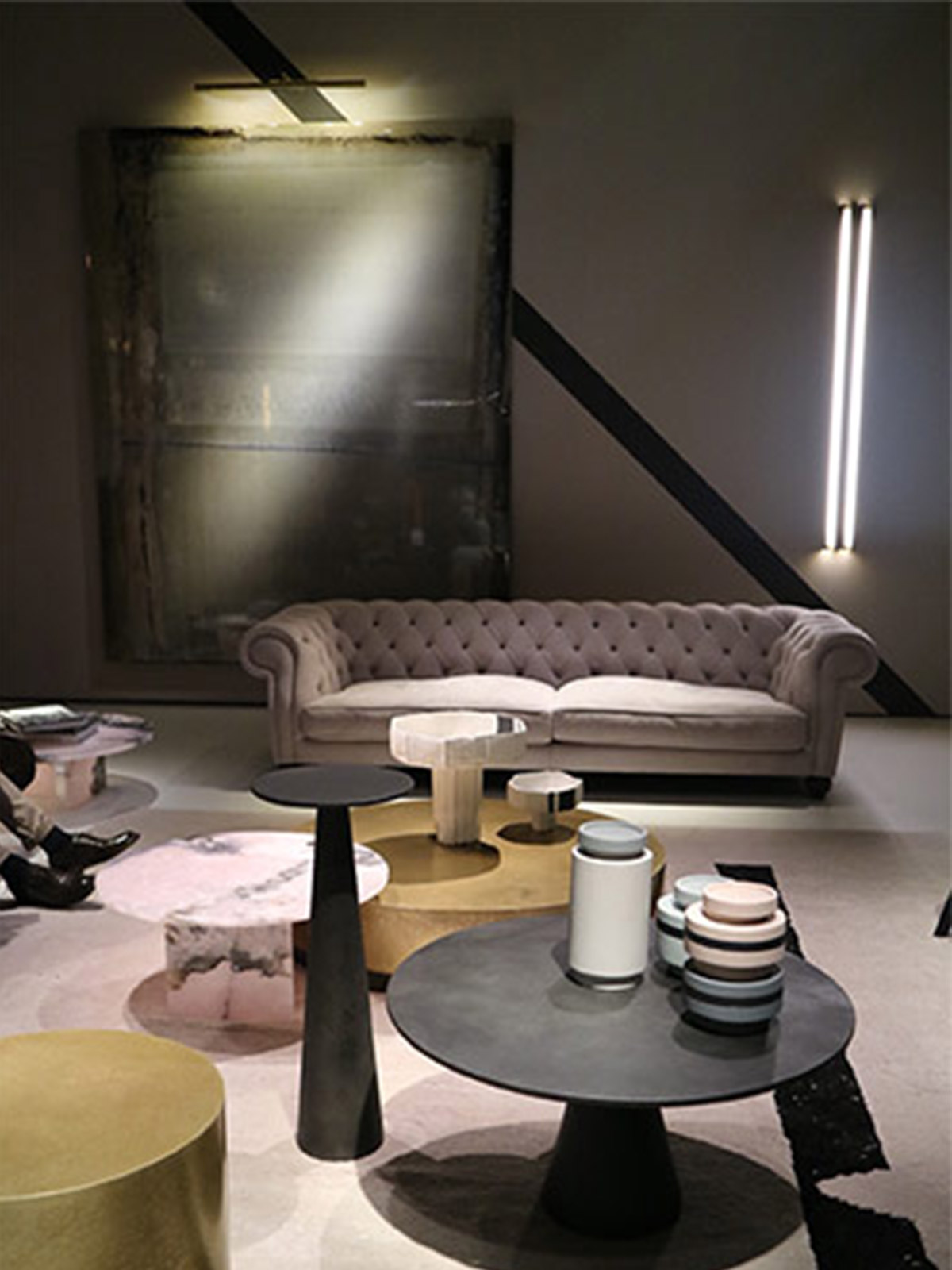
The colours were less pop and more sophisticated, shown best by the incredible Dimore Studio (yes we have been banging on about them for that last 4 years, but that’s ok, because they are amazing) who were at the top of their game this year with an apartment that was deeply layered, their most heavily styled to date. It felt like the soulful city apartment of someone from another world, a vampire, who has been around for millennia.
Dimore stuck to their guns giving us a look that said, we’ve arrived and we are here to stay, while others followed in their wake, bringing us more fully realised apartments to showcase their work. And gladly so.
Se, created a stunning, fully realised space with deep brown or pale bubble print wallpaper by Calico.
At the main show, Fiera, there were stunningly styled spaces by Baxter and Wittman (Jaime Hayon’s house)
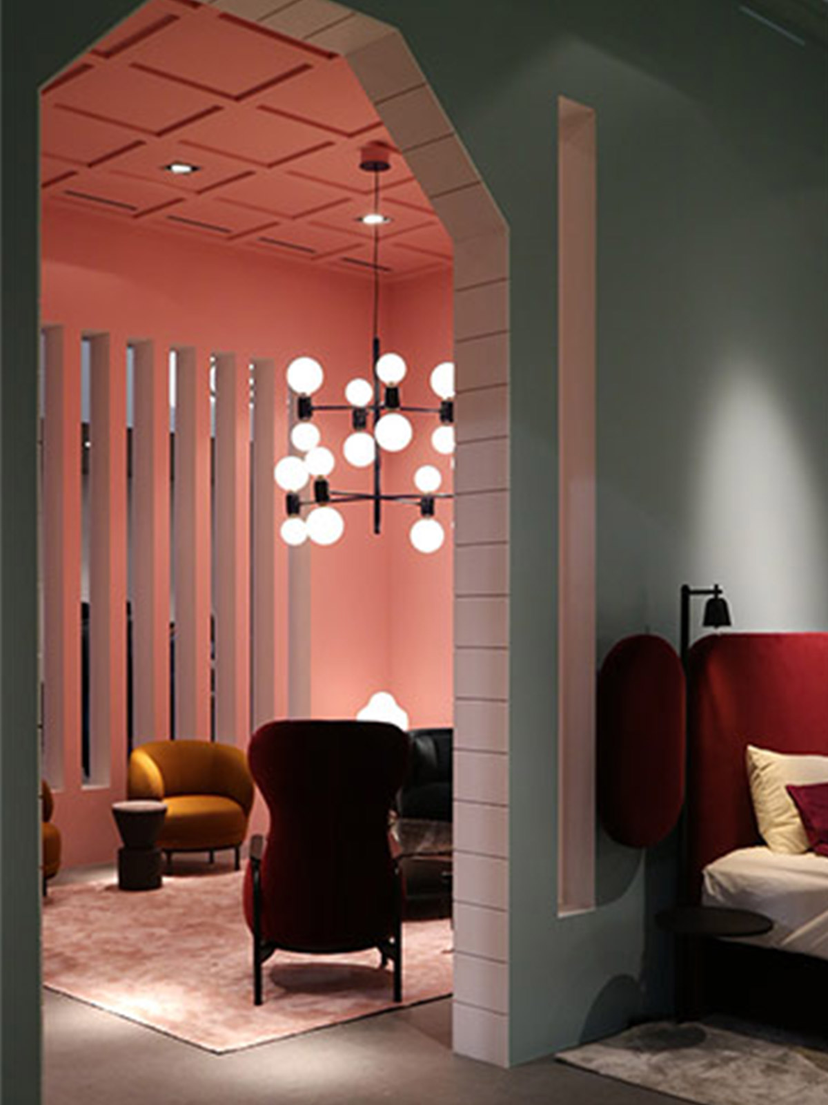
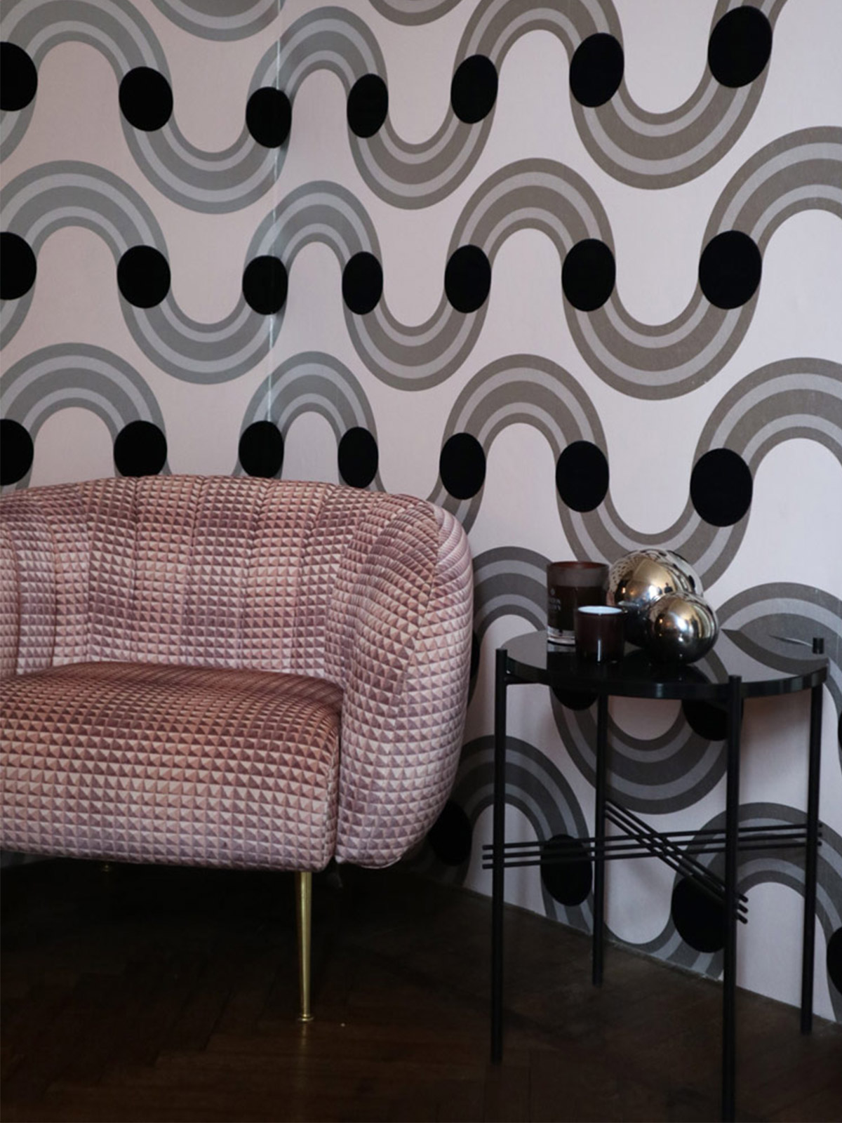
Kirkby design collaborated with Eley Kishimoto, creating an apartment filled with pattern and colour. It was joy. Their use of dark Browns, soft pink, with monochrome was topped off with touches of actual chrome. Is brass making way for chrome as we head towards a nineties revival?
For now, it seems the nineties can wait a little longer, as the 70’s Deco Revival was still being revived and was the go to look of choice. With colour blocking so evident that even we felt like it was time for a change.
Perhaps this year, designers are not focussed so much on driving forward with their colour choices as they have bigger fish to fry.
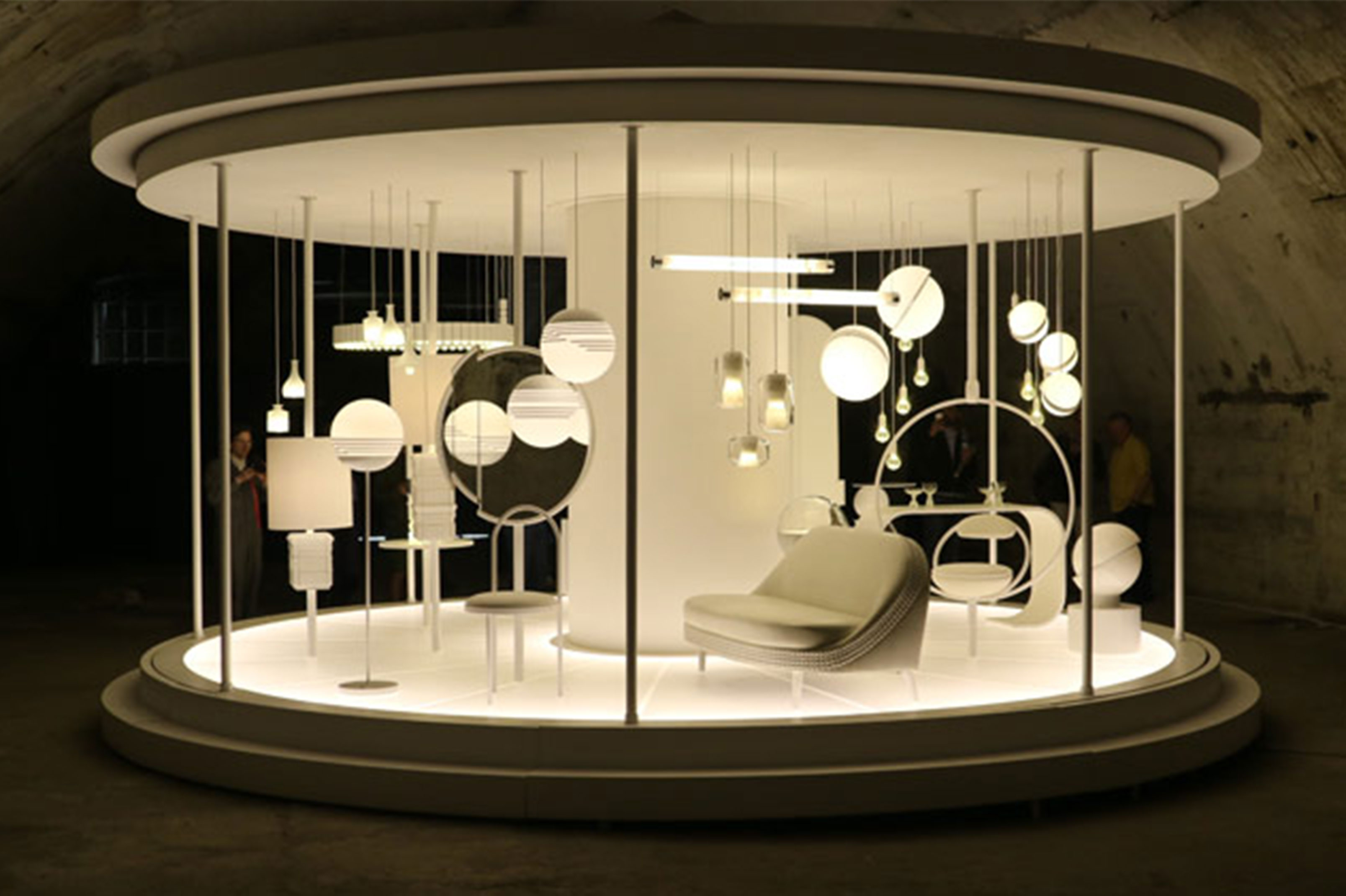
Lee broom celebrated his 10th anniversary of design with an all white merry-go-round in an abandoned railway arch. Displaying his best pieces from his portfolio all in custom white this installation was a ghostly and epic highlight. The music was painfully beautiful and the pieces seemed trapped in time as they glided past.
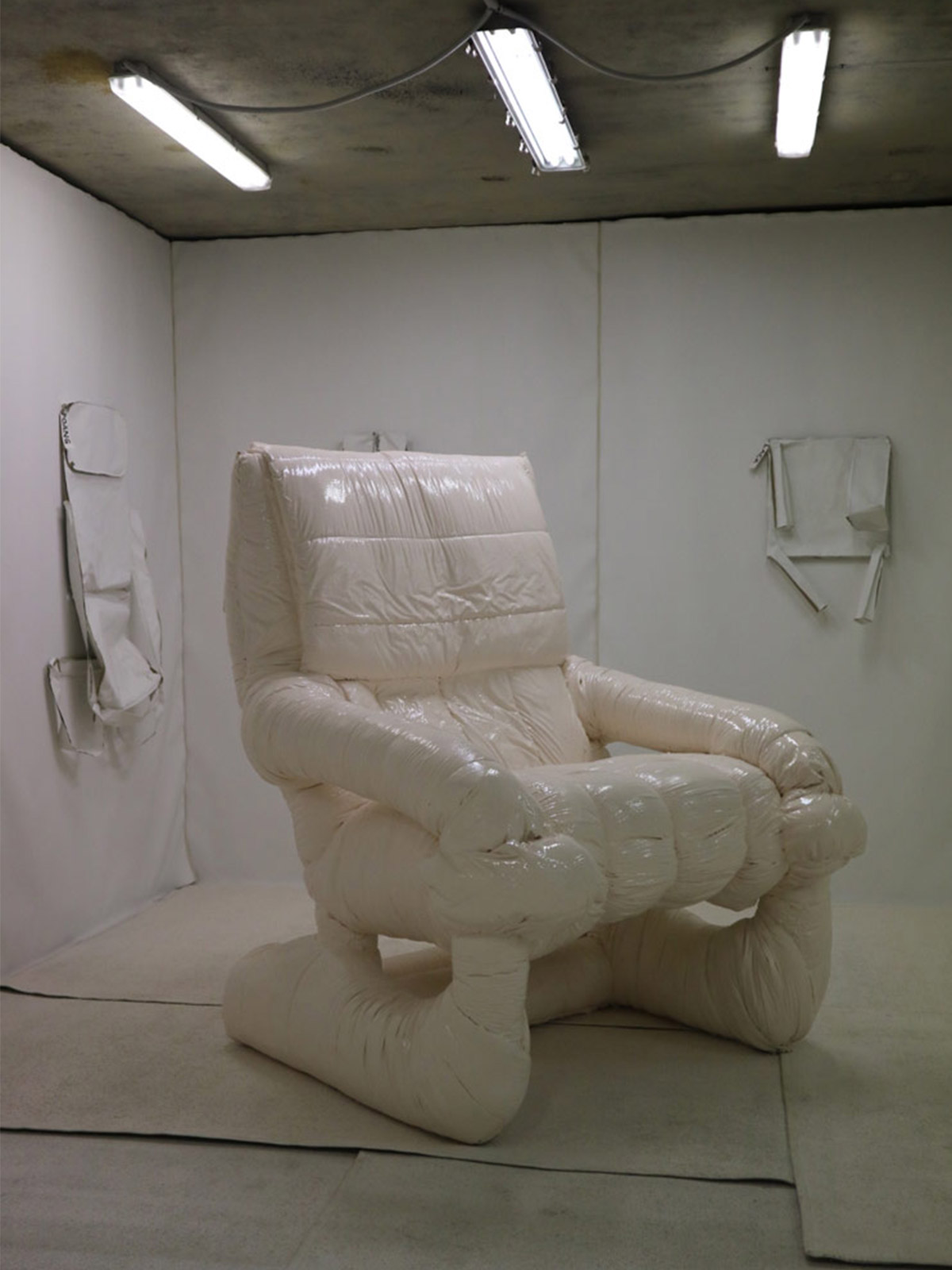
Faye Toogood was prolific this year and in anarchic mode with her installation for IKEA, ‘Enfant Terrible’, a playfully disruptive experience of altered scale and shape. Is she the Enfant terrible? or are we, the human race, behaving badly?
For Nobody & Co, Toogood went on to create a series of ‘Superfollies’ in which to house the furniture pieces by Nobody and Co. One was a small bottle like vessel with door with a chair inside, giving us an oppressive sense of small space living. Whilst the whimsical woodland setting was left untouched and unharmed. Another of the follies put us literally ‘in the dog house’, as if nature is not safe in our hands and we must be contained and control for the good of the natural environment.
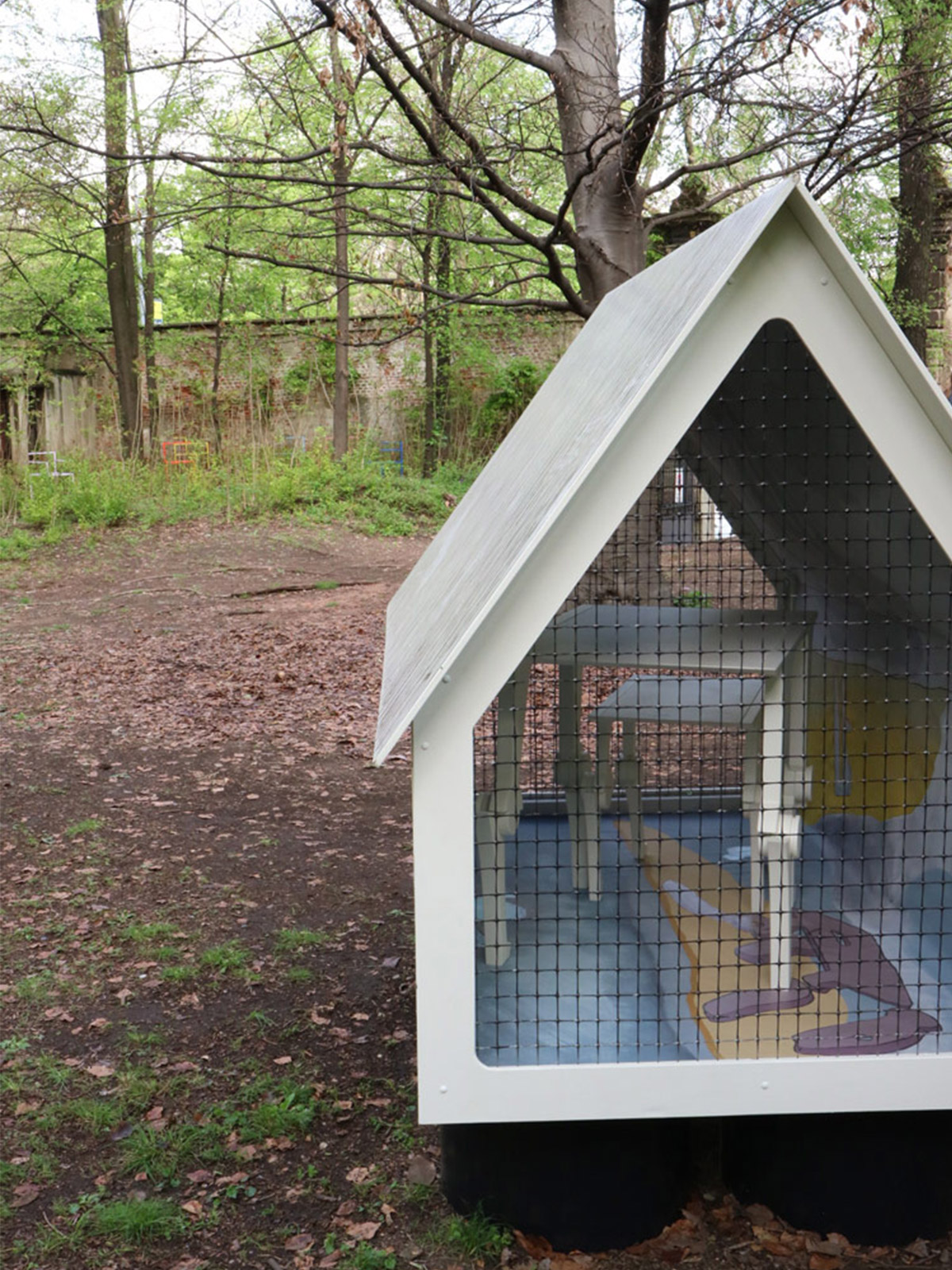
Spazio Pontaccio, often a favourite stop off of ours in the Brera Design District, also referenced the caged animal idea, showcasing a cabinet with wire fence motif on the glass frontage.
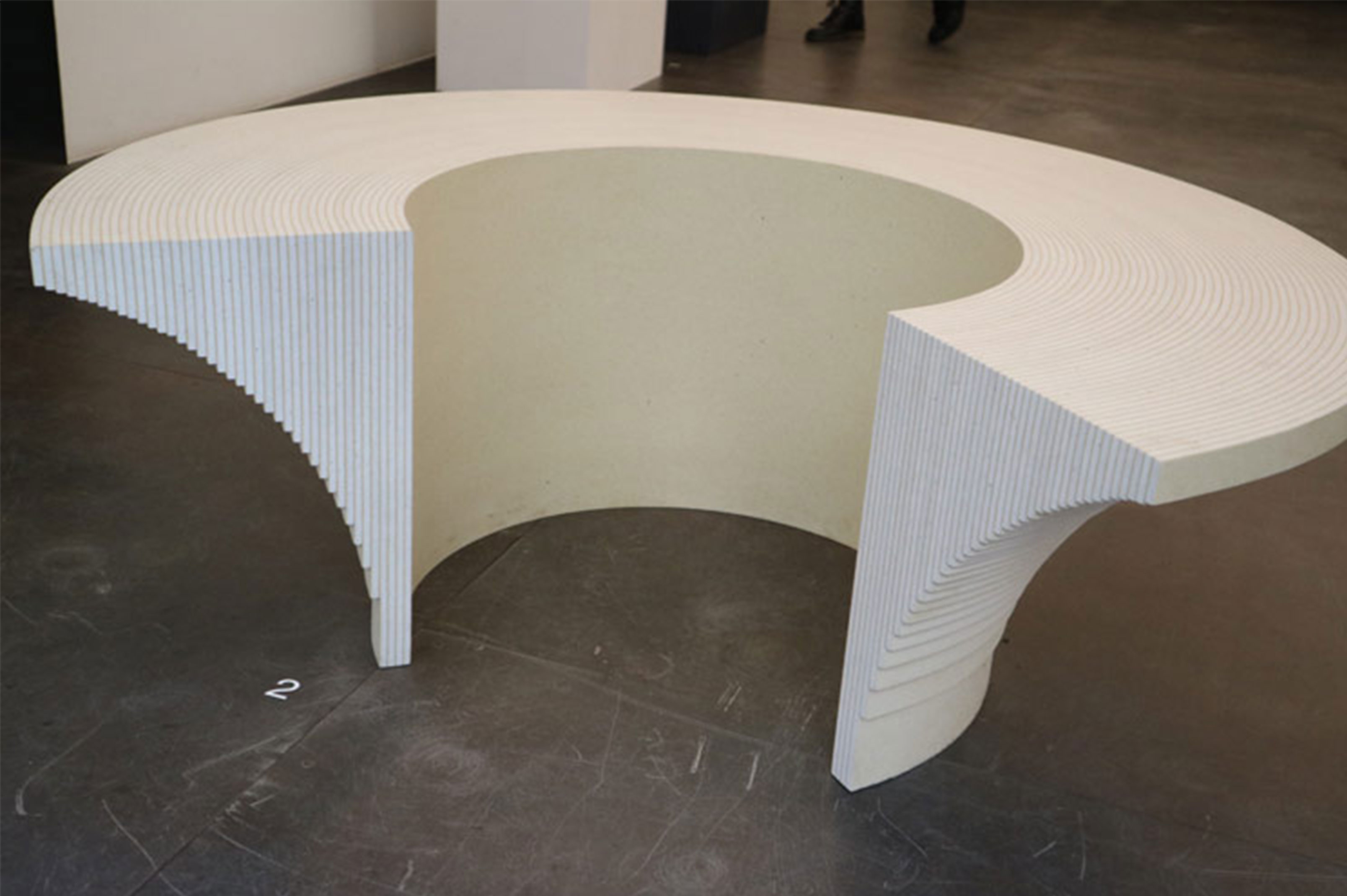
Perhaps in an effort make up for some of our wrongs as a race and as an industry, Kvadrat launched their waste textile turned solid material. This is not new or groundbreaking, but the material itself is beautiful and versatile. Really, the installation of sculptural and functional pieces designed by Max Lamb was a highlight.
Transparency, looking through and beyond obstacles was a continued theme this week.
Looking into the mirror art of designer Jordan Soderberg-Mills, we get a sense that nothing is what it seems and the world is multi layered and filled with complex colour. A distorted reality.
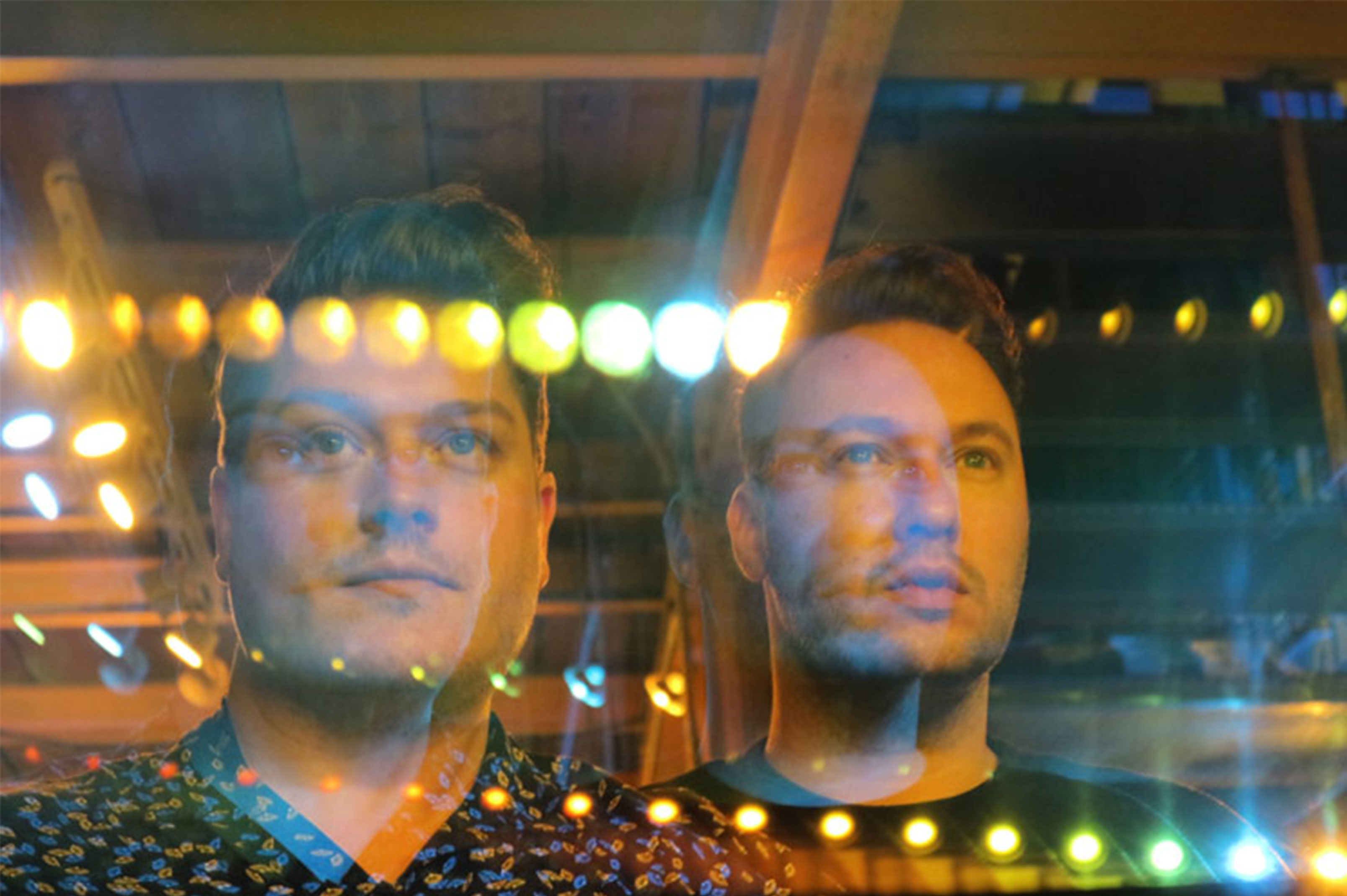
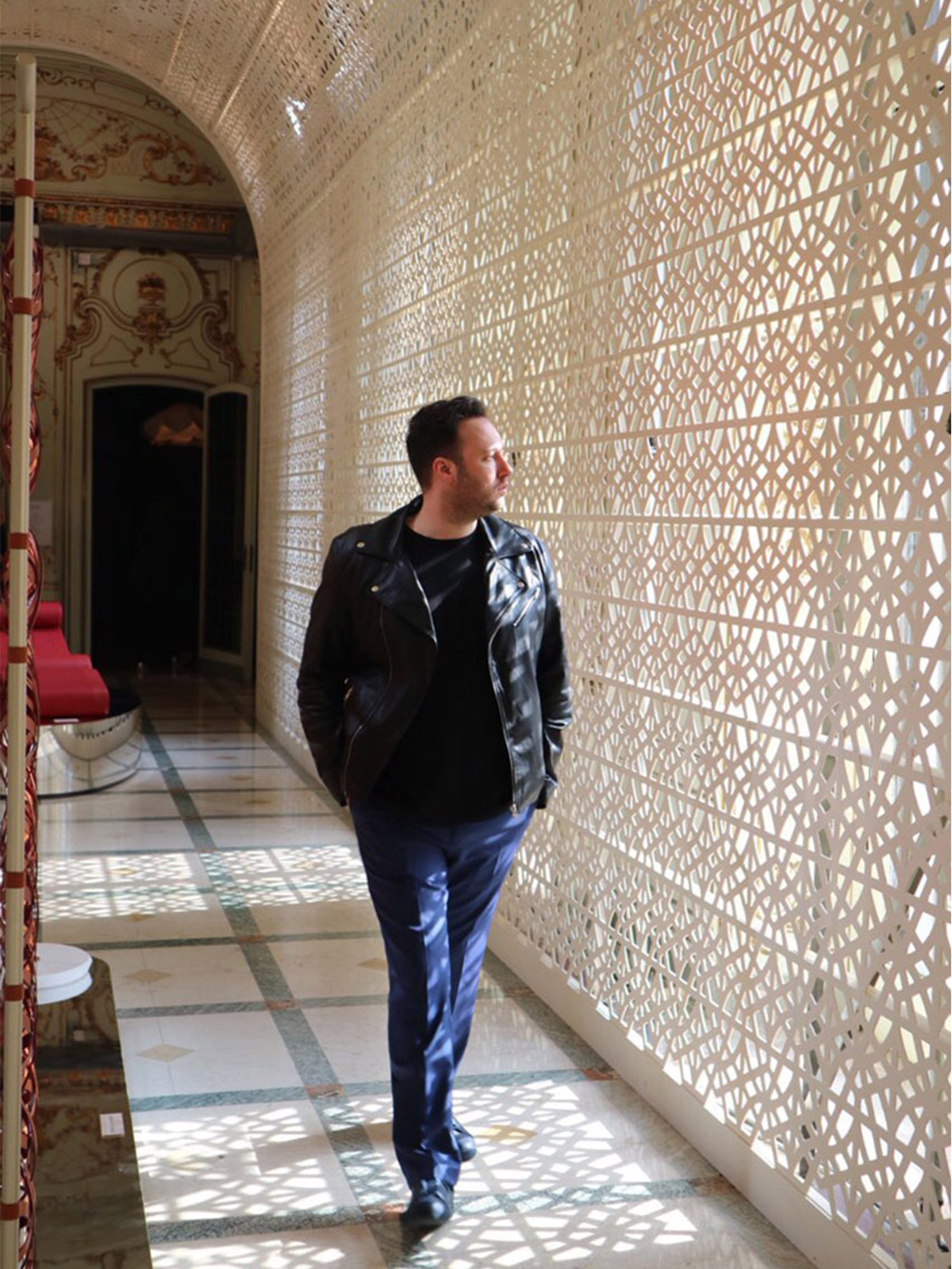
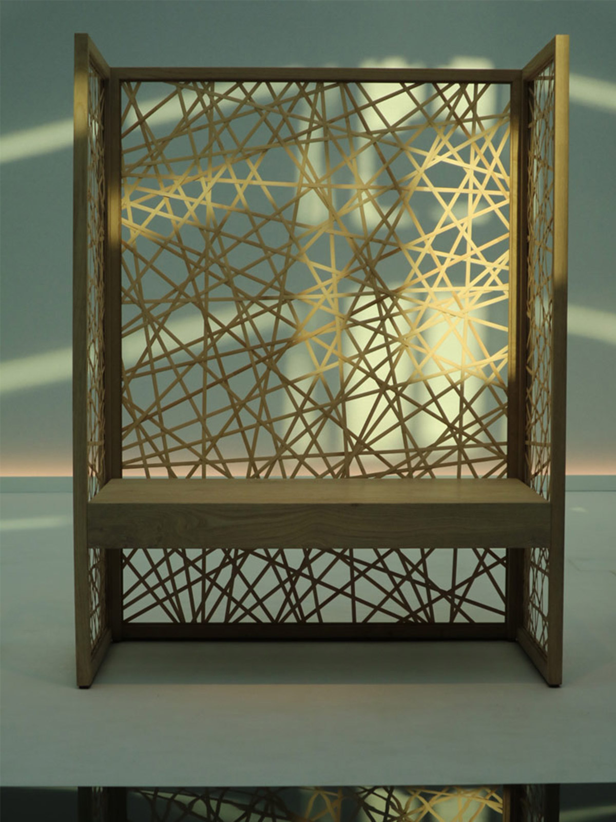
A desire for deeper understanding was present, whether we were looking through luxurious space dividers, as in the Louis Vuitton installation. Transparent obstacles through which to look or to divide us from the natural world.
Wander from within, an exhibition by Adrian Cheng and Uchida Design, created a Japanese tea house that forces you to bow to enter its small door, humbling you and making you leave your ego outside the calm space.
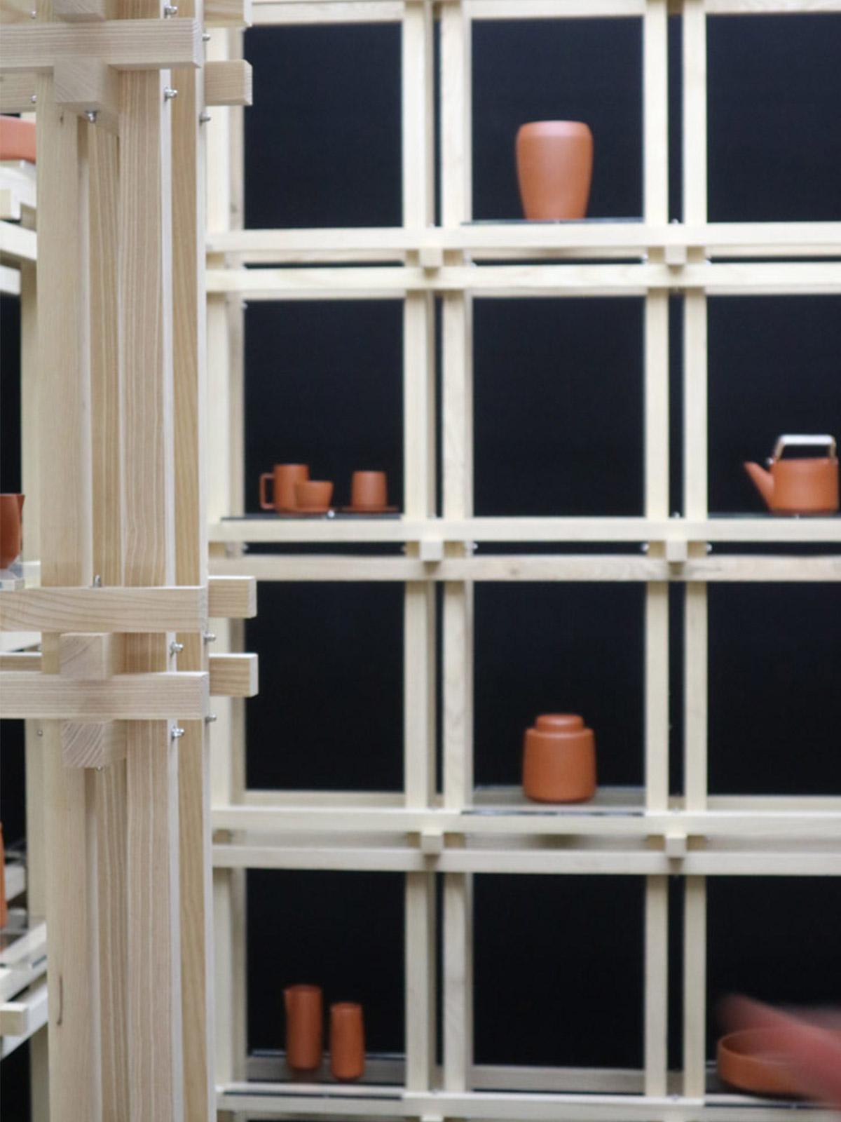
In fact, Japanese influence was in abundance, with Christopher Jenners exquisite tea project elevating the simplest of materials, clay, into near religious territory with its deep ceremonial roots and beautiful bare ash wood installation.
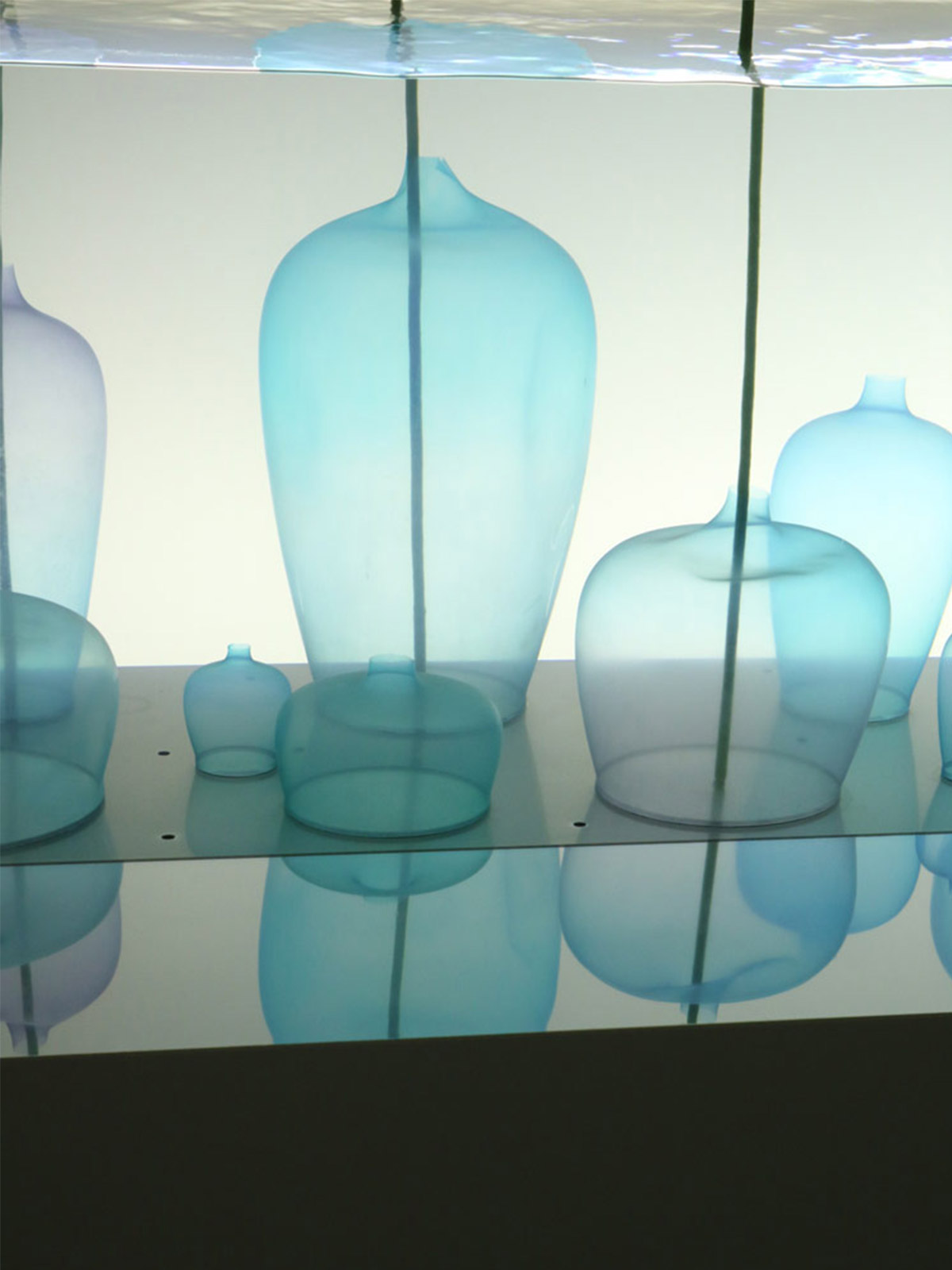
Serenity itself was objectified by Nendo for Jill sander in their stunning installation that left us in awe. Nendo created the thinnest of silicone vases in pale blue and pink hues that floated beautifully in an aquarium. Minimalism and white calm space created a beautiful escape.
But on the flip side there was a big win for the exuberant design talent, Matteo Cibic, who won best deign talent at the Elle Decor awards. We loved his work for Scarlett Splendour last year and have been following his work eversince so it was great to see such a unique voice rewarded.
Ending on a high we saw lighting brand, Giopato and Coombes, delivering their most stunning work to date. We specified one of their lights almost 2 years ago for one of our interior design projects having met them in Milan, and this year their new collection set out to challenge our perception of ornamentation. Lighting as giant jewellery. We are all over that. Look out clients, they are definitely a must.
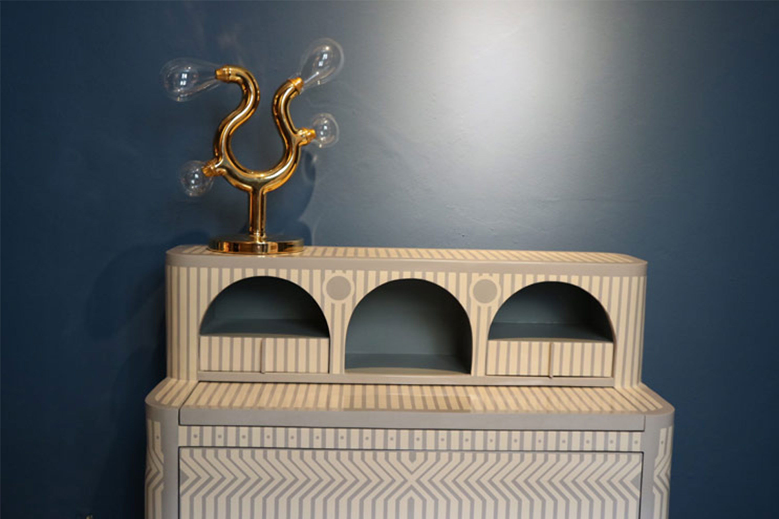
Milan is our education, our soul food, our playground. One day we will show at the festival ourselves and we can’t wait to get there, but for now we are happy to look and listen and learn.
Our hearts are full and we hope that you have enjoyed it as much as we have.
Other Milan Moments:
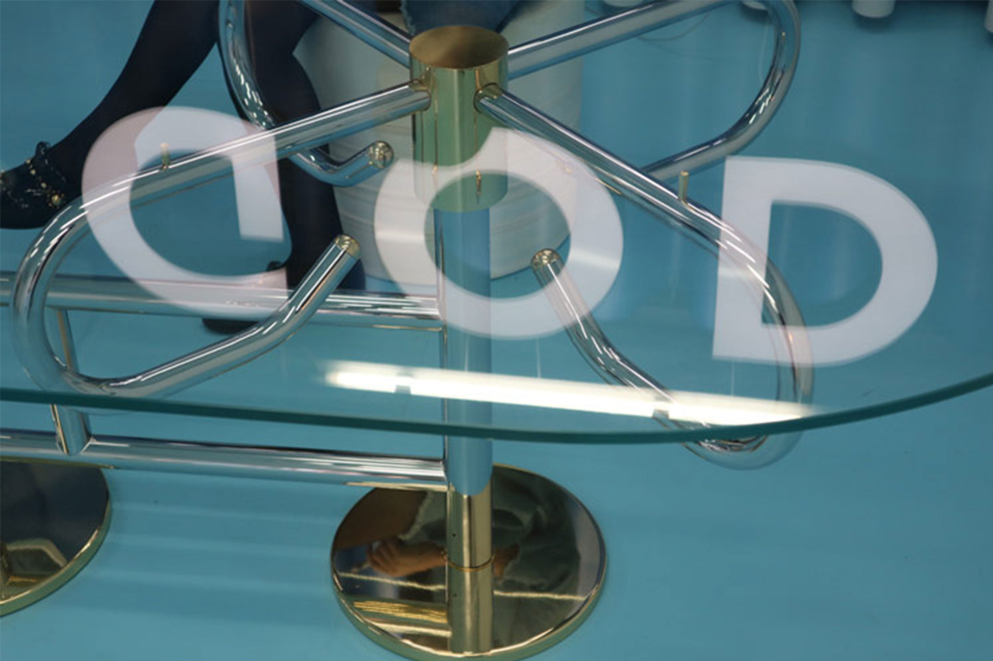
God – atelier biagetti – a comment on the relationship between God and Gold, religion and bling. Plastics meets glamour in a boarding to a better, sunnier place. As out there as we would expect from Atelier Biagetti and full of unexpectedly beautiful design.
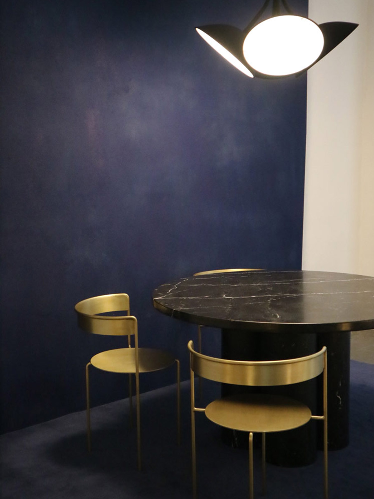
Matter Made – Ana Kras, Philippe Malouin and Faye Toogood blowing our minds again in this New York based company’s exhibit. Deep, rich and clean lined. We can’t wait until we go to New York Design week in May to see them on home turf.
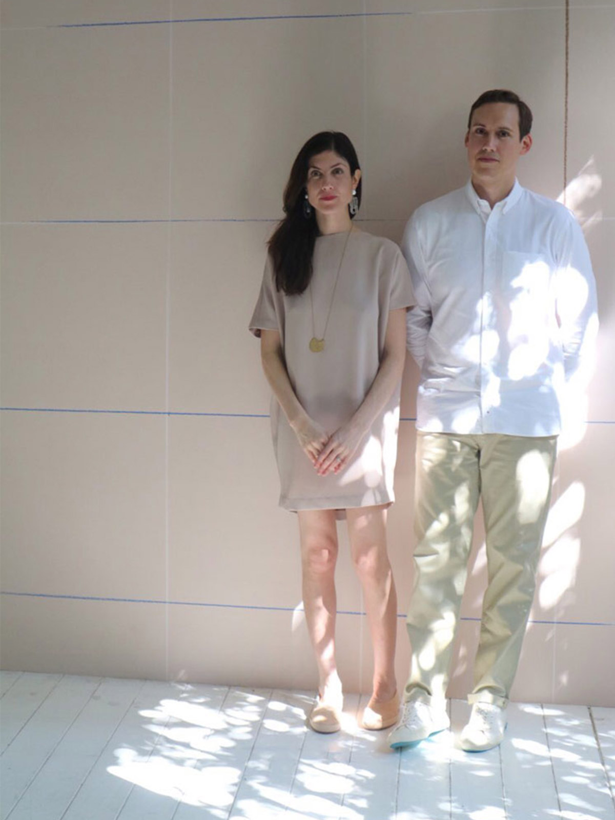
Calico Wallpaper – Wonderful to see our friends collaborating with some amazing talents on a new collection of wall coverings. Their installation was as beautiful as the designers themselves and the new designs are going to be sought after.
Capitalism is Over – A farewell party
This Indy show was out on a limb in tone as well as in location, but we loved the punk sensibility and the fresh edge of the work.
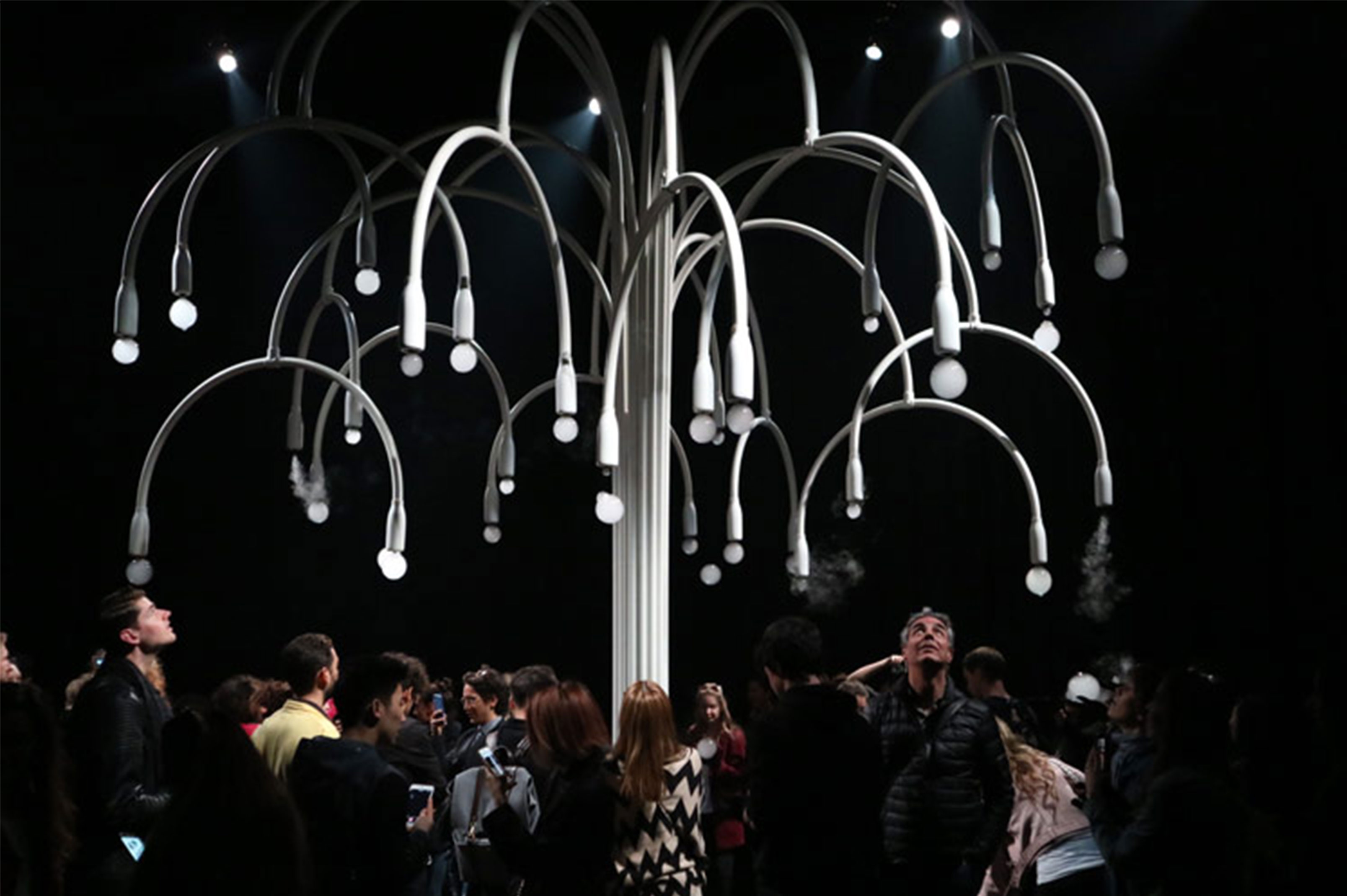
Cos x Studio Swine – a beautiful fantasy experience that gave us a moment of childish wonder, with smoke filled bubbles falling on us.
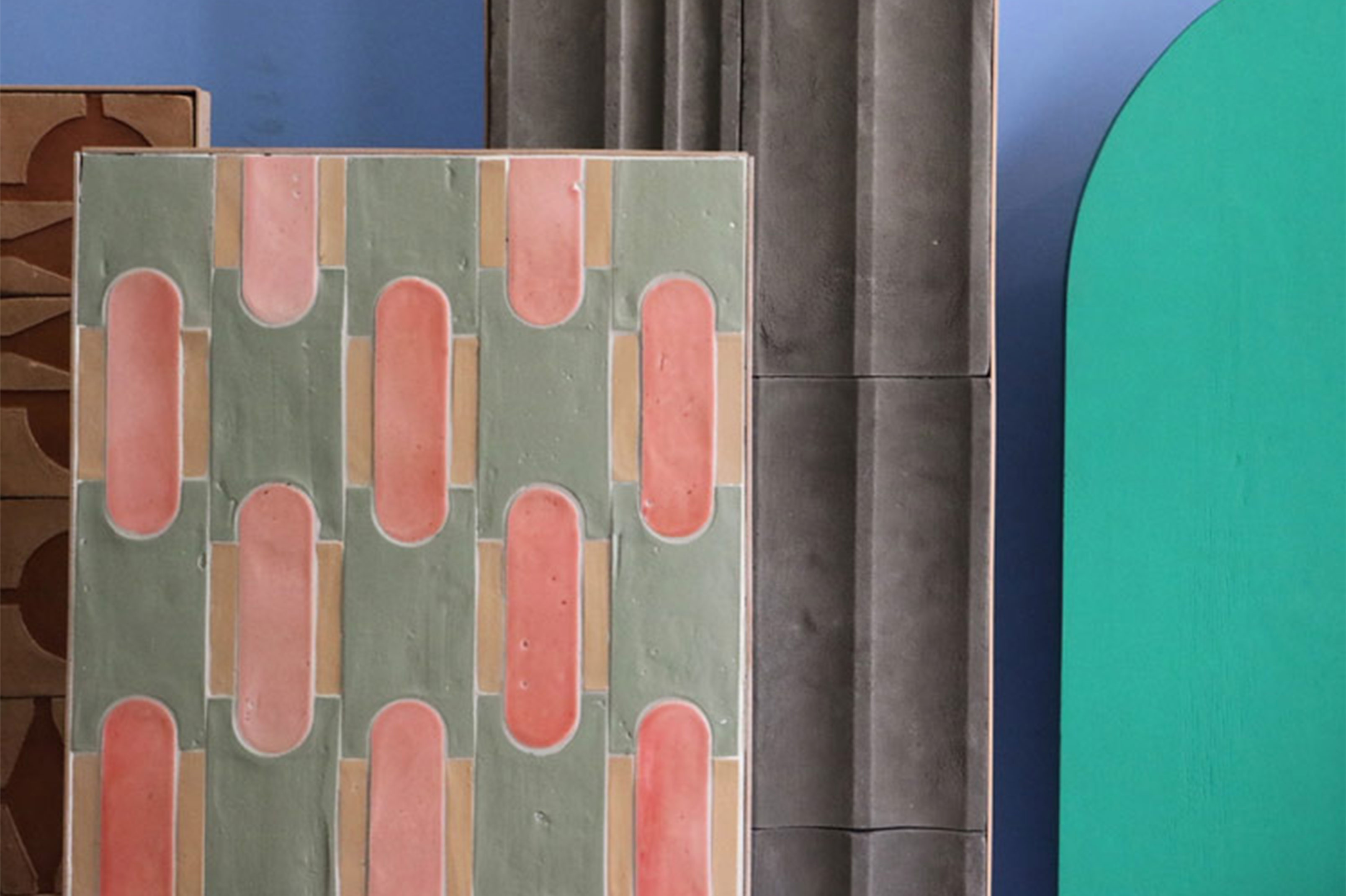
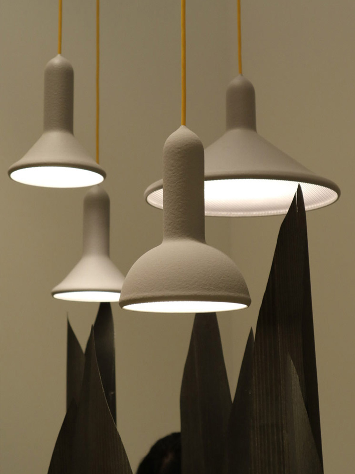
Cristina Celestino x Brioni – we’ve been following the work of this interior architect and had to check out her work in Milan first hand. She did not disappoint with tiles to die for and a space styled to perfection at the main fair with wardrobes that had decorative sliding fabric panels in place of doors.
Wrong returns! – we caught up with Sebastian Wrong in Milan at the main fair as he returns to Brit Design Heroes, Established and Sons. This year they stood proud with the best of their back catalogue as a prelude for what’s to come. We got an exclusive interview with the man himself so watch this space to read that in full.
