Lighting brand, Cameron Design House giving us virtual dreams!
Cameron Design House
Cameron Design House
Cameron Design House
Cameron Design House
For us, it’s important to sketch with pencil and paper as well as using the new tools the digital age can offer. We enjoy showing our clients real objects and surfaces and materials in a moodboard and they respond to it too. Then digital illustrations re-inforce this stage and add specific detail and line to a space. But then perhaps this is because we are Xennials – stuck between the analog and the digital ages.
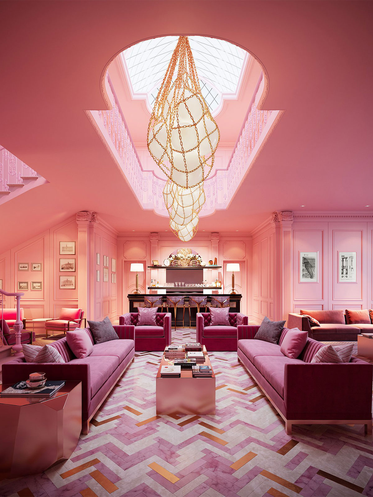
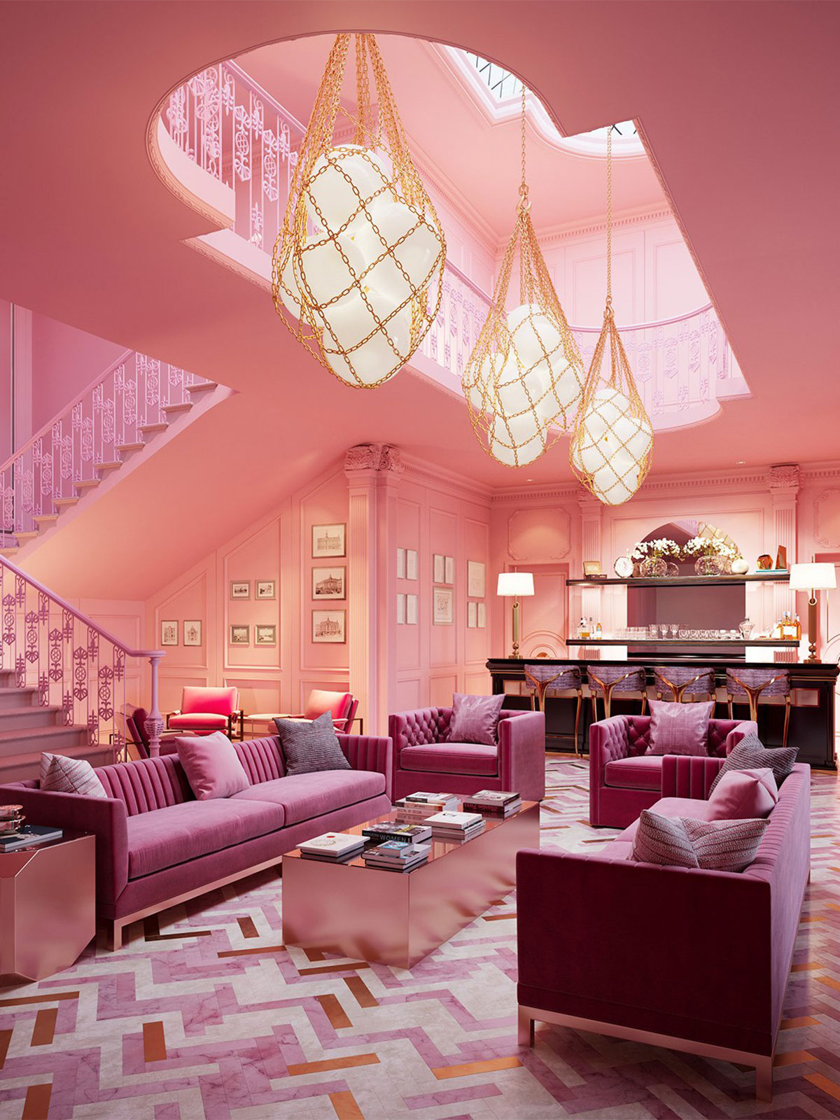
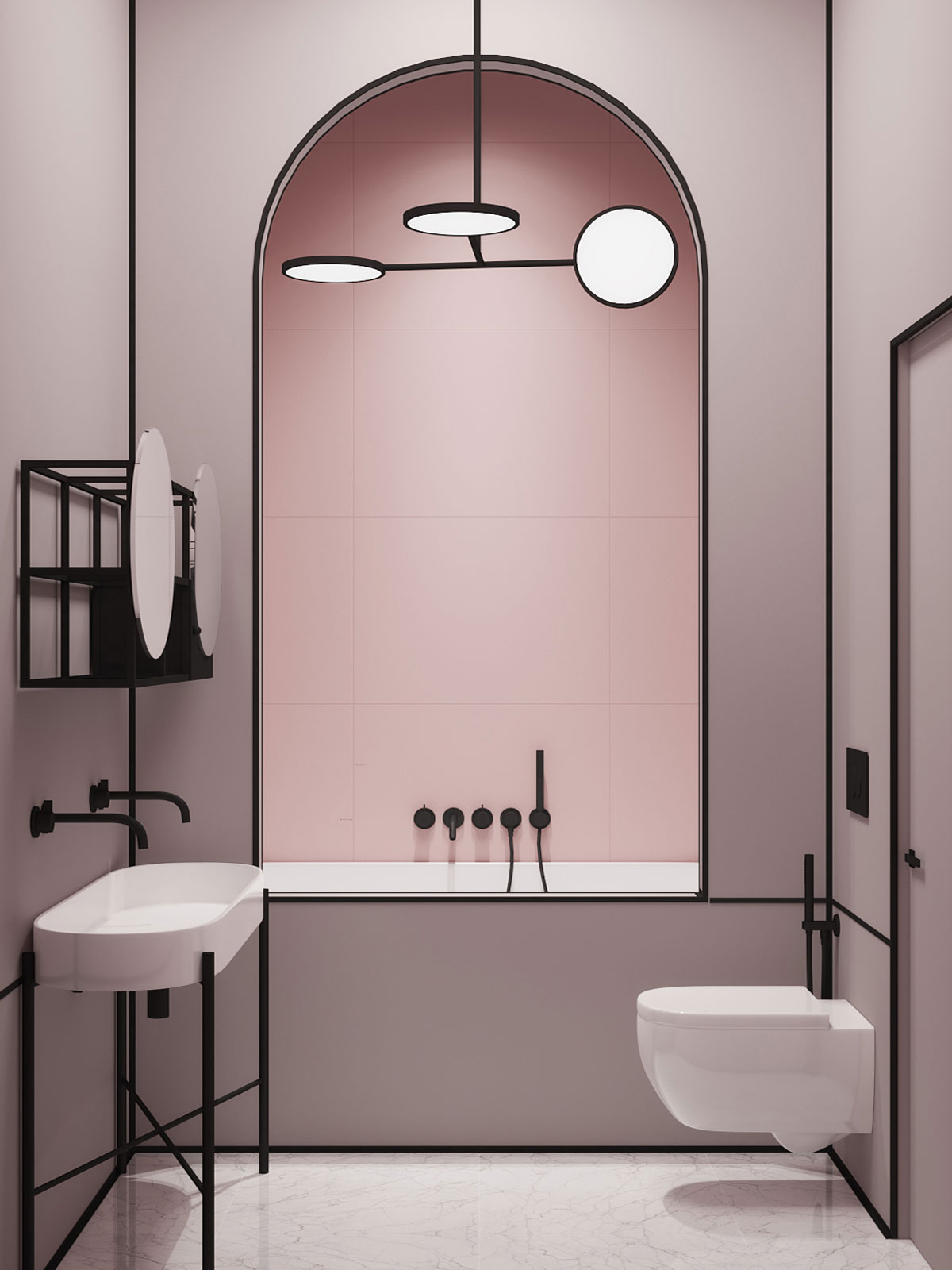
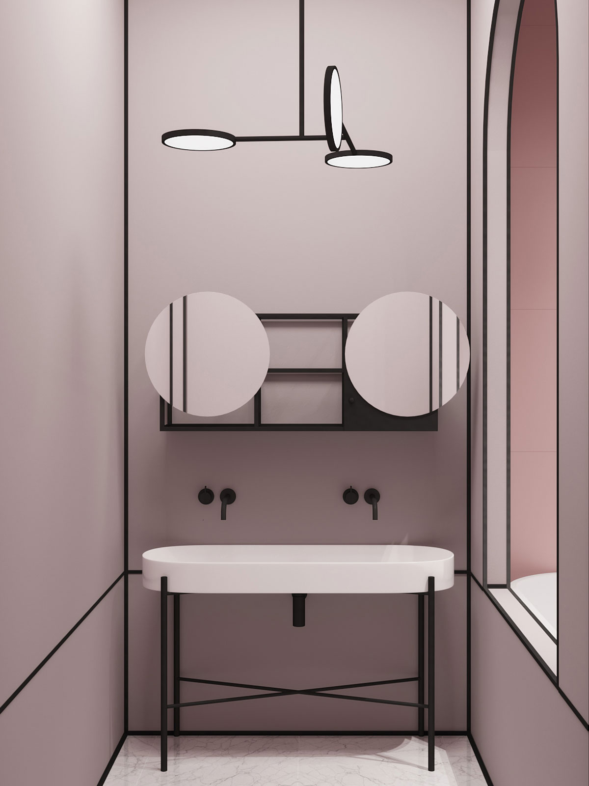
We wouldn’t have it any other way. You have to know what’s gone before to build a better future right? But there is no denying that some of the most incredible spaces inspiring us right now are rendered to perfection. Take Crosby Studio as an example of this at the highest, most insta-worthy level.
Pink Bathroom with Black outline details by Crosby Studio
Crosby Studio Bathroom Design
Crosby Studio Bathroom Design
Crosby Studio
Crosby Studio
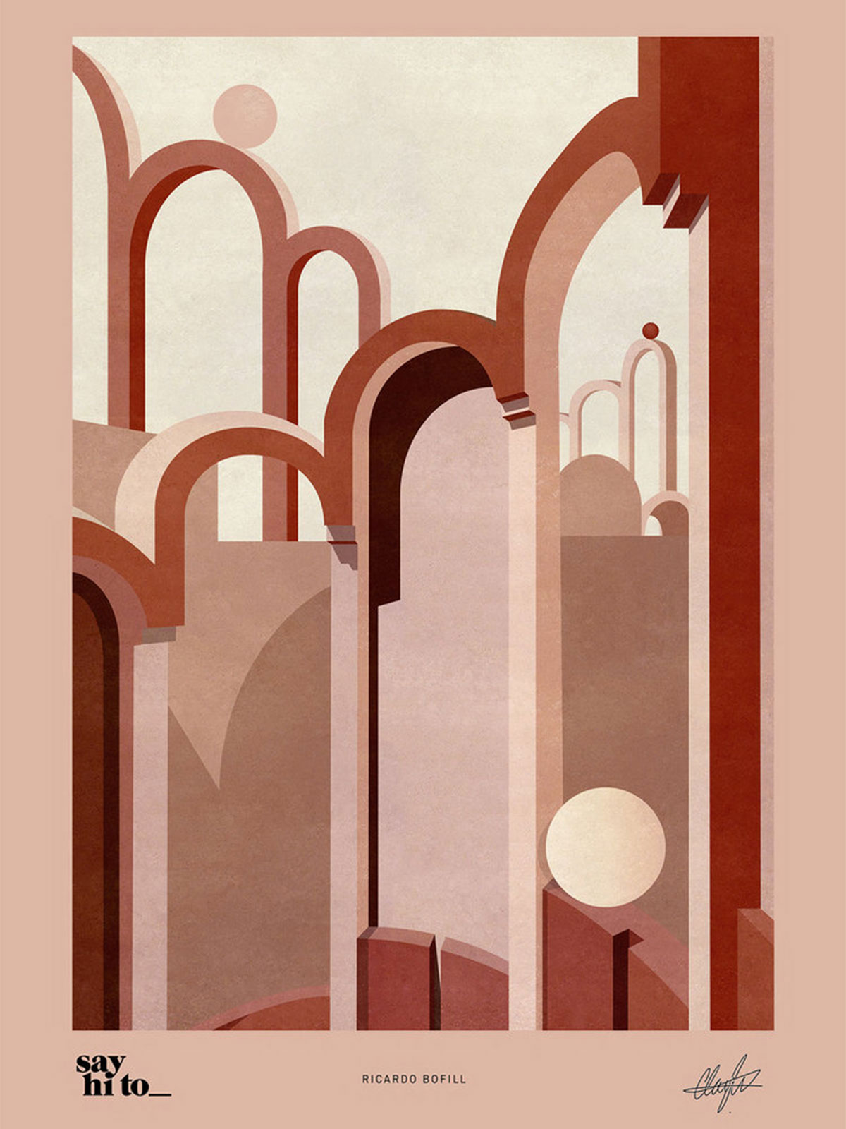
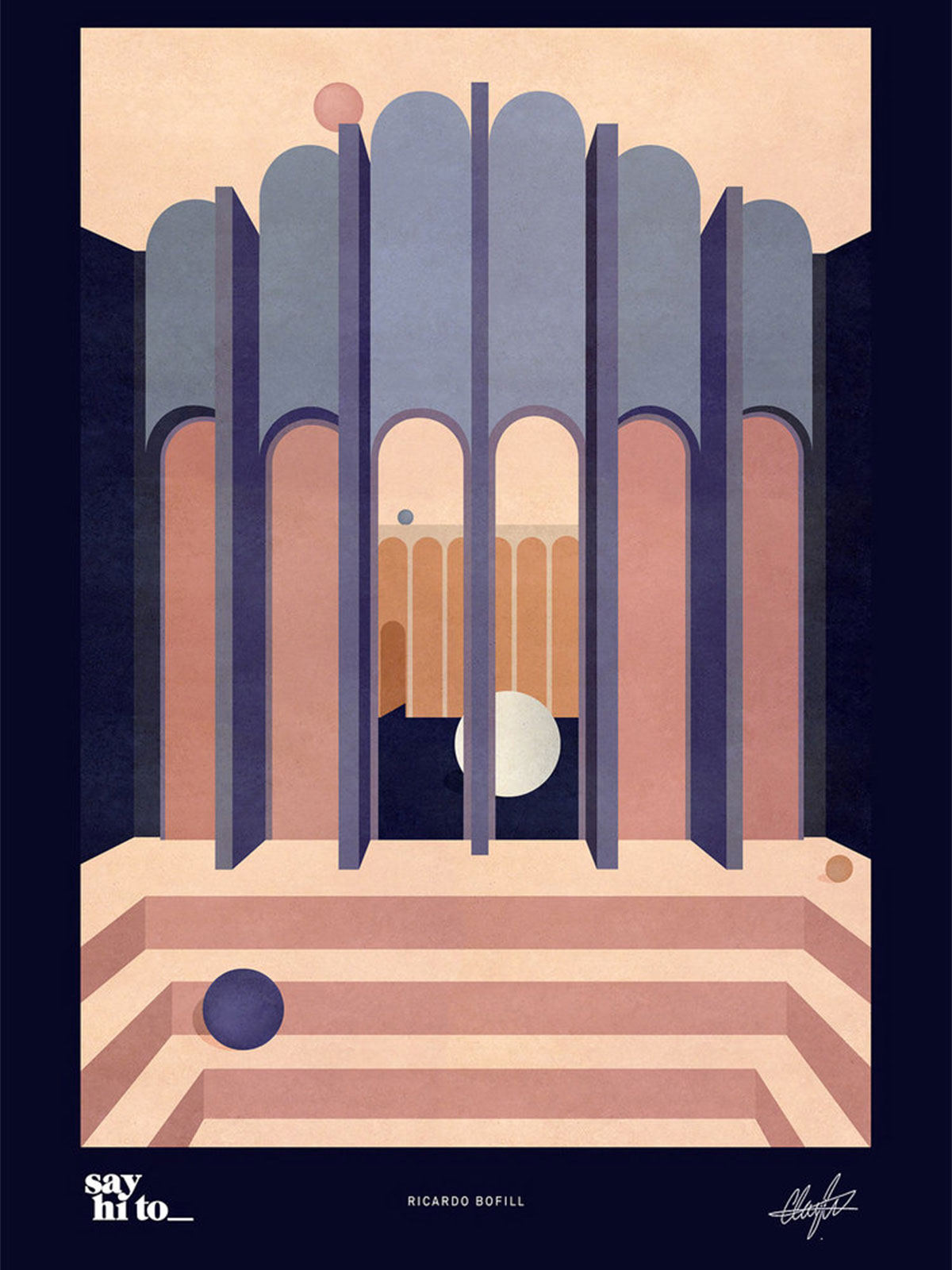
Art pints by Charlotte Taylor x Ricardo Bofill for Say Hito
Charlotte Taylor x Ricardo Bofill for Say Hito
Charlotte Taylor x Ricardo Bofill for Say Hito
Charlotte Taylor x Ricardo Bofill for Say Hito
Charlotte Taylor x Ricardo Bofill for Say Hito
The print collab between artist Charlotte Taylor and Architect, Ricardo Bofill (available to buy on Say hi to) straddles a wonderful middle ground. Imagining wonderful spaces with subtly textured combinations of colour and texture, simply assembled but somehow managing to convey atmosphere.
I can almost imagine someone buying a Charlotte Taylor print for their white box interior for example and allowing that to create their interior for them in their minds rather than putting the shapes and textures and colours into reality. Not that we have anything against this. White boxes can be wonderful spaces of opportunity. They can be sanctuaries, but we wanted to pose the question. Have we lost touch with real objects and textures because we love to consume the images so much? And are we becoming so tuned into perfectly rendered images that real life can’t match up?
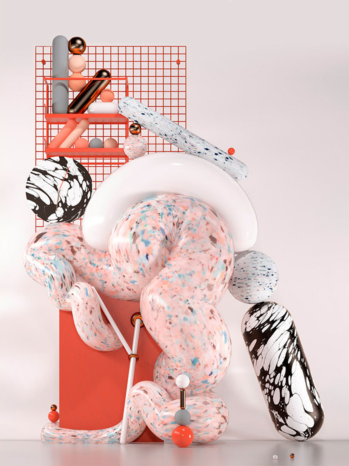
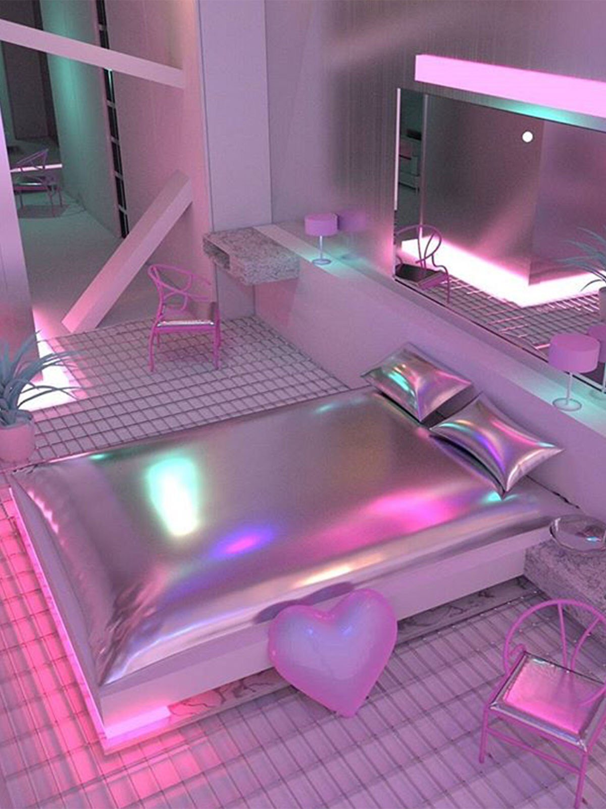
3D Artists, Jess Audrey Lynn and Bold Tron giving us futuristic vibes.
Jess Audrey Lynn
Jess Audrey Lynn
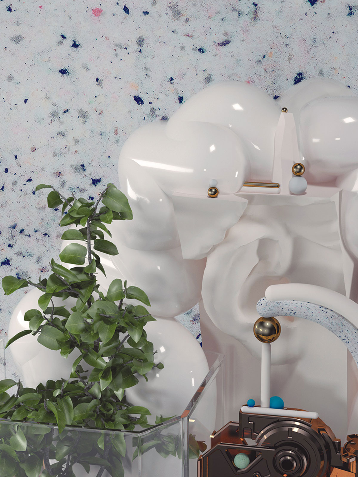
With rooms like these created in the digital world of 3D artists like the incredible Jess Audrey Lynn and digital curations of textures, architectural detailing with vintage objects and plants, seen above in the stunning work of Artist, Bold Tron, the possibilities are becoming endless as dream interiors become visual reality like never before.
What are your thoughts? Do you love real things, are you obsessed with mind expanding images? Do you feel those images as a pressure or do they help you to dream big for your own spaces? Should we be airbrushing out sockets and rads from shoots in order to create a more perfect version of our interiors? Or will this lead inevitably towards the damaging airbrushing scene of models and now insta stars?
Is any of it damaging or is it all progress?
Answers on a post card gratefully received. In the meantime, we will continue to give our clients real textures to feel and focus on creating atmosphere in spaces that we design. As for plug sockets, we have found ourselves moving them in the design/build stage more now so that they really are hidden from view. Much better than Photoshopping them out after.
x





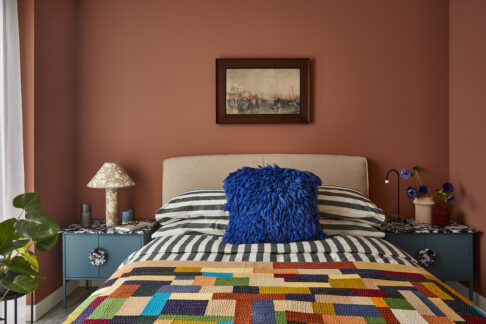 Coppermaker Square
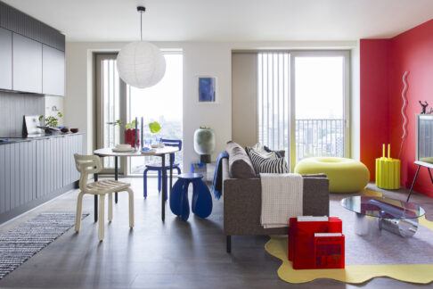 Xavier Building
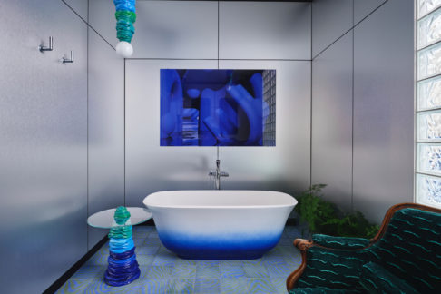 2LG x Wow House
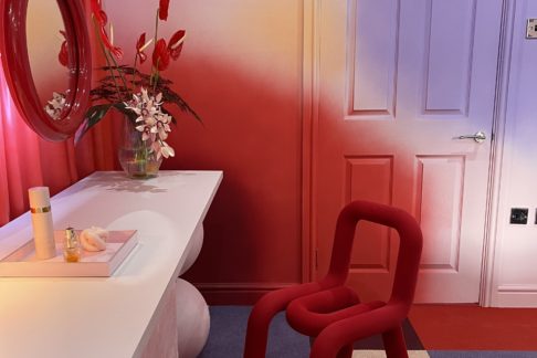 Lipstick Fantasy – Bury St Edmunds (Changing rooms)
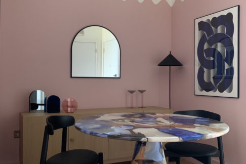 The Printworks