As we approach a new year, we take a look at what makes us tick and how we approach interior design. Embracing two seemingly opposed movements, to create our own look.
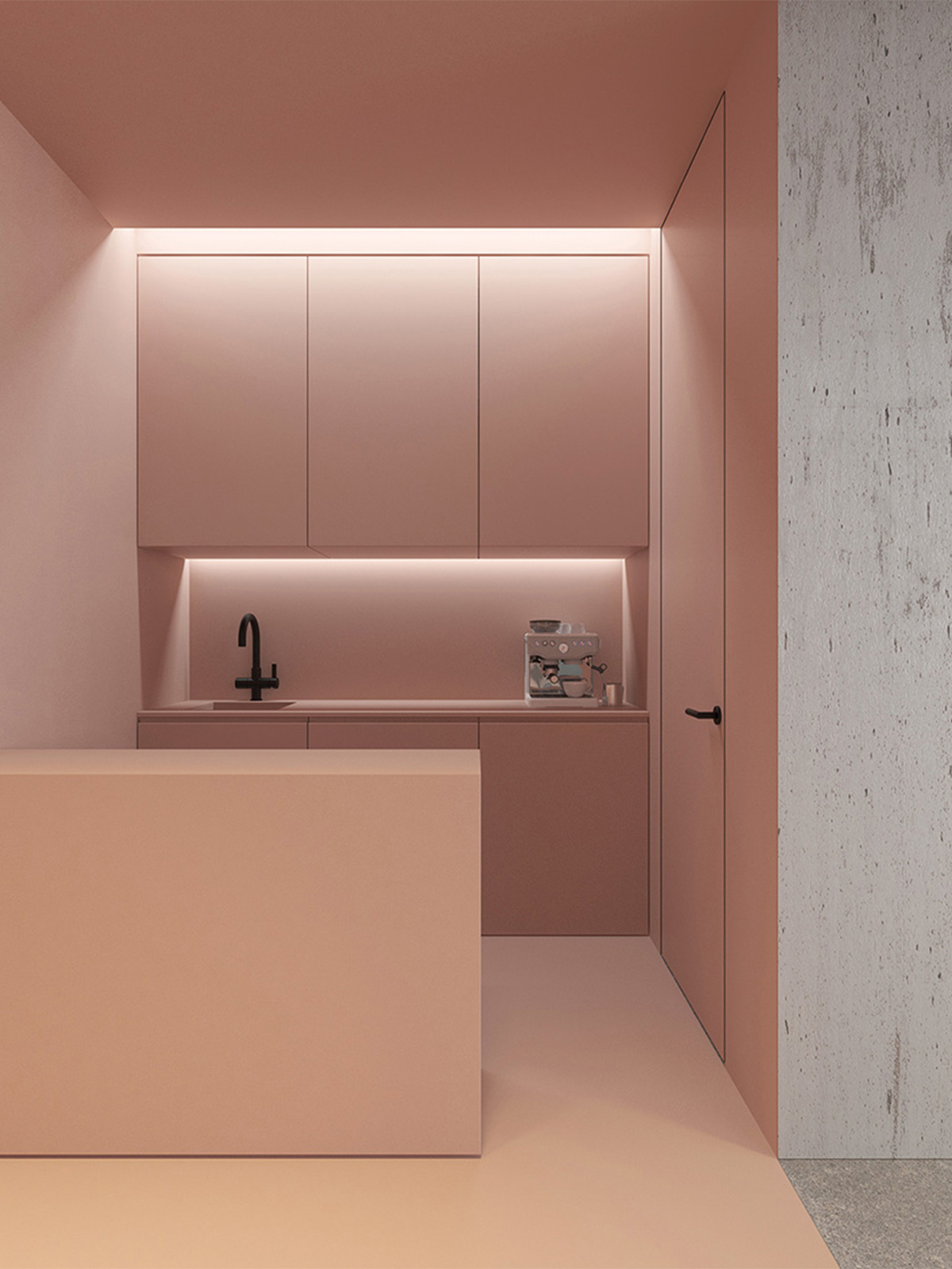
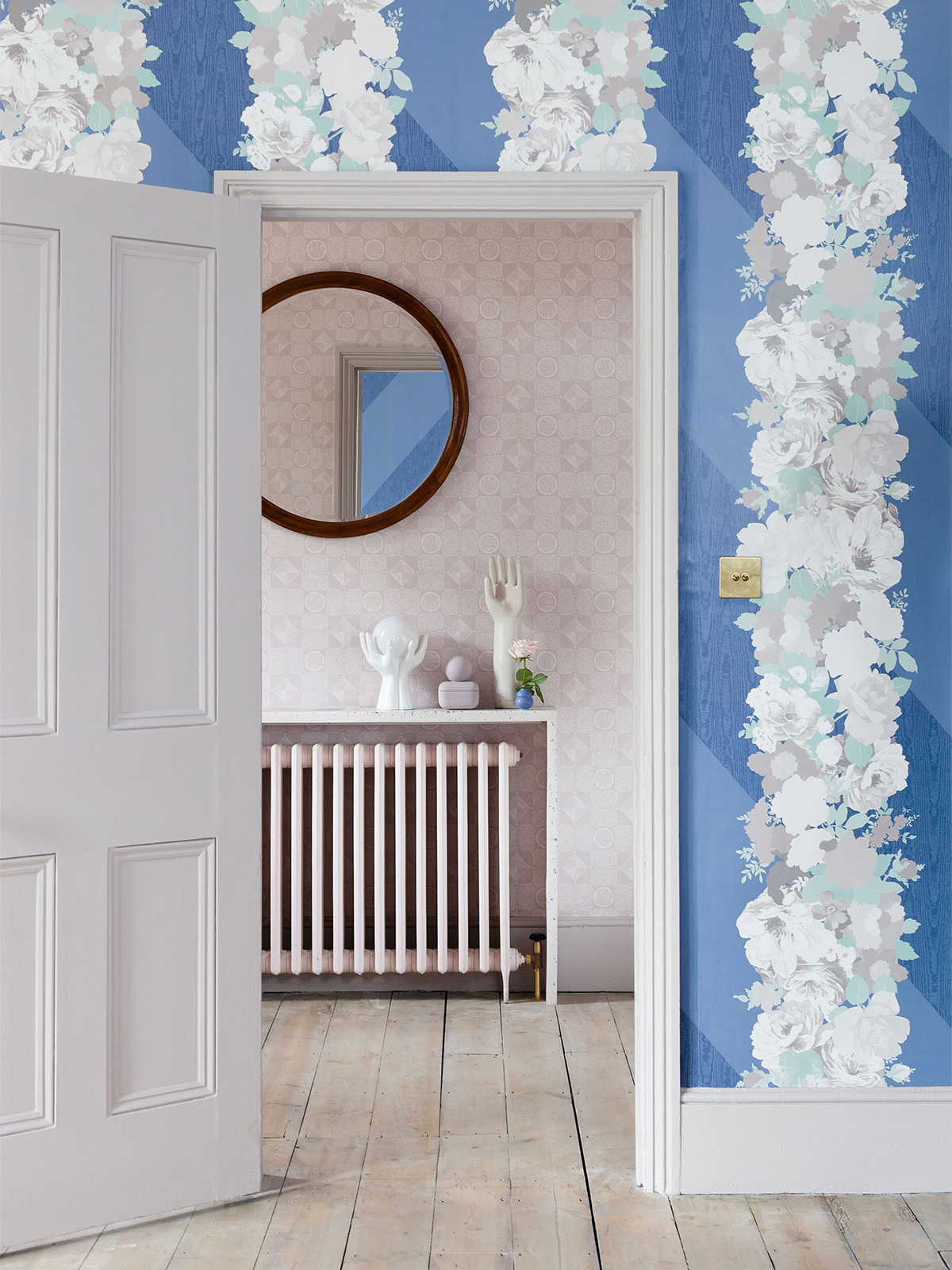
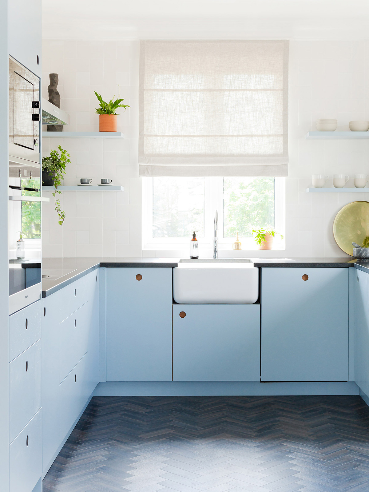
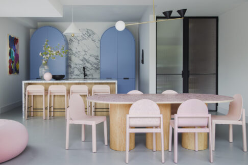
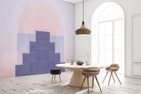
The tension between these 2 schools of thought has never been more strong. With massive pop culture influence coming from The Minimalists with their hit doc on Netflix last year, and a growing wave of excitement in the social media scene about a new maximalism in interiors, you would be forgiven for feeling torn. Check out this minimal kitchen design above, ‘Office P’ in Kiev by architect, Emil Dervish for total minimalist goals. Next to a shot of our own ‘Design House’ project with a more maximal vibe.
We have always loved both and as we look back over our design work to date it is clear that we have been playing with different proportions of maximalism and minimalism in all of our schemes.
Clean lines and focussed functionality are a go to for us as the start point for any interior we design, but we also have a huge passion in our hearts for colour and pattern and sculptural form. So we want to make a case for the restrained maximalists and the joyful minimalists.
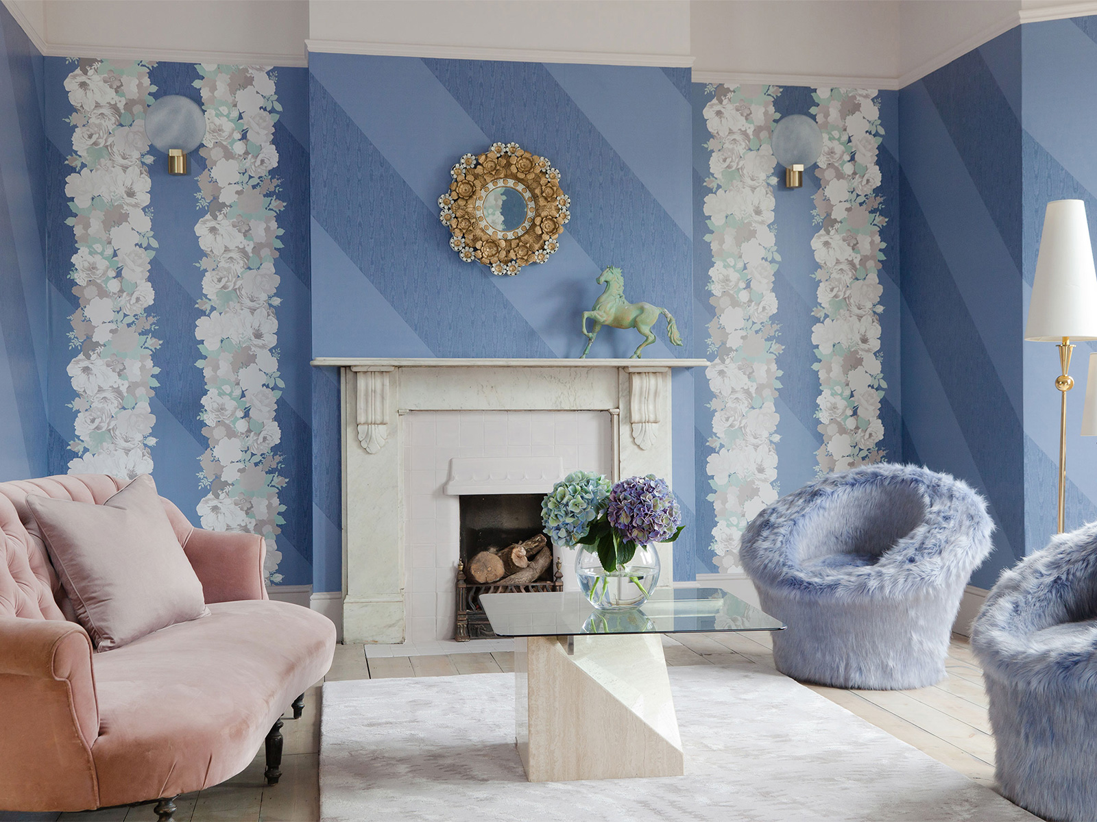
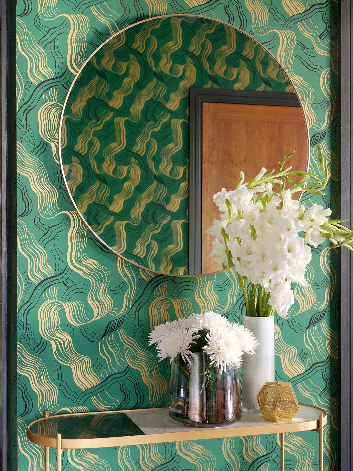
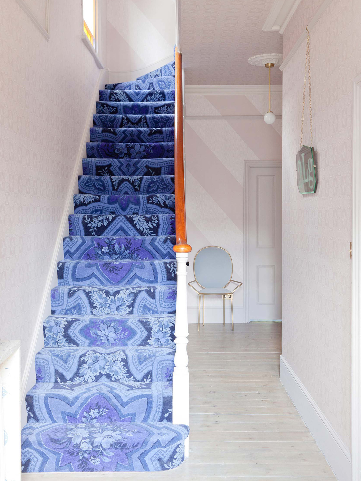
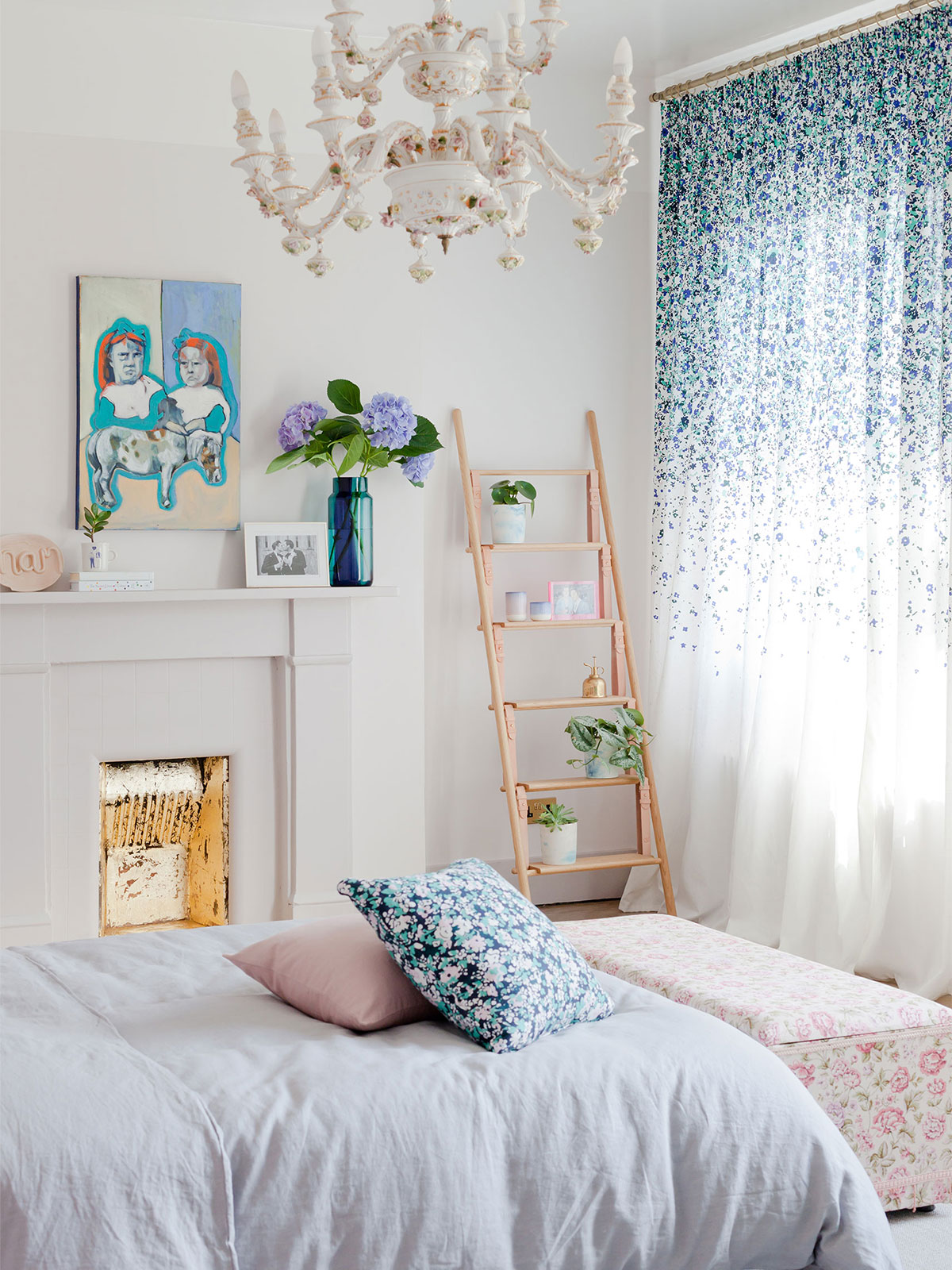
Pattern used on a grand scale can still give a minimal look if the lines are clean and the palette is limited. In the entrance hall of our ongoing passion project, Perry Rise, we have used our Wallpaper and carpet collaborations to wrap pattern on every surface, giving a minimal look even though the use of pattern is maximal. The approach is more maximal in the bedroom with a wall of patterned curtain amongst other eclectic elements, but the bones have been approached in a minimal way with a pale colour palette.
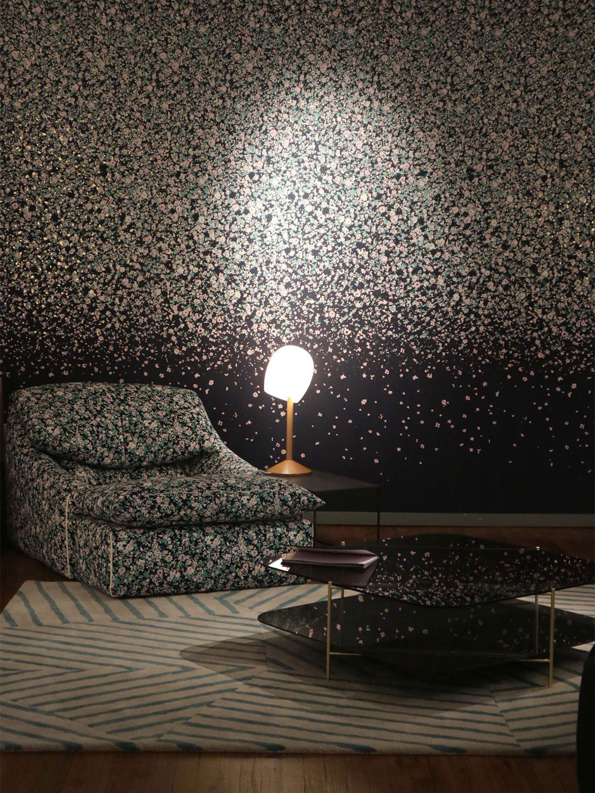
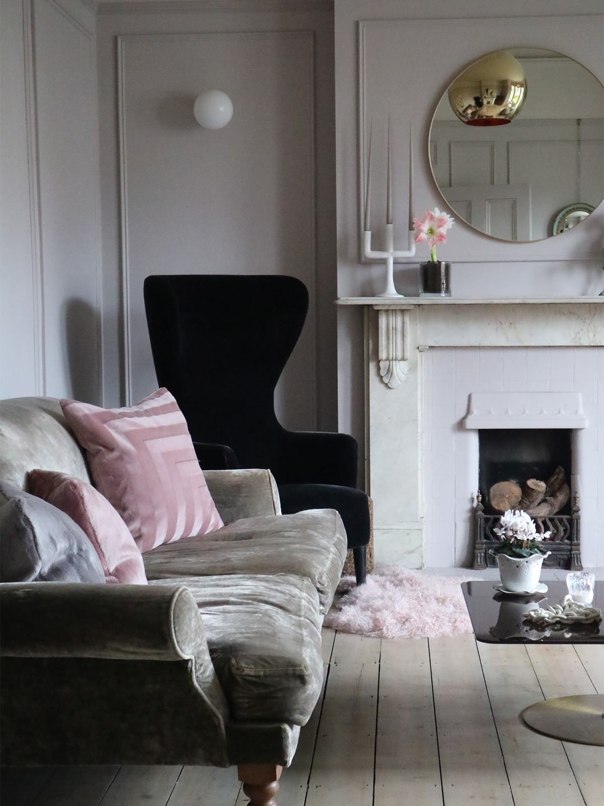
You can dial this up either way and still deliver a balanced scheme. Maximal backdrop with minimal pieces or minimal backdrop with maximal pattern.
For more info on our collection with Custhom, as seen in New York, and how to buy it, check this out.





 Sunderland Road
 Wallcoverings with Newmor
 Rental Realness
 Dramatic Flowers for a special occasion – How to get the look
 Living with pattern – how we approach pattern in our designs