This is the fun bit then. But getting the shell right requires a different kind of attention.
The devil is in the detail and in this case those details are the junctions. Where floor becomes skirt, skirt moves into wall, wall to architrave, to frame to door itself.
The way you chose to blend or contrast these junctions is so key to making a strong base for all the other elements to come, so we have spent a lot of time on these decisions and wanted to share some of those junctions with you – the shell can then become more than the sum of its parts.
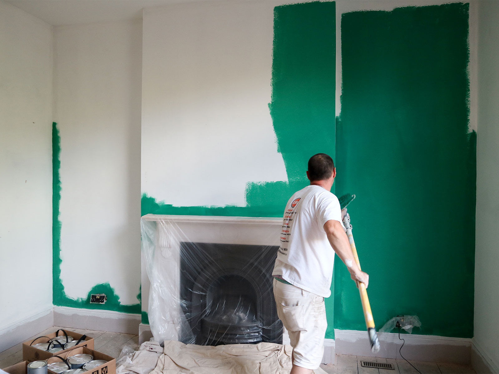
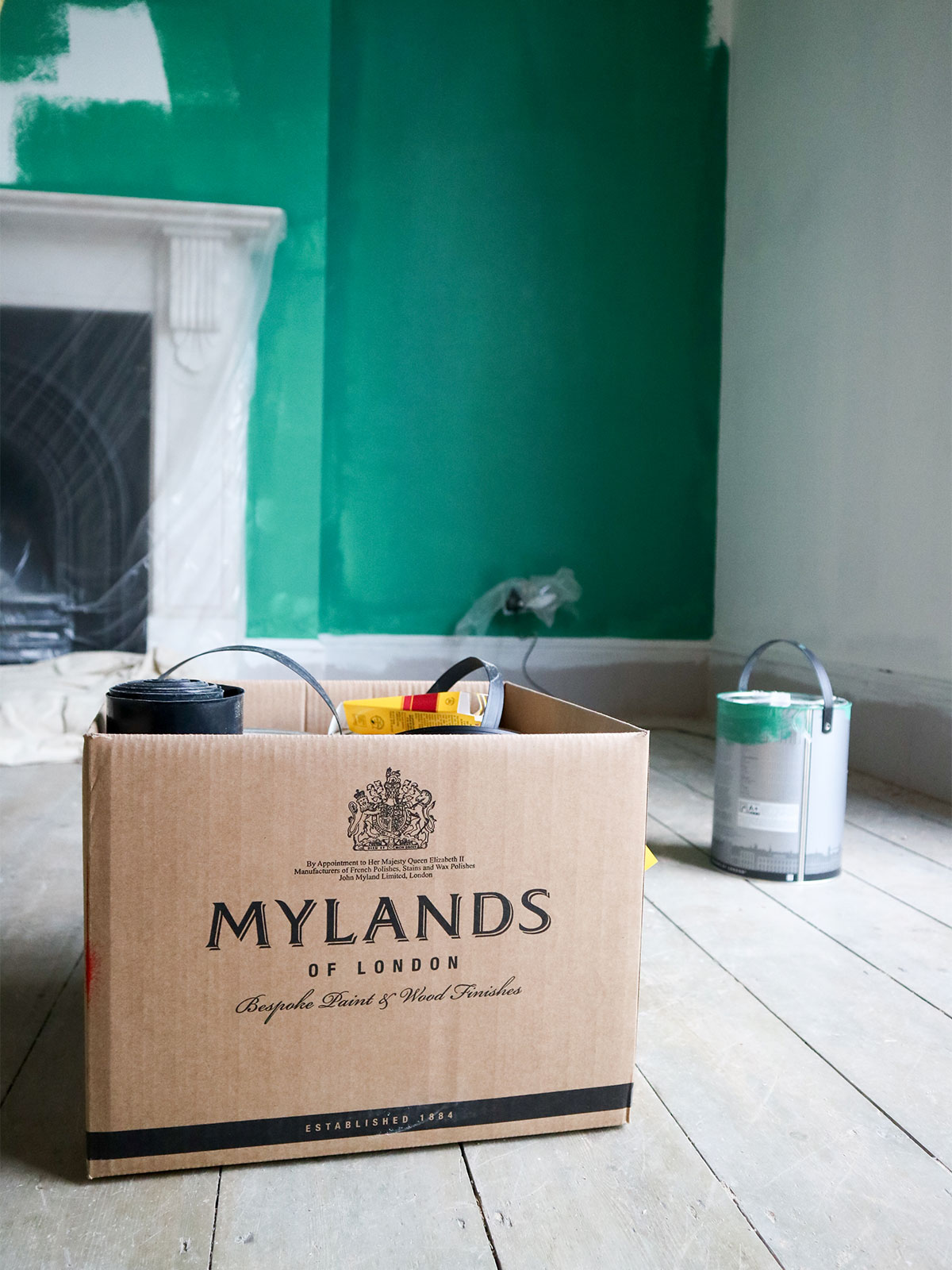
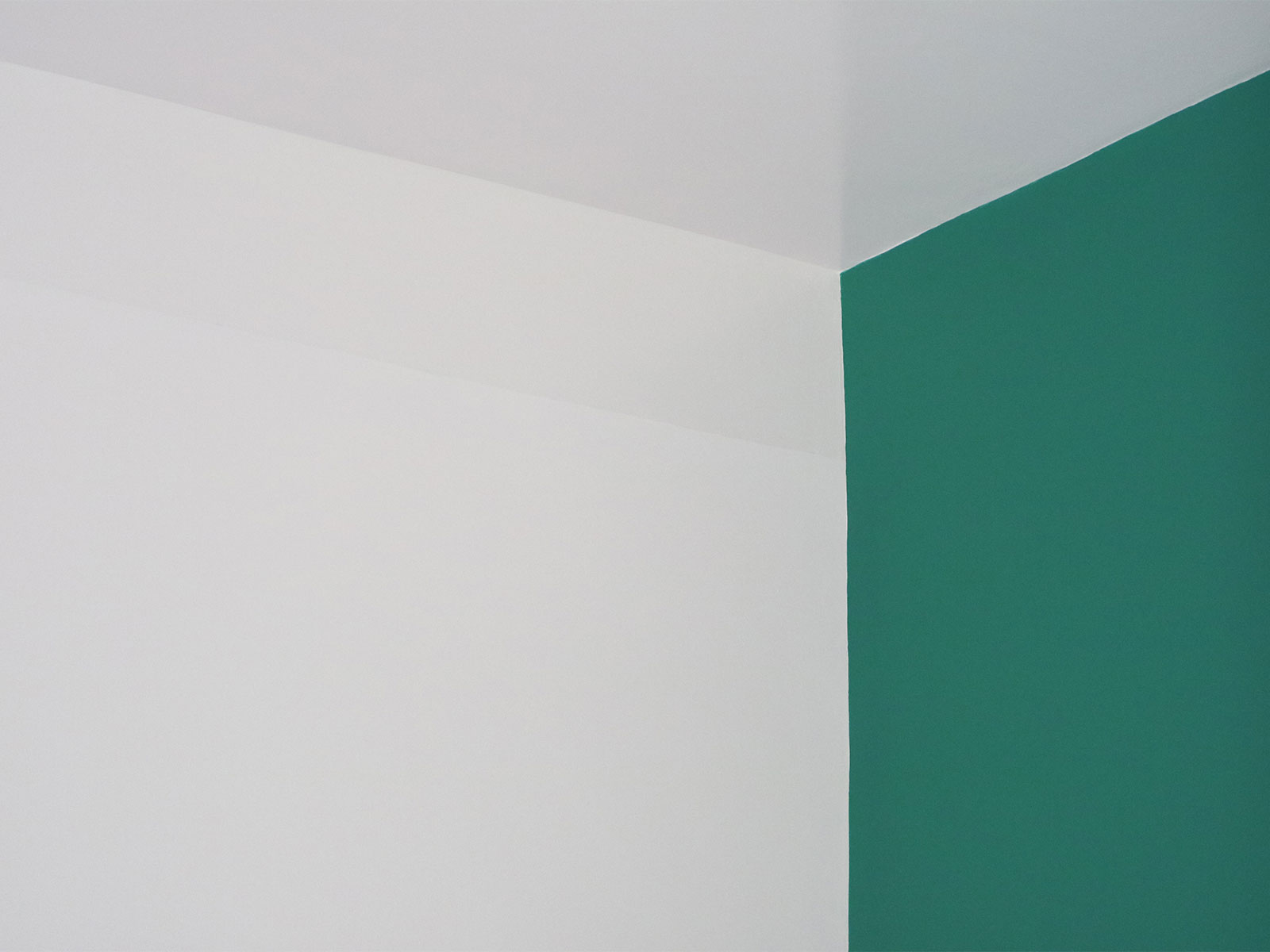
Yes that is a bit of colour going on our newly plastered walls. You know we love our colour and here we wanted to carry the garden into the space with a bit of green.
This delicious green is from Mylands, and we will give you more info on that soon, they say, teasing you with a half painted wall. But that is the joy of this process, it moves so fast once you get into it (if you have prepped properly), and you have to take in each moment as it goes.
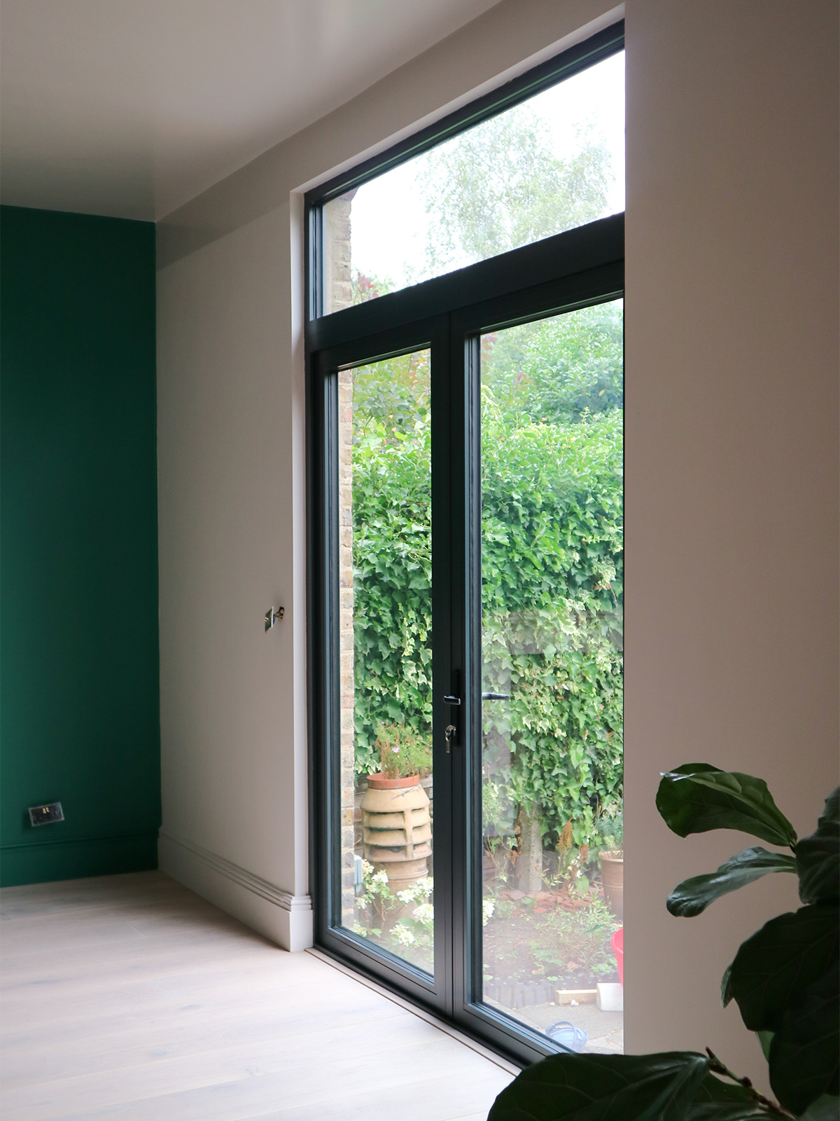
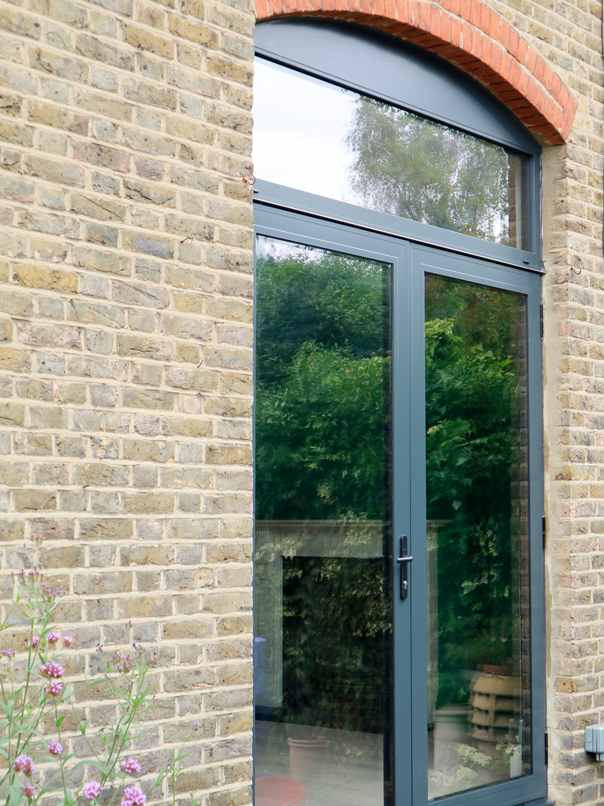
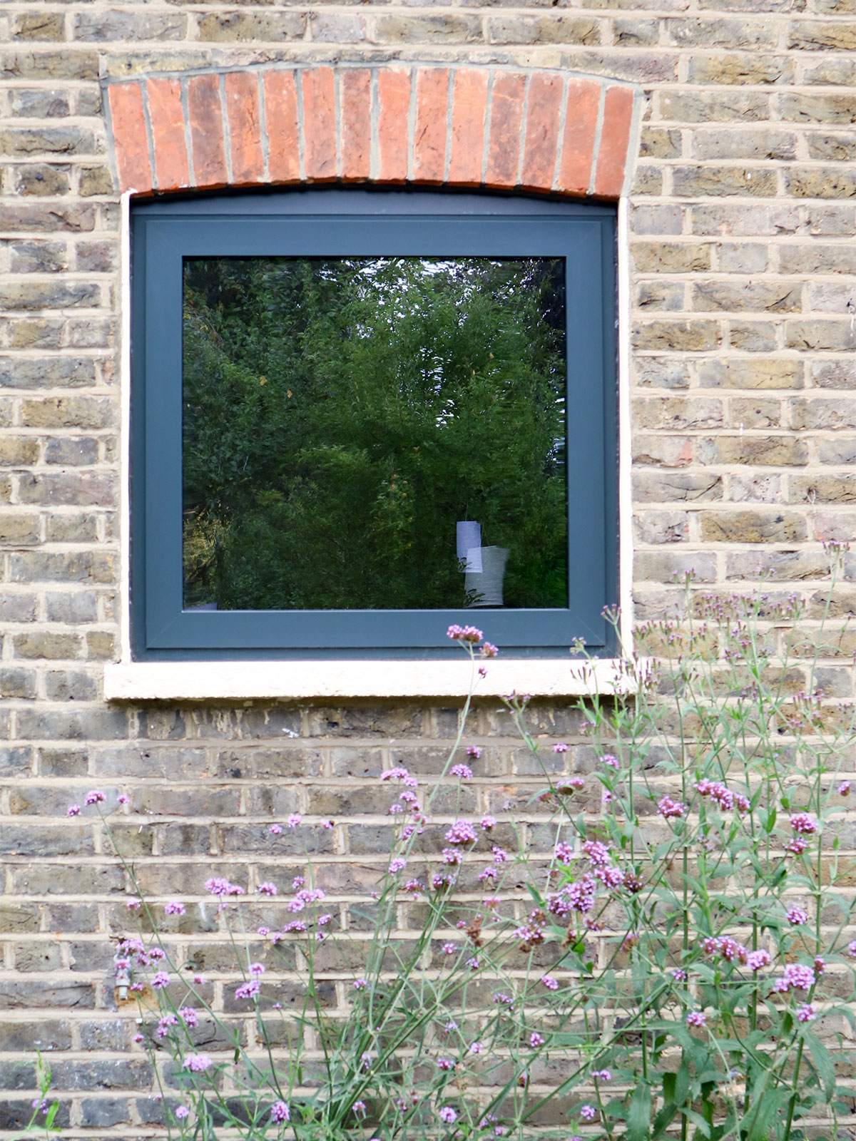
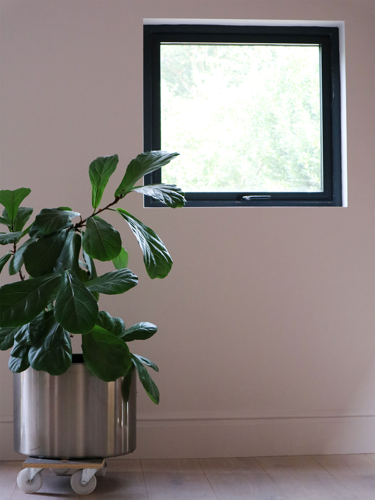
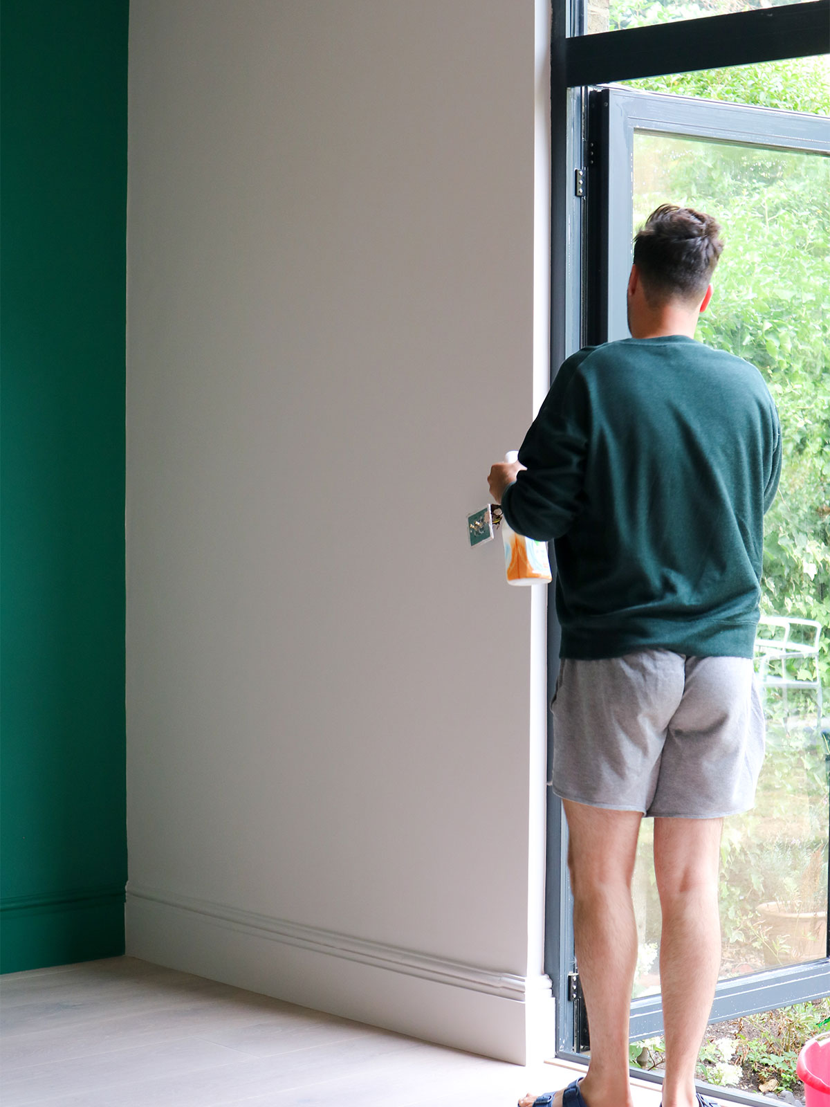
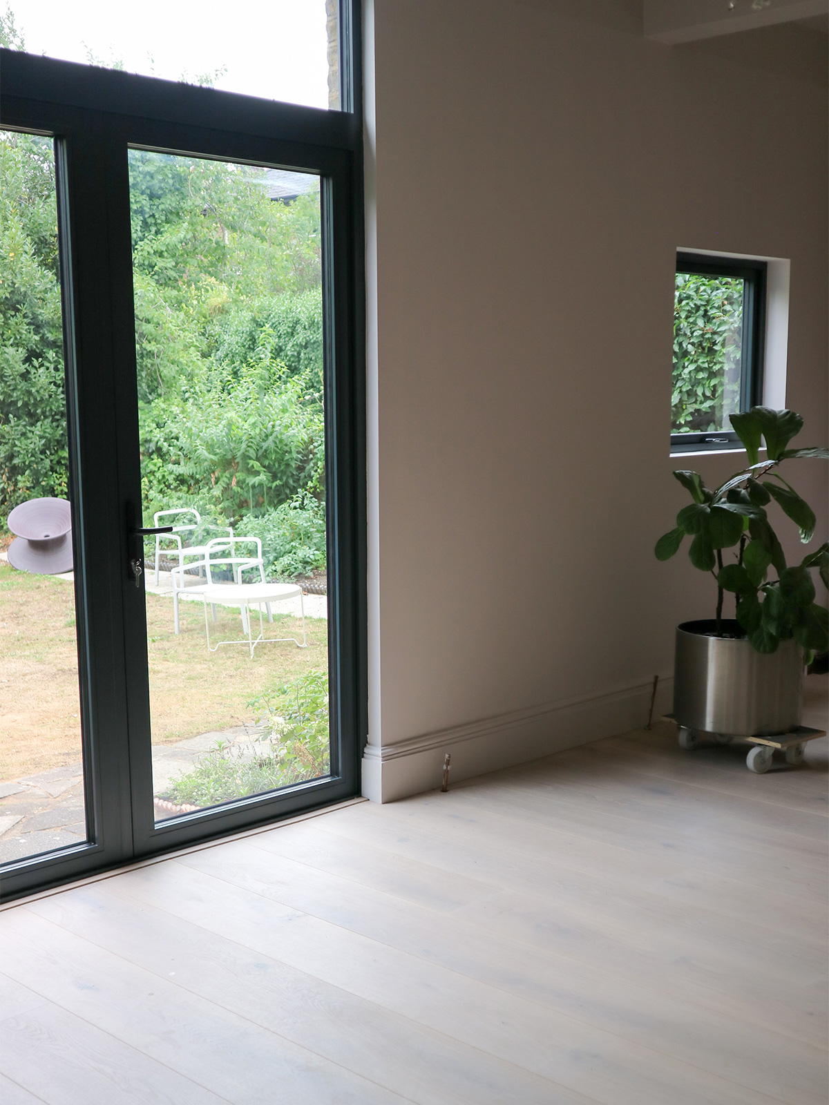
So, first things first, our rickety, drafty old wooden doors and windows had to go, before we could put in new plaster and paint. It is a big job and one that we took a lot of time over. In the end we have opted to stay true to the lovely brick arches outside and keep the proportions of the doors and window, original. We have put in modern units by the lovely team at ODC Glass of anthracite grey aluminium, which not only open fully to give us a major garden connection at the back when they are open but they are also giving us major extra warmth and security. The previous doors were so old that you could have pushed your way into our house easily. Now we feel so much safer. Amazing what a pair of doors can do.
And don’t they look sexy! ODC also offer a colour service so these doors could have been powder coated in any colour. We immediately got very excited about this and started playing with various colour options. But ultimately, we wanted the bones here to remain classic. There is going to be plenty of fun to be had with colour inside (more on this to come) and so we felt that the modern classic that is Anthracite Grey, would nod to an industrial vibe whilst grounding some of the wilder elements of the interior we have designed. We couldn’t love them more. Such a strange thing to love doors, but when you have spent three years living with condensation and wind blowing in and ice on the glass of your old doors, there is a special pleasure in stepping through newly fitted doors. Ahhhhhhhhhh. (another little joyful sigh).
Inside and out!
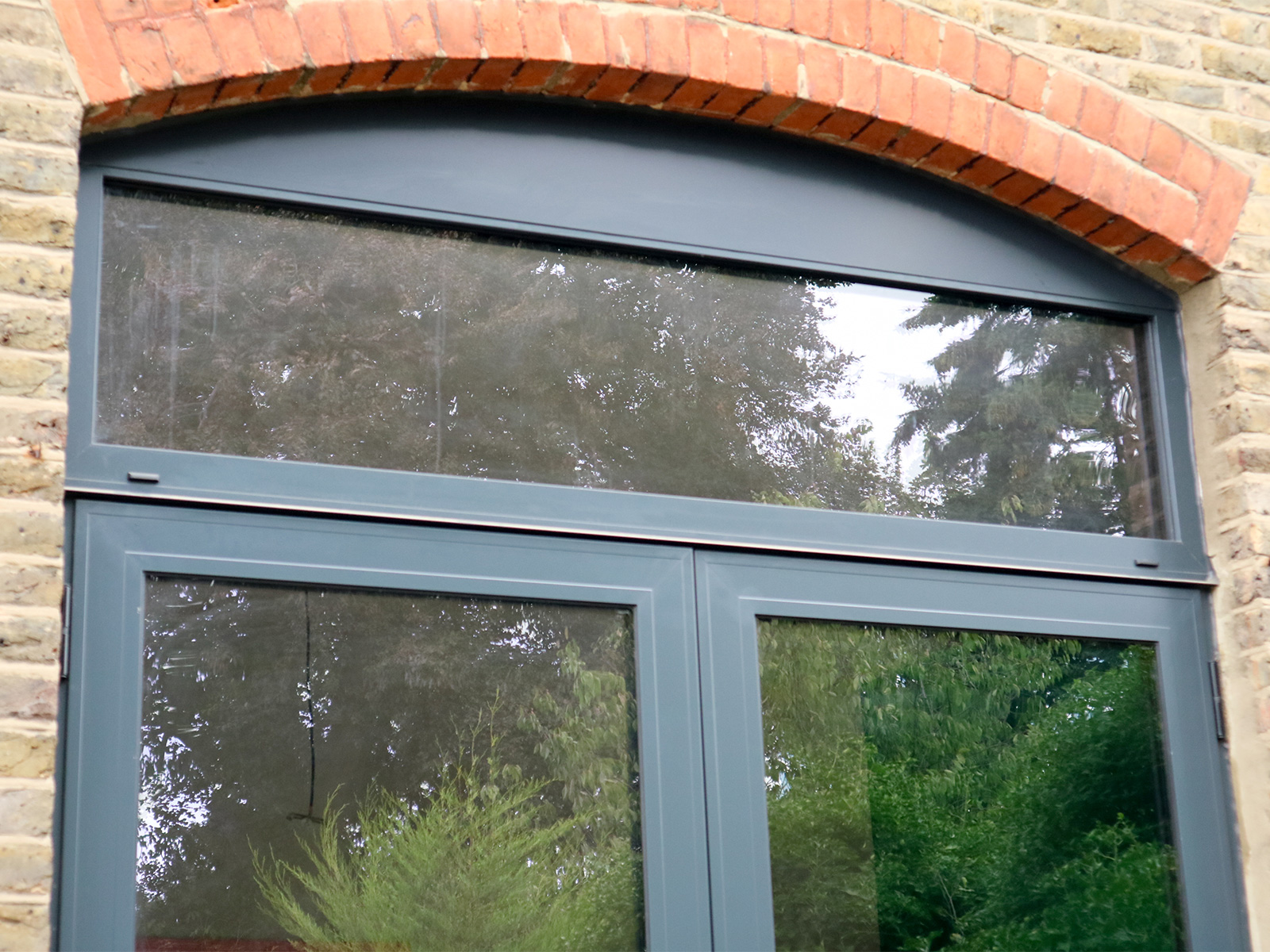
In Hindsight, we could have had a piece of glass at the top to match the arch of original brick. But this opportunity only arose once we removed the original coving inside because it dropped down inside below the line of the external arch.
We had intended to save the coving, but it was not possible when we started to open the rooms up so we made the choice to go forward without it and embrace the modern approach to this space since the rest of the house still holds onto the period features and we could go fully modern here without losing the charm of the property.
When the door survey was done and doors were ordered, (ODC do an amazingly easy supply and fit option) we were still keeping the cove detail, so there was no going back without major extra expense, so we stuck to the original plan and we still love it. Sometimes you have to see the bigger picture and let the budget dictate, as a change here would have meant no money left for furniture or lighting. We chose to keep the latter. These things are always a negotiation and you have to be ready to modulate at any time.
Anyway, we love the detail above the door as you turn back and look at the house, it really makes the brickwork pop and the new doors let in so much more light.
We also changed the old kitchen window and single back door, to match in and pull it all together.
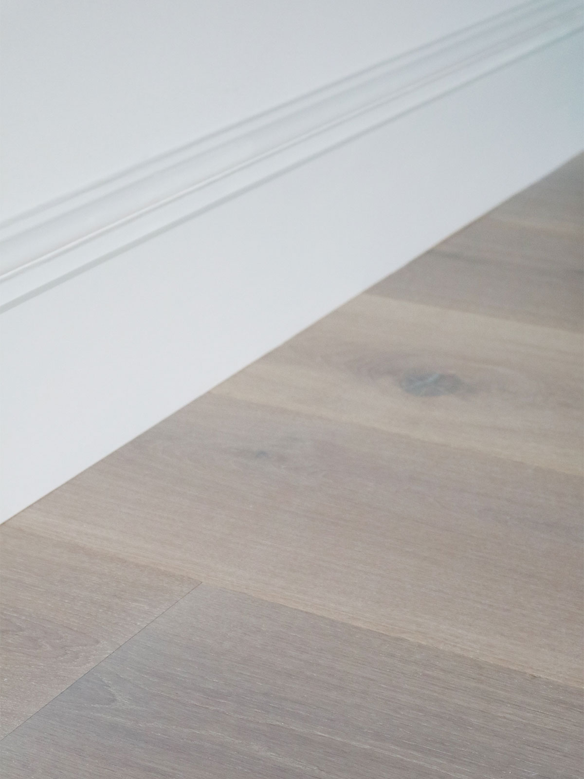
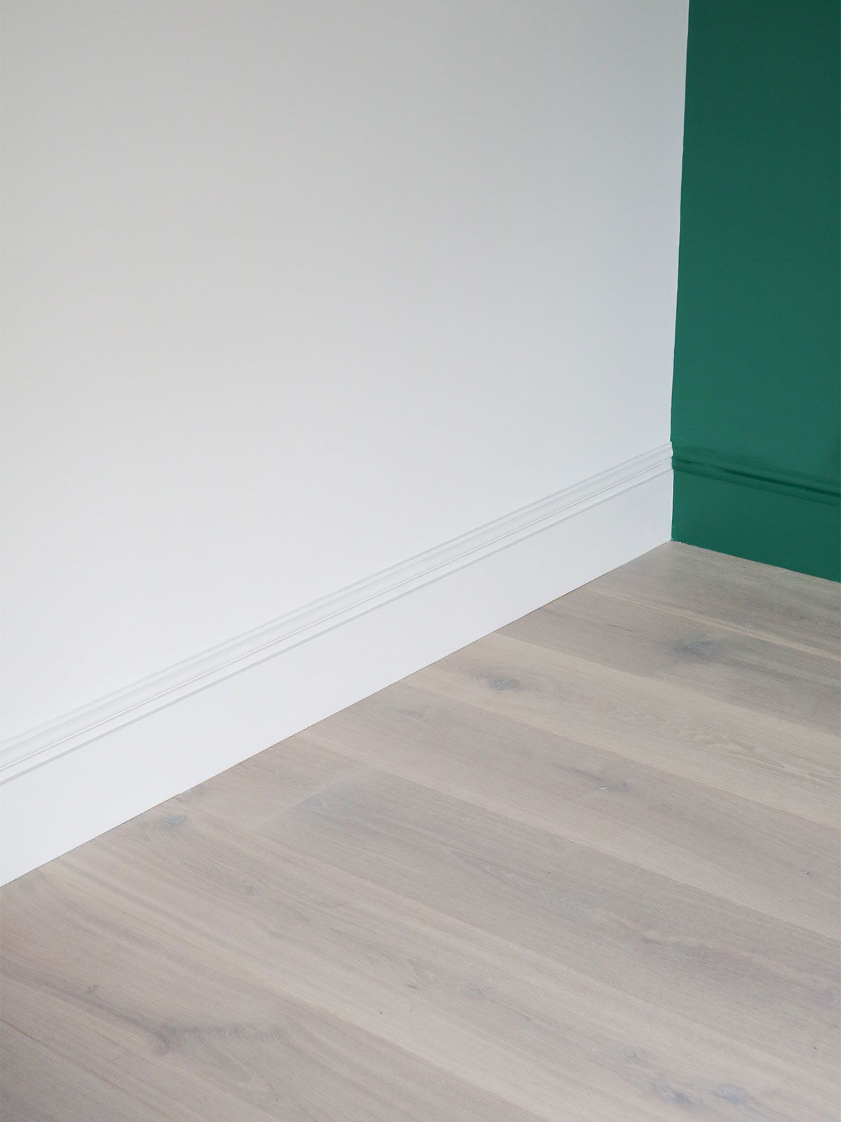
Now onto the new floor and tackling that dreaded junction between the original skirting boards and the new floor.
We are not into angled trim all around the room and taking off the skirts to run the floors under them is a whole can of worms in a period property that you do not want to get into. You can cut the bottom of the skirts off to run the boards under, but this has its own hazards with old pipes and wiring at risk of being disrupted and the levels in old houses are often so out that this method can be very problematic.
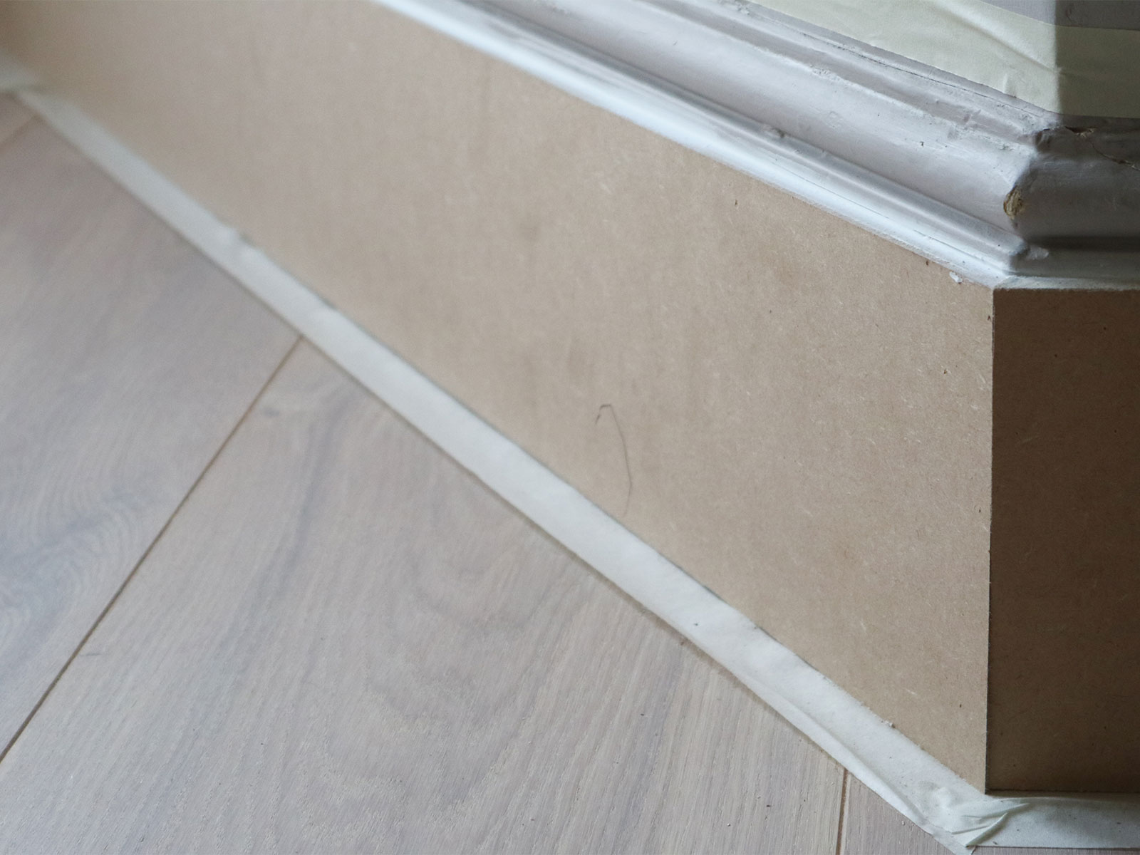
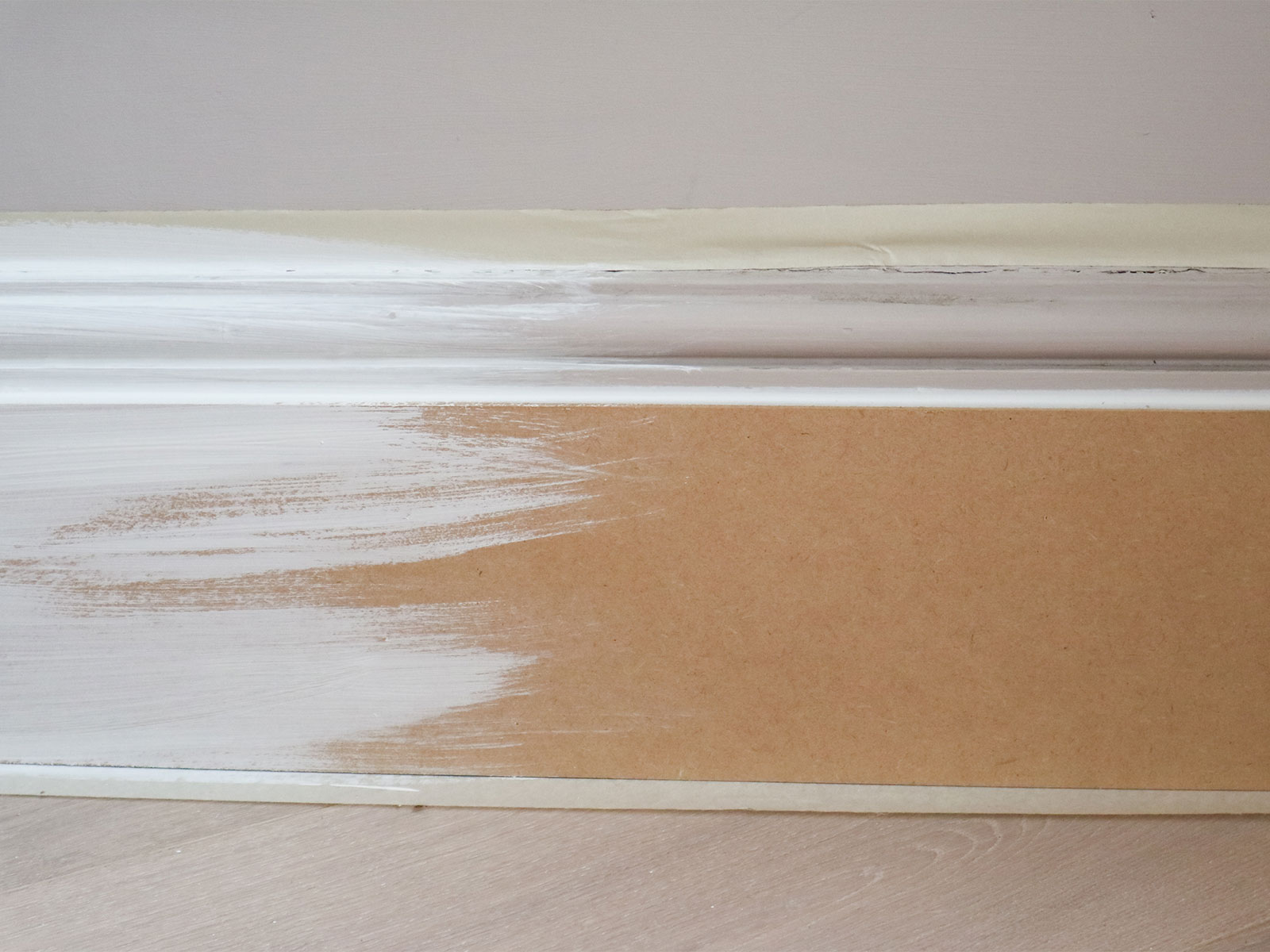
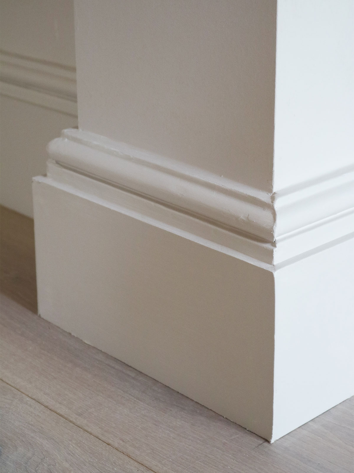
So, we have our own solution for you. One that involved a minimum of fuss and gets a seamless result. You take 6 or 9mm mdf and once the floor is down, you apply the mdf to the front face of the skirts right up to the height of the first detail/corner on the skirt. This just adds depth to the period detail and hides the floor edge under the bottom, leaving enough room for expansion gaps since old house do move a little and wood needs space to expand.
Tape it up and prime the MDF.
Then apply a couple of top coats of wood paint to match in with your existing skirts.
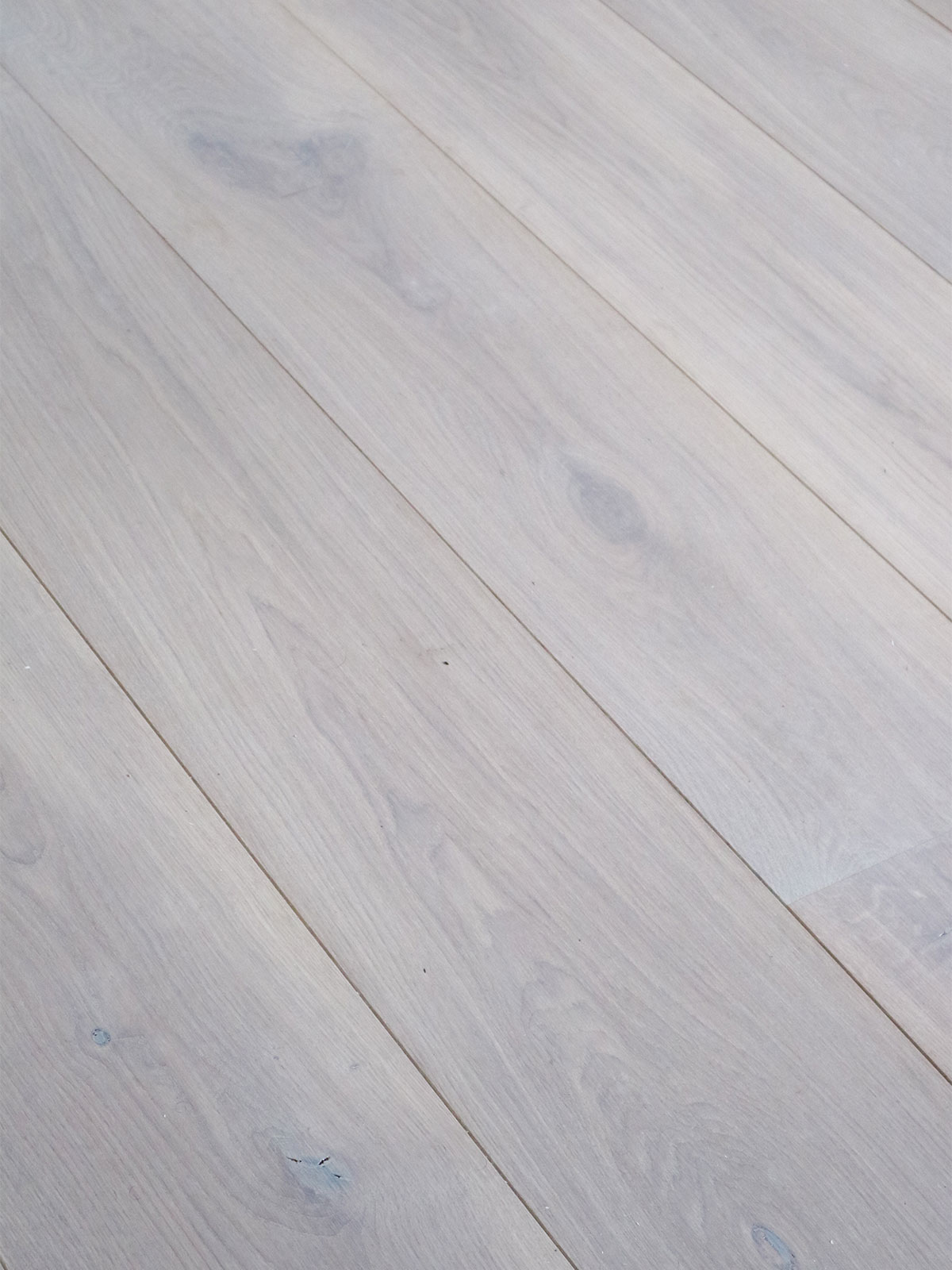
And what flooring have we chosen, we hear you ask? Well this one was a bit of a dream come true. When we first moved into the house we loved the original floorboards, but they have been hard to live with as they are more drafty than a… very drafty thing. SO we made do and sanded them and stained them and for a time we were happy. But all the time we were putting new lovely wooden floors into our clients homes and thinking “if only we could have these floors”. As it turns out, doing the knock through brought up new issues with the floors being different levels and thresholds that we didn’t want. So it was a chance to start again with the floors of the whole downstairs of our house and put in a floor with no thresholds and no compromises.
The wide long boards in washed oak that we have chosen really are dreamy and they run all the way through with no break points, unifying all the different spaces. We are not entirely open plan downstairs, preferring to have a living room we can close off for cosy movies nights, but the floor creates a strong through line.
We have worked with Havwoods on this because they have so many beautiful options and the width of these boards is harder to come by. The floor is engineered oak (great for stability and durability) and the specific range is Venture Plank, Blanco in 260mm wide boards. Our floors make us very happy indeed and you can get the same type of floor here.
Floors sorted...so onto some colour!
When we started designing our dream kitchen (3 years ago…hahaha) we knew that we wanted bold colour, because it makes us happy and the kitchen is so important. Mylands, the paint brand that is based just round the corner from us and have used in the past for our living room and bedroom, launched a new collection of paints based on their work in film and theatre. This got us very excited as our first careers were in that arena so, naturally we had to take a look.
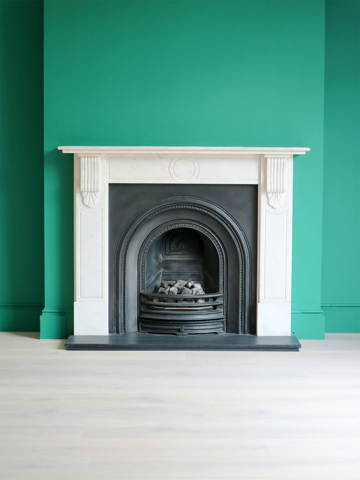
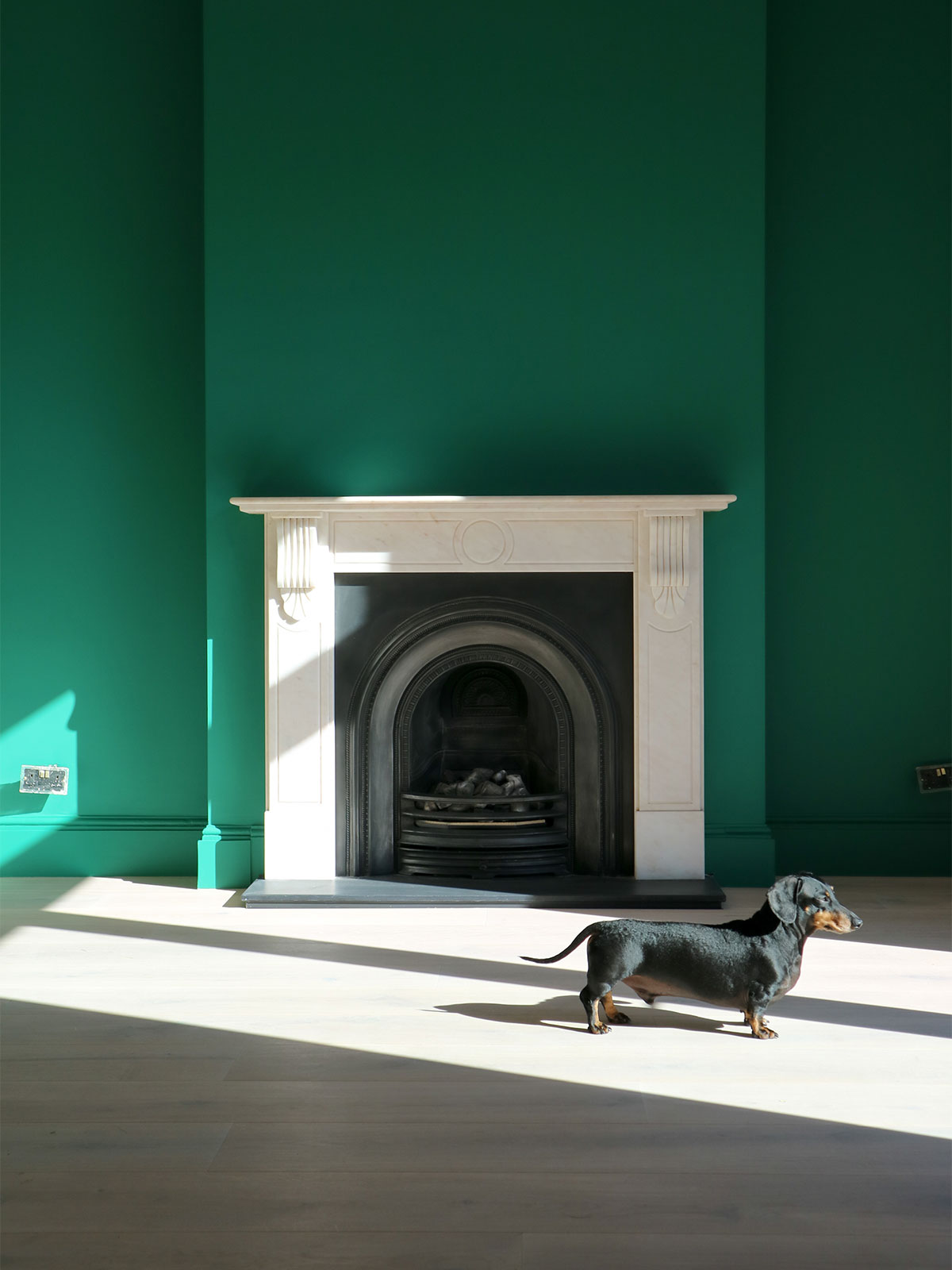
The colours in this range are so rich and bold and they feel contemporary but still have that depth of colour that fits in with our victorian setting. It was an excited moment of “yes please” for both of us. The green we have chosen if FTT012 (cute name) and it really is our green dream. This colour has been present in our client design work for years but never has it been this deep.
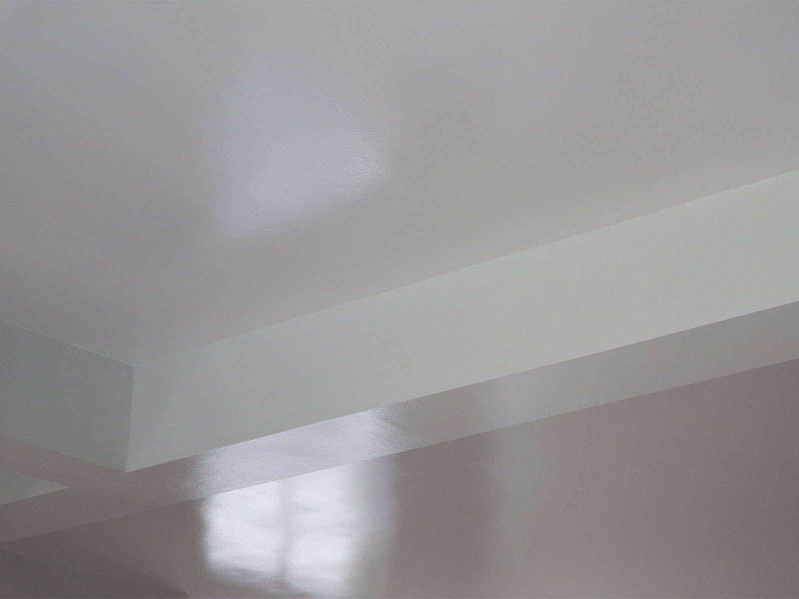
We also kept the ghost of the original coving (and made a virtue of the steel beams that drop below the ceiling) by painting the ceiling in a gloss version of the other wall colour, Fitzrovia (the colour of our living room). This not only gives a light boost to the ceiling but it adds a cute modern detail. The handpainted line all around the room disguises the junction between the beams and the walls effortlessly. And you know we love to make something of a ceiling. This may be subtle but it has impact when you are in the space.
There are some additional colour moments to come in the space, but we will keep you up to date on those as they happen…
Remember what we have said previously about getting a good plasterer? This is where that really pays off.
Buckley approves of the new junctions...and the new shaft of sun that he can lay in.





 Designing a shower room of dreams
 Project Garden
 Get your Curve on
 Broken-Plan Living
 2LG x FloorStory