Finding pattern is part of human nature...the search for ornamentation is innate as we try to find meaning
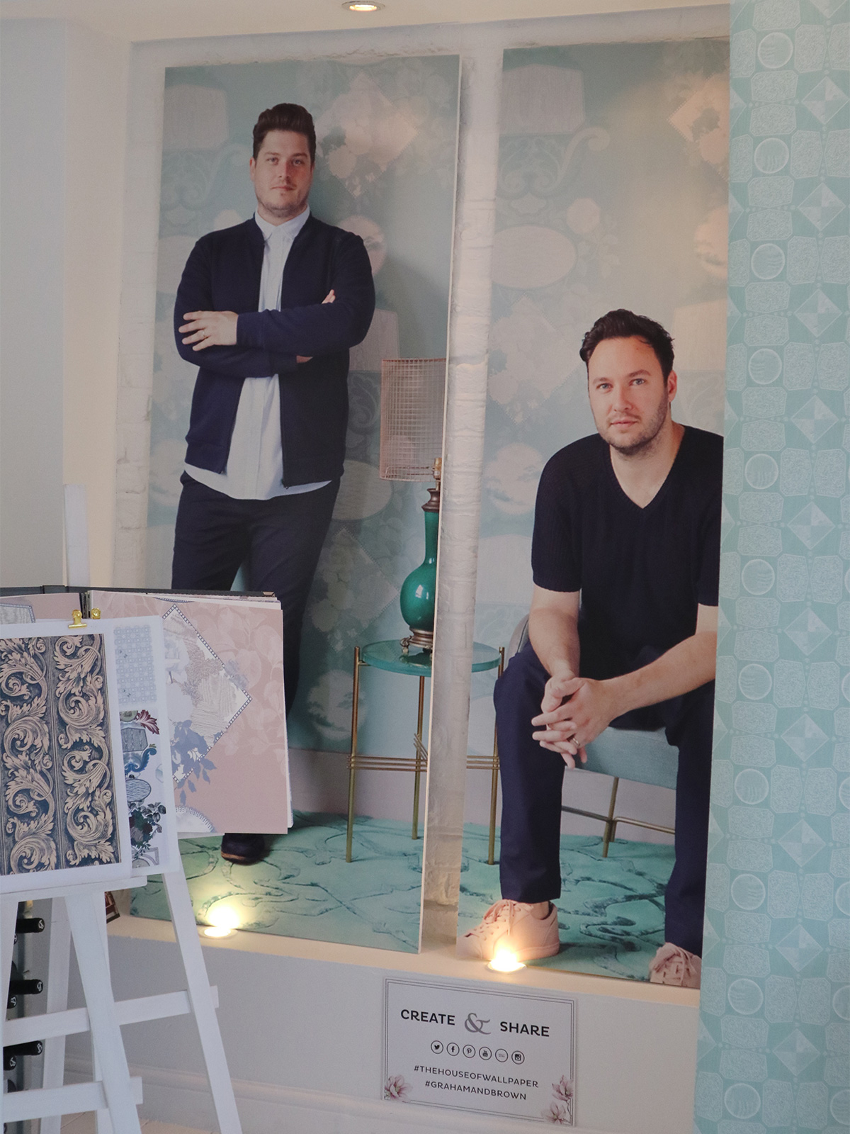
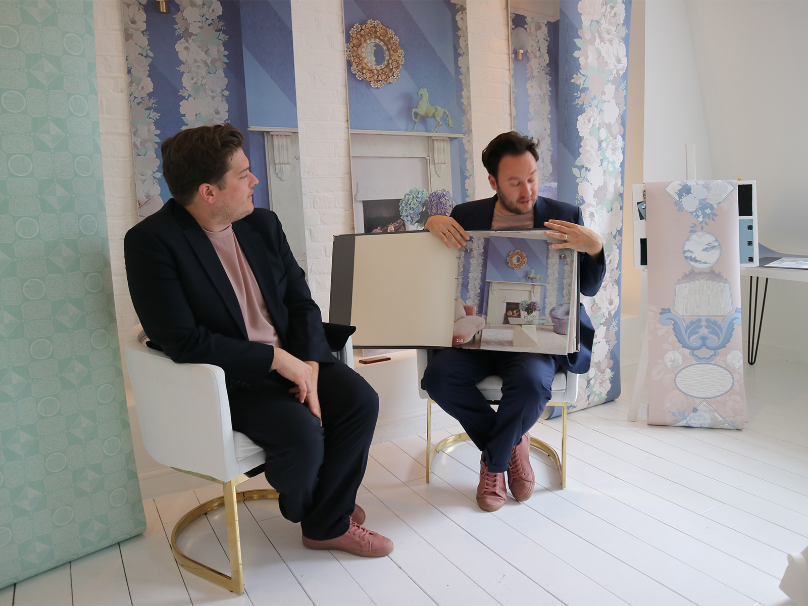
Jordan and Russell at The House of Wallpaper, 19 Greek Street
Jordan and Russell at The House of Wallpaper, 19 Greek Street
As you know, we are big fans of prints and patterns. We use them in many of our projects to inject a little soul into each of the homes we have designed. Our own patterns have also become a big part of our life as we originally started out designing prints and textiles before we launched our interior design business.
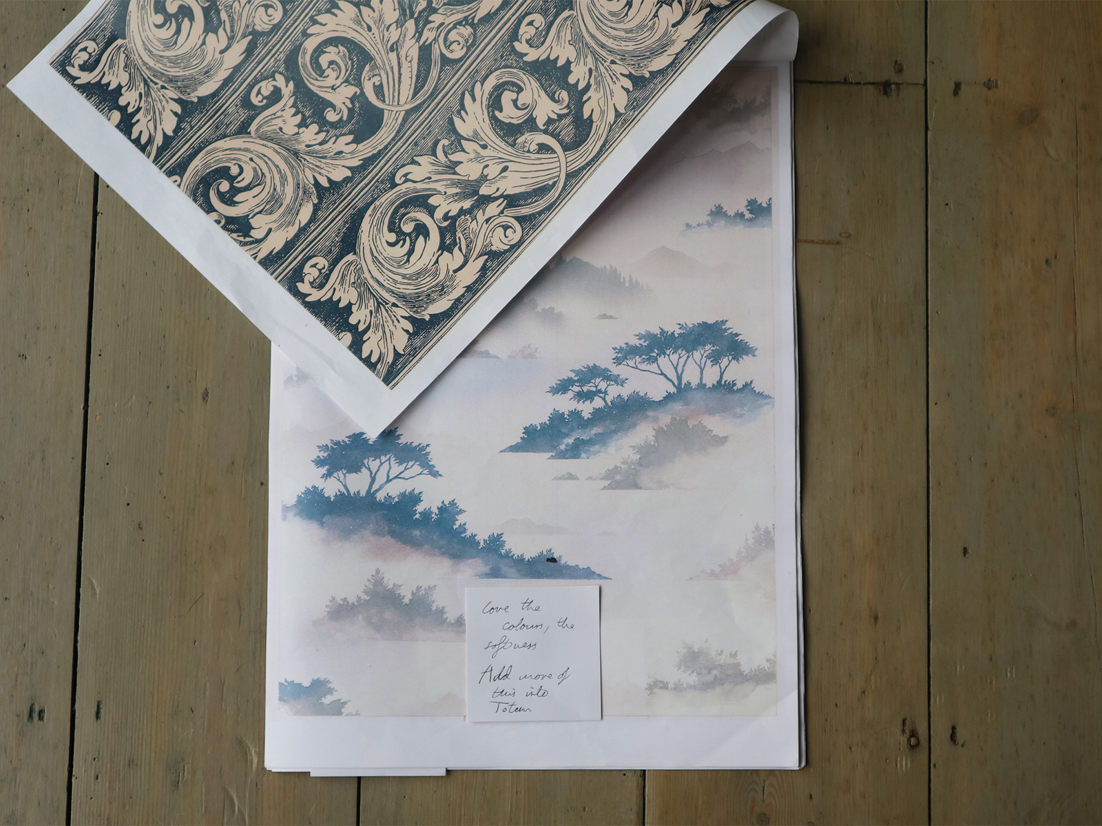
To help you understand our passion for pattern and the process of designing for interiors, we wanted to share some of the early stages of our wallpaper collection with Graham & Brown. There were two main inspirations for this collection:
- The G&B wallpaper archive.
- Our design house – Perry Rise.
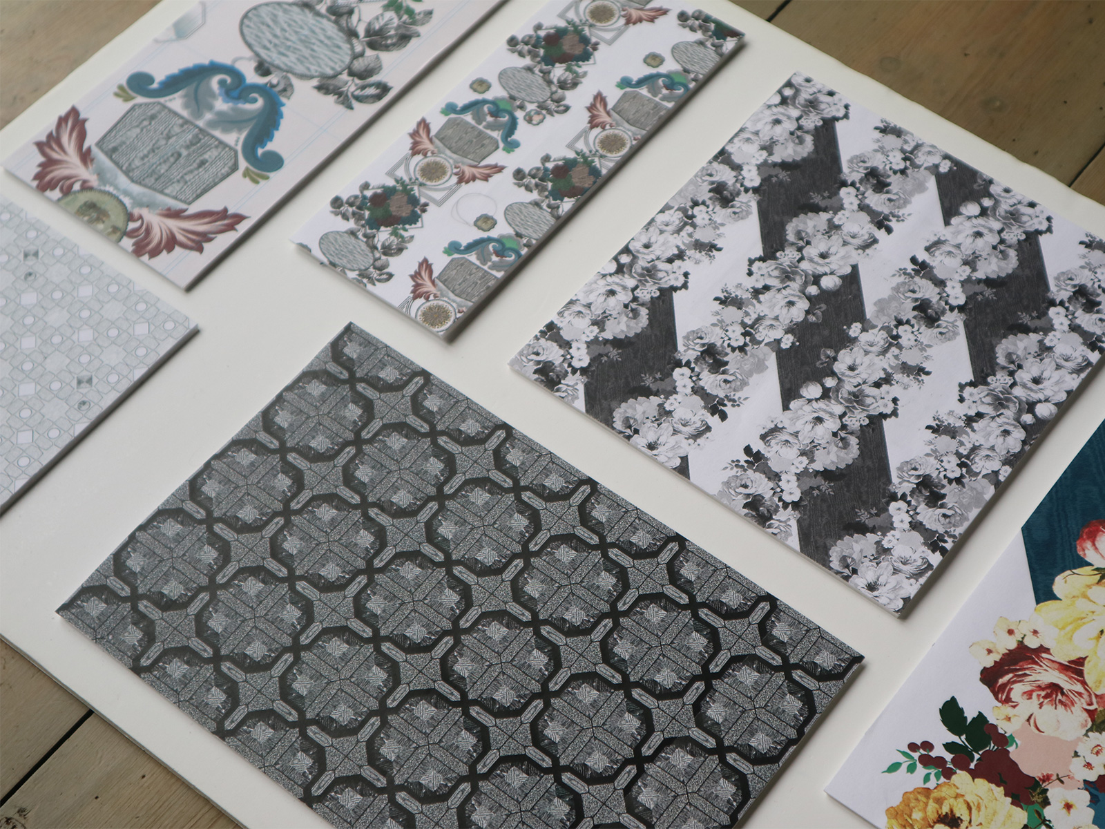
We wanted to express our love of different periods in designs and of pattern in general so we choose to create designs that touched on all these different elements. An eclectic mix of florals, period motifs and textures that reflected our personalities.
Behind the scenes - The Perry Rise Collection by 2LG for Graham & Brown
Behind the scenes - The Perry Rise Collection by 2LG for Graham & Brown
Pattern People...when you can't choose just one, why not have them all!
Early working stages of 2LG's first collection with Graham & Brown
Early working stages of 2LG's first collection with Graham & Brown
The designs went through many stages and in the end we united all the disparate elements with a limited pastel colour palette. Colour if often a great way to unite eclectic elements that you love. So that is our first big tip. If you just can’t decide on one print, don’t be afraid to mix it up with several prints in one space. Clash can give such impact to a space.
And don’t forget that if your are playing with scales of pattern and wildly different period references, Colour can be a powerful unifier.
To help you see what we are talking about in more detail, we’ve put together moodboards from 4 of our interior projects (one of which has not yet been seen because it isn’t finished). Each of the projects shows a different way to work with pattern and should help to give you a better understanding of where to begin and how to unify patterns into a coherent room scheme or overall home.
First off, our first ever project, Cloudsley Road in Islington. One of our most shared images and one very happy homeowner, with bold pattern at the heart of the home.
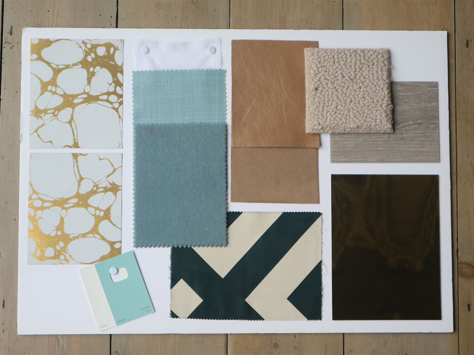
Islington project moodboard
Islington project moodboard
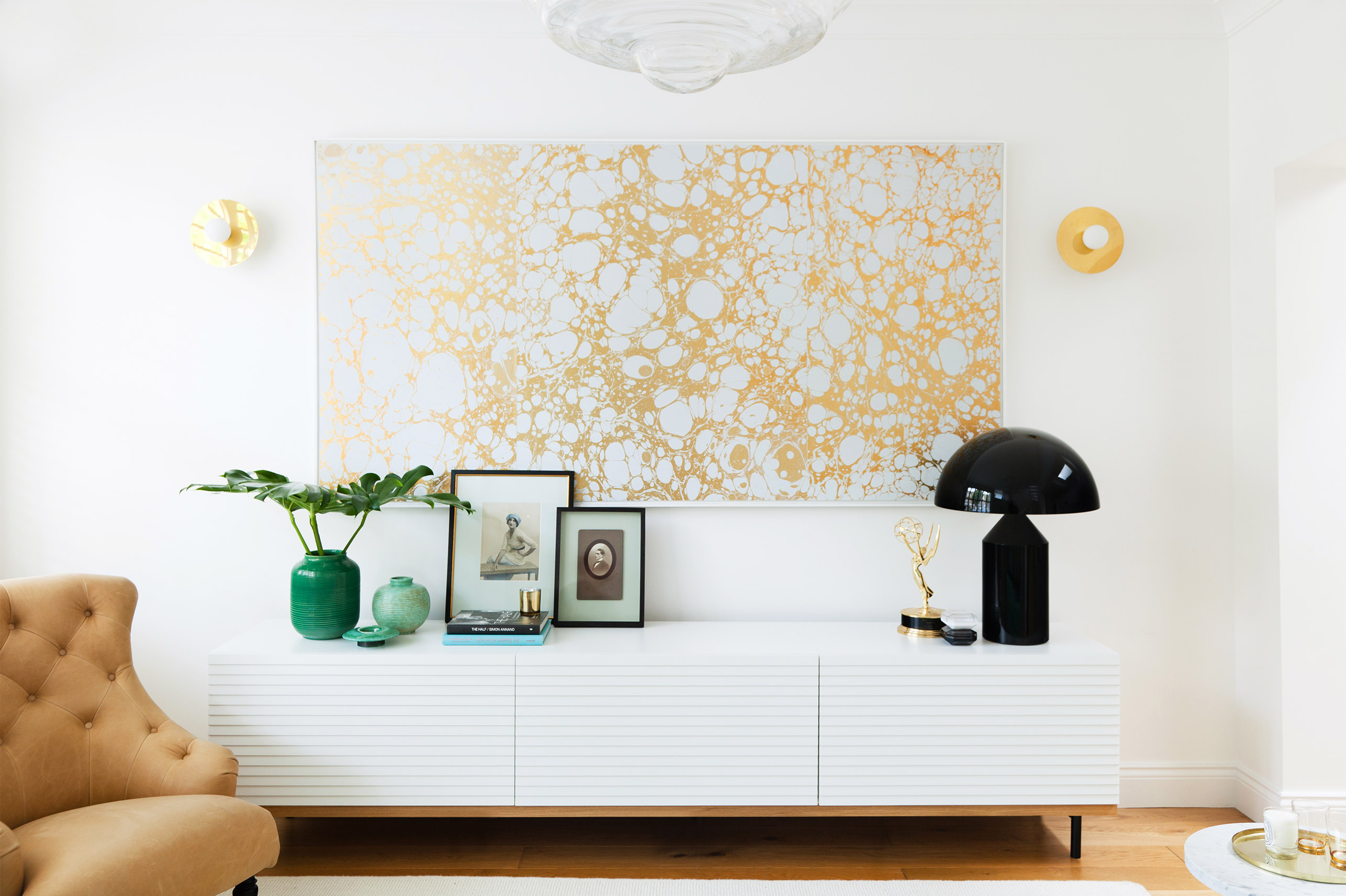
Pattern as statement
Cloudsley Road project by 2LG (photo by Megan Taylor)
Cloudsley Road project by 2LG (photo by Megan Taylor)
We used this beautiful bespoke wallpaper by brooklyn based designers, Calico Wallpaper, as a centerpiece of statement art in this bright open plan space. It’s an example of making pattern the star, with great support from the bespoke silk cushions in bold graphic black and pale grey. These were expensive elements so we used both patterns sparingly for the biggest impact possible in the budget. It ended up feeling fresh and restrained.
Key things to remember here: pattern can be used in small doses for big impact if you go for a clash in the designs. Set a strong graphic pattern against a more organic design (here we’ve gone for classic marbled paper) and you will be on to a winner.
Next up, our Upper Brockley Road project – a four storey victorian renovation with pattern uniting the whole building.
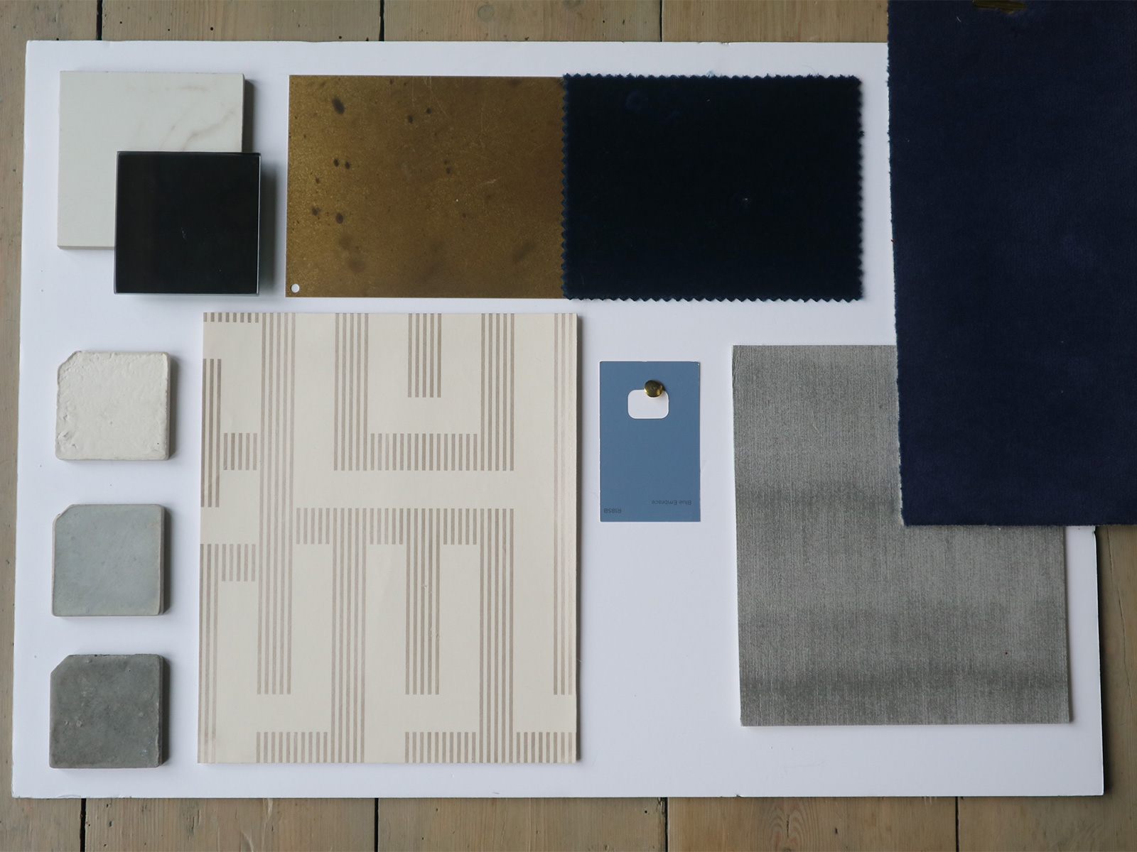
Brockley moodboard
Brockley moodboard
Pattern as through line
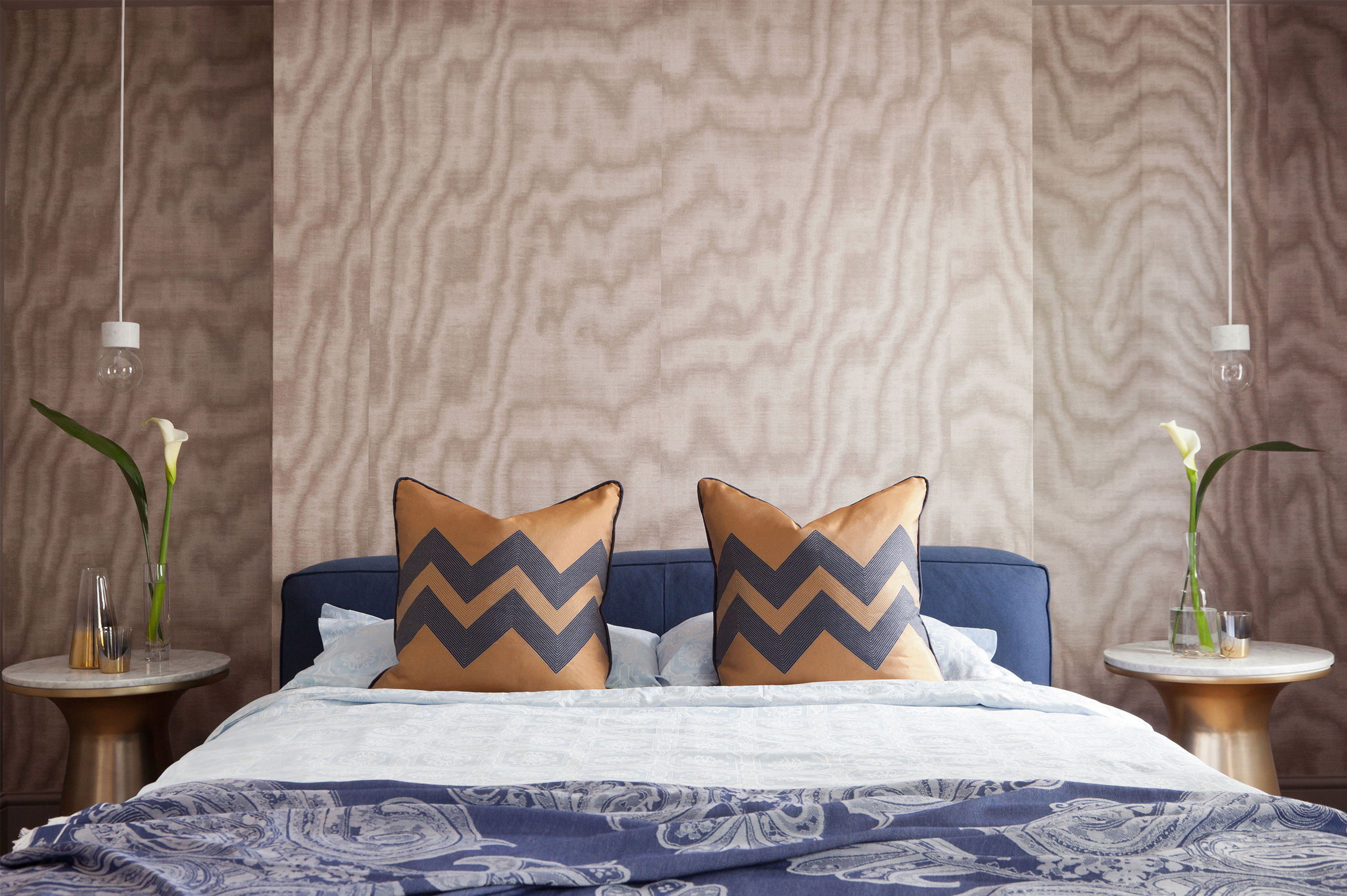
2LG's Brockley project (photo by Megan Taylor)
2LG's Brockley project (photo by Megan Taylor)
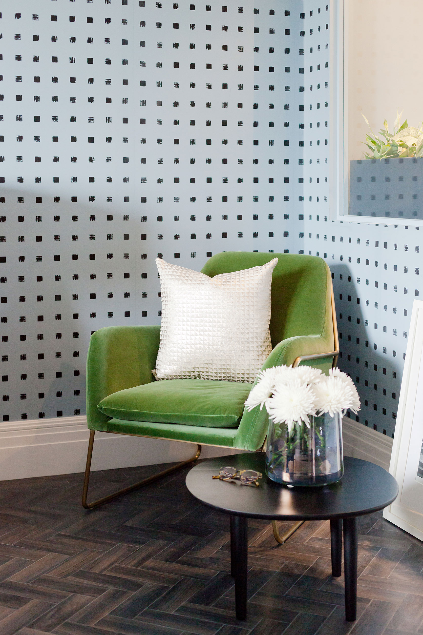
We used a sublte graphic wallpaper with a touch of metallic to unite all the floors of the home by hanging it all the way up the spine wall of the house, along all the stairways.
When you arrive at the top you are given another impactful moment of pattern in the double height Master bedroom. Here we used graphic cushions on the bed, a bold paisley throw and large scale moire wallpaper at the head of the bed. The pattern leads you all the way from the front door to the wow factor of the bedroom suite. We love a good through-line. Makes all the spaces feel connected and gives the whole house a bigger sense of space. A great example of how pattern does not close a space in – quite the opposite!
Now onto our Kew penthouse project – a white box apartment in need of a personality injection. Enter patterned wallpaper stage left, to liven up the spaces.
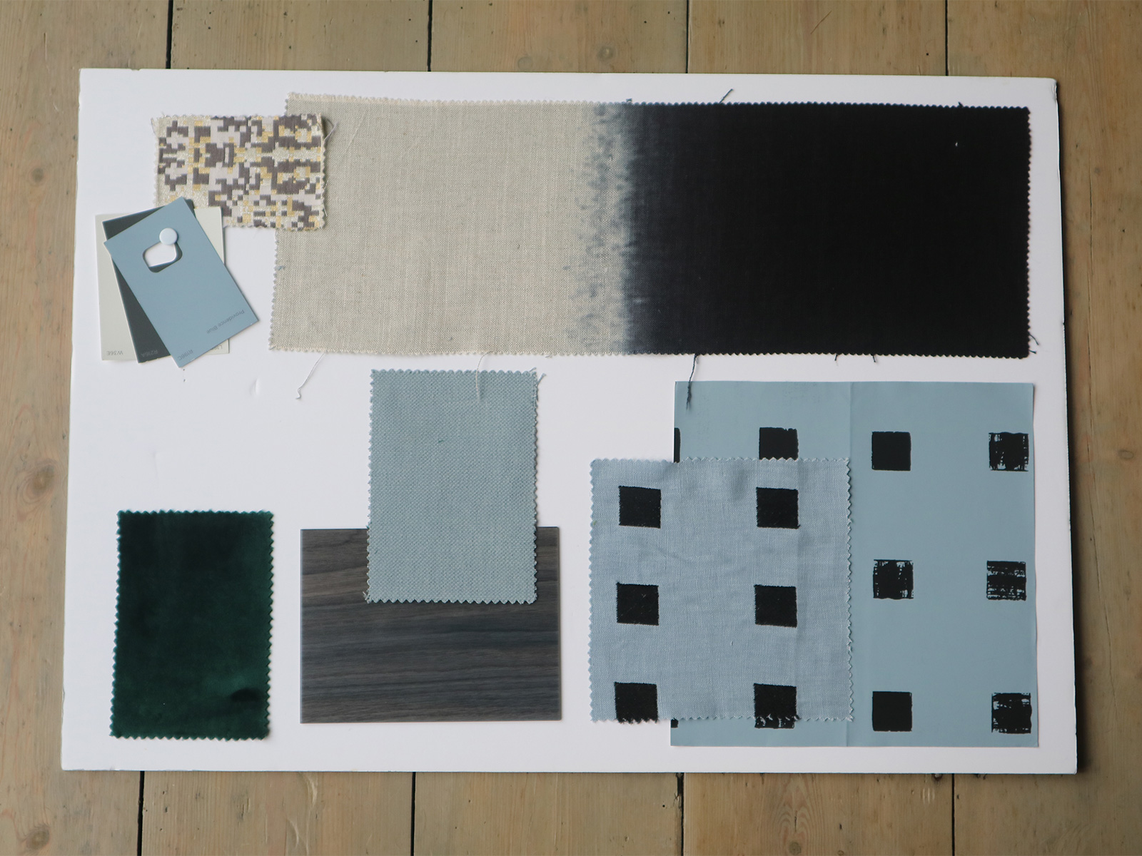
Kew project moodboard
Kew project moodboard
Pattern as starting point
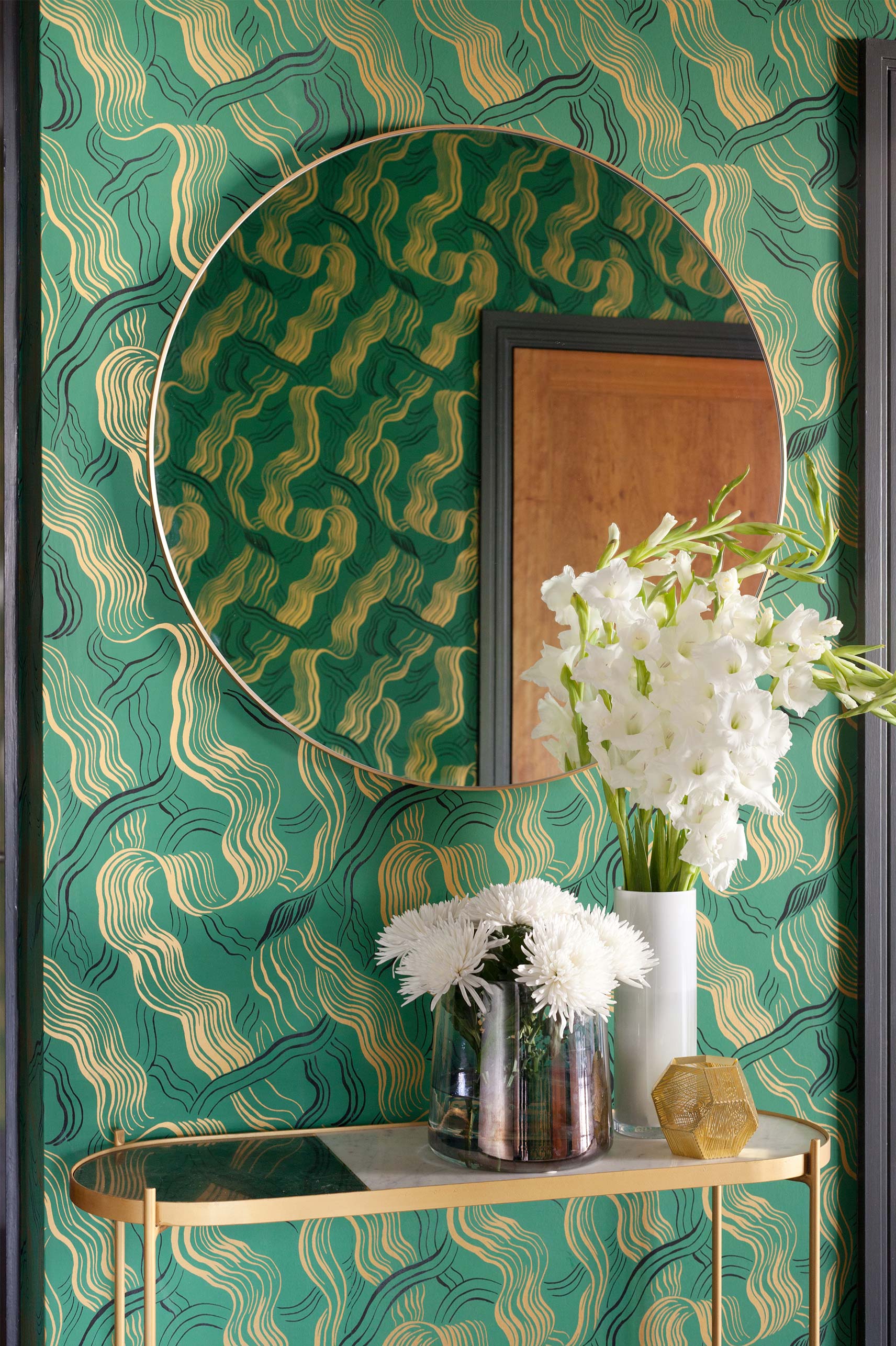
2LG's Kew project hallway in Kelly Wearstler wallpaper from GP&J Baker
2LG's Kew project hallway in Kelly Wearstler wallpaper from GP&J Baker
Bedroom at the Kew project (photo by Megan Taylor)
Bedroom at the Kew project (photo by Megan Taylor)
We began with pattern for this interior as the client had already fallen in love with this green stunner of a wallpaper by our design crush, Kelly Wearstler. It was a great place to start so no complaints from us. We used the colours to inform the rest of the spaces and put this wallpaper on all walls of the entrance hallway. This created a wonderful moment of compression (not to get too architect on you) allowing all the spaces coming off the main hallway to feel bigger and brighter by comparison. This is a useful trick in an apartment. It also give the home some much needed soul as a first impression when you walk in the front door. It’s a bold and unexpected surprise.
Sometimes bold pattern can be wrapped around a space for bold impact that benefits all the other spaces. If you are living in a modern white box, pattern should not be avoided, it should be embraced.
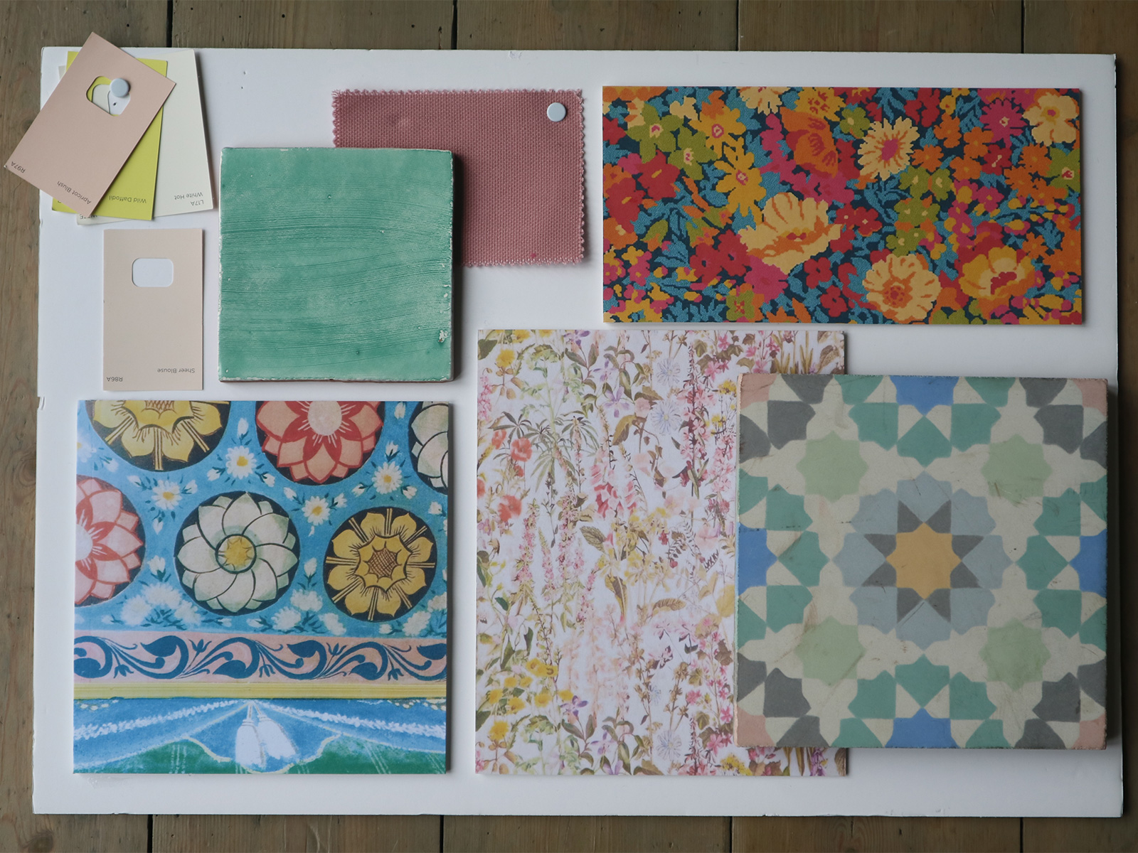
Finally, we have a wild explosion of eclectic colour and pattern in one of our latest projects that we have been working on for nearly 2 years! It’s soon to be shot for our projects page, but until we release the full house story, here is a sneak peek at the moodboard to quench the thirst of all you lovers of maximal interiors.
2LG's St Albans project Moodboard (full project coming soon)
2LG's St Albans project Moodboard (full project coming soon)
The starting point here was a hand-painted temple ceiling (bottom left on the board) that we photographed on a trip to Sri Lanka. We fell in love with this image instantly and so did the home-owner, so we used this to inform our colour palette. We have layered up the home with floral wallpaper and carpet as well as a bespoke encaustic tile that we commissioned for the main open plan kitchen diner. The result is a playful pattern palace (try saying that with your mouth full) and we cannot wait to share it with you.
If you feel inspired to try some pattern in your home, please share with us, we’d love to see. And if you want to try one of own designs from our first Graham & Brown wallpaper collection you can find it here.
Big Pattern Love,
Russell and Jordan x




 Green Carnation
 Sunderland Road
 Coppermaker Square
 Interview – Wilkinson & Rivera
 Interview – Eny Lee Parker